
What's improved
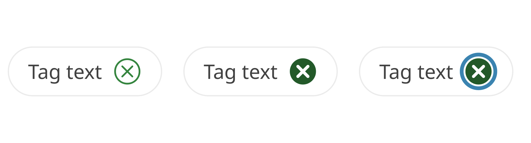
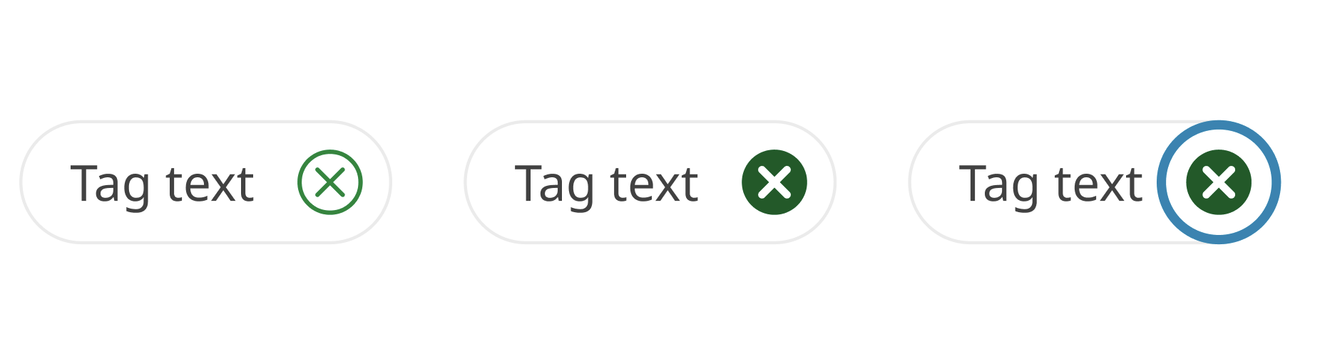
Tags
We’ve refined the visual design and usability of the applied filter tag. The right padding now matches the top and bottom for a more balanced appearance. We’ve also improved the focus style and increased the clickable/touchable area of the icon, making it easier for everyone to interact with.
Before
After
File usability improvements
Since the last minor version release (v4.4.0) we’ve also published numerous hotfixes in file to improve the experience for designers and collaborators.
- Accordion - Added auto layout to a layer so that the height expands when the title goes over more than one line.
- Promotional panel - Fixes to inconsistent padding, border radius and button order across the components: ‘Indented image panel’, ‘Indented text panel’, ‘Contained panel' and 'Promo panels’.
- Link columns - Fix to icon stretching when text went over two lines or more. Adjusted bottom padding on the 'Link-cols button' nested component to be 16px (aligned to 4px baseline grid).
- Buttons - Set the current width (160px) as a minimum width and applied auto layout to hug-contents for the ‘Default button’, ‘Leading icon’, ‘Trailing icon’ variants. This fixed an issue with button width not adapting to the text within.
- Tabs - A fix to icon colour for hover and disabled states.
- In-page navigation - Deprecated ‘Page-contents' component and introduced a replacement named 'In-page navigation' that fixes usability issues and simplified the component’s structure.
- Cards - Corrected icon colour in ‘no action card’ from secondary action to default heading colour as these cards are not interactive/have no action. Restored a missing ‘single-action card’ variant from version history.
- Callout (Event) - Updated font from ‘Lato' to 'Noto Sans'.
- Footer base (phone) - Added link style to phone number text.
- Spacing (horizontal guide) - A new component to cater for horizontal spacing guidance (gutters and margins). To reflect this addition the page was renamed from ‘Spacing (Vertical)’ to ‘Spacing (Guides)’.
- Grid guidelines - Replaced margin spacing elements with spacing components and fixed the LG-Grid visualisation to remove negative space on the edges of the frame. All horizontal Grid guides have been replaced with the relevant spacing components and updated with auto layout to reflect their respective specifications.
- Mobile nav links - Updated text link style on the menu item’s ‘Active’ states from ‘Regular’ and ‘Bold’ to ‘SemiBold’ to help distinguish between default and active states and maintain consistency with the horizontal nav.
- Tables - Applied auto layout to table cells. Combined table base variants into a component set and synchronised the naming of the layers to retain edits to text content when cell type/colour is changed.
- Layout guide style: LG-Grid - Margin updated from 48px to 32px to align with guidance. Reflected this in updates to horizontal padding across multiple components including Banners ('lg' variants), Footer / lg (Desktop and Vertical Navigation xl), Footer-dark / lg (base), Footer / lg (base), Horizontal Navigation lg (Desktop), LG Navigation Patterns.
- Pagination - Restored a missing variant from version history.
- Direction links - Arrow icons on the disabled state were changed from action/secondary green to match the disabled colour.
- Cards - Restored icon background colour for the xs-sm light colour variant for the no-action, single-action and multi-action cards.
- Single-action-card - Corrected the CTA arrow colour on the dark theme variants from light/action/secondary to dark/action/secondary.
Before you update
While we've reviewed all the changes in this update, we recommend creating a backup of your current working file/s before updating to v4.5.0.