
Overview
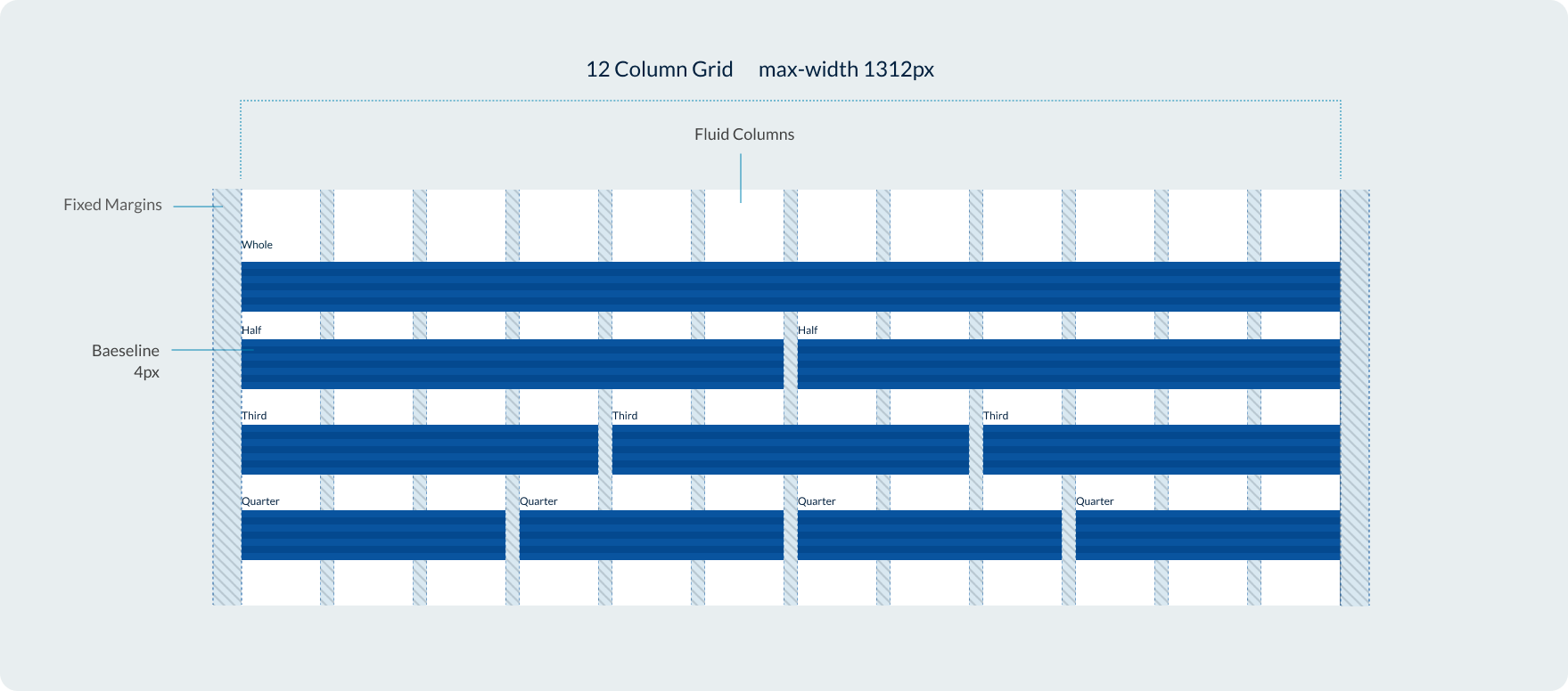
Our grid system uses a flexible 12 column design based on percentages with fixed gutters and margins. Our grid system is similar to bootstrap, giving users the option to change how content within columns behaved across breakpoints via classes.
Breakpoints
The Design System uses a responsive grid which adapts to the user’s viewport across 5 breakpoints.
| Breakpoint | Range | Margin | Gutters |
|---|---|---|---|
Extra-small | 400 | 16 | 16 |
Small | 400 - 699 | 16 | 16 |
Medium | 700 - 991 | 32 | 24 |
Large | 992 - 1312 | 32 | 32 |
Extra-large | Over 1312 | 32 | 32 |
We also have an XXL breakpoint for screen sizes over 1600px however this is specially for the implementation of our contained banner and promotional panel components. It isn't available as a class modifier for our grid system.
Max-width
Our page layouts have a maximum width which is set by a class applied to containers. This maximum width is 86rem which is equal to 1376px including margins or 1312px when you remove the outer margins.
Creating layouts with the grid
The Queensland Design System utilises a grid system consisting of rows and columns. You can control how content spans across columns at different breakpoints by changing the class name or by using the variables in the example below.
To define the columns within a row, specific classes are used in the following format:col-{breakpoint}-{columns}
The classes for columns are determined by the desired breakpoint, which can be one of the following: xs, sm, md, lg, or xl.
The number of columns can range from 1 to 12.
                <div class="container-fluid example-col">
      <div class="row">
        <div class="col-xs-1"><span>1</span></div>
        <div class="col-xs-1"><span>1</span></div>
        <div class="col-xs-1"><span>1</span></div>
        <div class="col-xs-1"><span>1</span></div>
        <div class="col-xs-1"><span>1</span></div>
        <div class="col-xs-1"><span>1</span></div>
        <div class="col-xs-1"><span>1</span></div>
        <div class="col-xs-1"><span>1</span></div>
        <div class="col-xs-1"><span>1</span></div>
        <div class="col-xs-1"><span>1</span></div>
        <div class="col-xs-1"><span>1</span></div>
        <div class="col-xs-1"><span>1</span></div>
      </div>
      <div class="row">
        <div class="col-xs-2"><span>2</span></div>
        <div class="col-xs-2"><span>2</span></div>
        <div class="col-xs-2"><span>2</span></div>
        <div class="col-xs-2"><span>2</span></div>
        <div class="col-xs-2"><span>2</span></div>
        <div class="col-xs-2"><span>2</span></div>
      </div>
      <div class="row">
        <div class="col-xs-3"><span>3</span></div>
        <div class="col-xs-3"><span>3</span></div>
        <div class="col-xs-3"><span>3</span></div>
        <div class="col-xs-3"><span>3</span></div>
      </div>
      <div class="row">
        <div class="col-xs-4"><span>4</span></div>
        <div class="col-xs-4"><span>4</span></div>
        <div class="col-xs-4"><span>4</span></div>
      </div>
      <div class="row">
        <div class="col-xs-6"><span>6</span></div>
        <div class="col-xs-6"><span>6</span></div>
      </div>
      <div class="row">
        <div class="col-xs-12"><span>12</span></div>
      </div>
    </div>
Recommendations:
The following number of columns per breakpoint are recommended to ensure your content meets best accessibility and usability.
- xs (Extra small) - 1 col layout
- sm (Small) - up to 2 columns
- md (Medium) - up to 3 columns although 2 often works best.
- lg and xl (Large) - up to 4 columns although 3 often works best.
Controlling the order with pull and push
You can control the visual order of columns within a row by using the pull and push modifiers in class names.
                <div class="container example-col">
    <div class="row">
      <div class="col-xs-4 col-xs-push-8"><span>First in source, last to display.</span></div>
      <div class="col-xs-4"><span>Second in source, second to display.</span></div>
      <div class="col-xs-4 col-xs-pull-8"><span>Last in source, first to display.</span></div>
    </div>
  </div>
Offset columns
You can offset a row by a specified number of columns by using the offset class name.
                <div class="container example-col">
    <div class="row">
      <div class="col-xs-6">6 cols</div>
      <div class="col-xs-offset-3 col-xs-3">3 cols</div>
    </div>
  </div>
Fluid
Use [.container-fluid] class for a full width container, spanning the entire width of your viewport.
                <div class="container-fluid example-col">
    <div class="row">
      <div class="col-xs-4"><span>4</span></div>
      <div class="col-xs-4"><span>4</span></div>
      <div class="col-xs-4"><span>4</span></div>
    </div>
  </div>
Research and rationale
Breakpoints
Our breakpoints were created by selecting the mid points between most commonly used screen resolutions for desktop, tablet and mobile devices in Australia. This method allowed us to determine the optimum place to create our ‘break points'.
For example, 960px was the largest frequently used screen size of note in medium screen category while 1024px was the smallest used screen size in the large category. We determine the break point to move from md-lg screen by finding the midpoint between these 2 sizes. The midpoint between 960 and 1024 was 992px.
We also compared our chosen breakpoints to other break points used in Design Systems to make sure we were consistent with any common practices, and we changed the number of breakpoints to 5 levels opposed to the original DTA system which only had 4 as this was more common amongst other design and allowed for greater control and flexibility at very large screen sizes.
All our breakpoints are based use variables so that we can easily optimise and adjust them as displays and resolutions change.
Why does the qld__grid class exist?
The qld__grid class is added for specificity. If a developer or designer is using another grid system that uses the same classes or has an element with the class of container they won’t inherit those styles. This prevents styles unintentionally leaking onto elements (DTA2018).
Why do we we use multiples of 8 in our grid?
For most common devices, the screen size in pixels is a multiple of 8. Keeping grid-component values at a multiple of 8 will generally make it easier to scale and implement a grid (Gordon 2022).
Classes and variables
Classes
| Name | Description |
|---|---|
qld__gridCopy | This class is used to define a grid layout for organizing content on the web page. |
containerCopy | The
.container
class is used to wrap the site's contents and create a responsive fixed-width container. It means the container's width changes at predefined breakpoints depending on the size of the screen.
|
container-fluidCopy | Similar to
.container
, the
.container-fluid
class is used for a full-width container that spans the entire width of the viewport. This container adjusts fluidly as the size of the viewport changes. This is often used when you want the content to take the entire width of the screen without the horizontal paddings that
.container
provides.
|
rowCopy | The
.row
class is used within a
.container
or
.container-fluid
to create horizontal groups of columns. This forms the basis of the grid system which is based on flexbox. The
.row
class is used to create the horizontal sections in which you can define your columns.
|
col-{breakpoint}-{columns}Copy | Controls the width of a col based on the users current viewport. |
col-{breakpoint}-push-{columns}Copy | Controls the visual order of columns by pushing a column forward. |
col-{breakpoint}-pull-{columns}Copy | Controls the visual order of columns my pulling a column backward. |
col-{breakpoint}-offset-{columns}Copy | Offset a col by a specified number of columns by using the offset class name. |
Variables
| Name | Description |
|---|---|
$QLD-media-smCopy | Variable that defines colour of descriptive icons on dark backgrounds. |
$QLD-media-mdCopy | Variable that defines colour of icons that are associated with links on light backgrounds. |
$QLD-media-lgCopy | Variable that defines hover colour of icons that are associated with links on light backgrounds. |
$QLD-media-xlCopy | Variable that defines colour of icons that are associated with links on dark backgrounds. |
$QLD-media-xxlCopy | Variable that defines hover colour of icons that are associated with links on dark backgrounds. |
Accessible grid requirements
Our default grid has been designed to meet accessibility requirements however keep these considerations in mind if you're modifying the Design System or creating a custom component.
WCAG guidelines
WCAG Guideline 1.3 Adaptable
Content should be presented in different ways without losing information or structure. For grid layouts, this means ensuring that the structure remains intact across various devices and orientations.
1.3.4 Orientation (AA): Grid layouts shouldn't restrict their view and operation to a single display orientation, such as portrait or landscape, unless necessary. This ensures that content is accessible in both orientations, especially for people using mobile devices.
1.4 Distinguishable
Grid layouts should make it easier for users to see and hear content by ensuring a clear separation between the foreground and background.
1.4.10 Reflow (AA): Grid layouts should reflow content in a single column when users zoom in to prevent scrolling in multiple directions. This is especially important for people with low vision who may need to zoom in to read text.
2.4 Navigable
Grid layouts should be easy to navigate through, helping users find content and understand where they are.
2.4.3 Focus Order (A): When navigating through elements in grid layouts using a keyboard, the focus order should be logical and intuitive. This is particularly important for people who can't use a mouse and rely on a keyboard for navigation.
4.1 Compatible
Ensure that grid layouts are compatible with current and future user agents, including assistive technologies. Properly marking up and coding grid layouts can make them accessible to a wider range of user agents.
4.1.1 Parsing (A): Grid layouts should be created in a way that avoids major code errors. This ensures that they can be reliably interpreted by a wide variety of user agents, including screen readers and other assistive technologies.
References
Digital Transformation Agency (2018) Grid, Gold Design System (Formerly DTA), accessed 10 April 2023.
Gordon K (2022) Using Grids in Interface Designs, Nielsen Norman Group, accessed 11 July 2023.