
Overview
Tabs are UI controls used to organise the content of a page into multiple panes where users can see one pane at a time. Tab content is always related and lies in the same hierarchy.
There are 2 types of tabs in our Design System Default tabs and Section tabs.
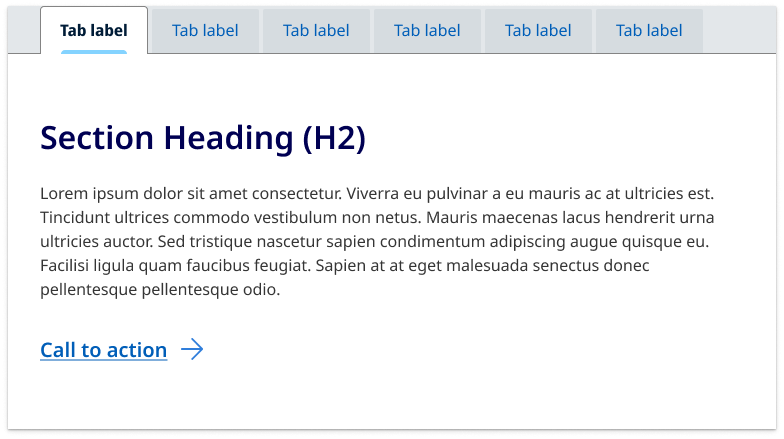
Default tabs
This is the default style for tabs. It's known as a contained style where the tab is a self component that sits with the content of a page and is used to further separate related content and establish hierarchy.
Please note the default Tabs component is best previewed in a new window.
                <!-- Tab Container -->
<div class="qld__tab-container qld__tab-container__fixed col-lg-9" id="tab-example">

    <!-- Scroll Button Left -->
    <button class="qld__tab-nav__item-scroll tab-overflow-nav-button-left" aria-hidden="true" aria-label="Scroll tab buttons left" tabindex="-1" style="display: none;">
        <i class="fa-solid fa-chevron-left"></i>
    </button>

    <!-- Scroll Button Right -->
    <button class="qld__tab-nav__item-scroll tab-overflow-nav-button-right" aria-hidden="true" aria-label="Scroll tab buttons right" tabindex="-1" style="display: none;">
        <i class="fa-solid fa-chevron-right"></i>
    </button>

    <!-- Tab Buttons -->
    <div class="qld__tabs" role="tablist">
        <!-- Tab 1 -->
        <button role="tab" class="qld__tab-button active" data-tab="tab1-example" aria-selected="false" aria-controls="tab1-example-content" tabindex="-1" id="tab1-example-button">
            <span>
                <i class="fa-regular fa-circle-info"></i>Title 1
            </span>
        </button>

        <!-- Tab 2 -->
        <button role="tab" class="qld__tab-button" data-tab="tab2-example" aria-selected="false" aria-controls="tab2-example-content" tabindex="-1" id="tab2-example-button">
            <span>
                <i class="fa-regular fa-circle-info"></i>Title 2
            </span>
        </button>

        <!-- Tab 3 -->
        <button role="tab" class="qld__tab-button" data-tab="tab3-example" aria-selected="false" aria-controls="tab3-example-content" tabindex="-1" id="tab3-example-button">
            <span>Title 3</span>
        </button>

        <!-- Tab 4 -->
        <button role="tab" class="qld__tab-button" data-tab="tab4-example" aria-selected="false" aria-controls="tab4-example-content" tabindex="-1" id="tab4-example-button">
            <span>Title 4</span>
        </button>

        <!-- Tab 5 -->
        <button role="tab" class="qld__tab-button" data-tab="tab5-example" aria-selected="false" aria-controls="tab5-example-content" tabindex="-1" id="tab5-example-button">
            <span>Title 5</span>
        </button>
    </div>

    <!-- Tab Content -->
    <!-- Content for Tab 1 -->
    <div data-tab="tab1-example" class="qld__tab-content active" role="tabpanel" aria-labelledby="tab1-example-button" id="tab1-example-content" tabindex="-1" aria-hidden="true">
        <h3>Tab 1 (Heading 3)</h3>
        <p>Lorem ipsum dolor sit amet consectetur. Mauris eu ut cras ullamcorper non nulla sem quis ac. Augue nascetur justo id at tristique nec praesent ipsum. Arcu est scelerisque nunc massa sit sed adipiscing. A aliquam libero vulputate purus platea vestibulum.</p>
    </div>

    <!-- Content for Tab 2 -->
    <div data-tab="tab2-example" class="qld__tab-content" role="tabpanel" aria-labelledby="tab2-example-button" id="tab2-example-content" tabindex="-1" aria-hidden="true">
        <h3>Tab 2 (Heading 3)</h3>
        <p>Lorem ipsum dolor sit amet consectetur. Mauris eu ut cras ullamcorper non nulla sem quis ac. Augue nascetur justo id at tristique nec praesent ipsum. Arcu est scelerisque nunc massa sit sed adipiscing. A aliquam libero vulputate purus platea vestibulum.</p>
    </div>

    <!-- Content for Tab 3 -->
    <div data-tab="tab3-example" class="qld__tab-content" role="tabpanel" aria-labelledby="tab3-example-button" id="tab3-example-content" tabindex="-1" aria-hidden="true">
        <h3>Tab 3 (Heading 3)</h3>
        <p>Lorem ipsum dolor sit amet consectetur. Mauris eu ut cras ullamcorper non nulla sem quis ac. Augue nascetur justo id at tristique nec praesent ipsum. Arcu est scelerisque nunc massa sit sed adipiscing. A aliquam libero vulputate purus platea vestibulum.</p>
    </div>

    <!-- Content for Tab 4 -->
    <div data-tab="tab4-example" class="qld__tab-content" role="tabpanel" aria-labelledby="tab4-example-button" id="tab4-example-content" tabindex="-1" aria-hidden="true">
        <h3>Tab 4 (Heading 3)</h3>
        <p>Lorem ipsum dolor sit amet consectetur. Mauris eu ut cras ullamcorper non nulla sem quis ac. Augue nascetur justo id at tristique nec praesent ipsum. Arcu est scelerisque nunc massa sit sed adipiscing. A aliquam libero vulputate purus platea vestibulum.</p>
    </div>

    <!-- Content for Tab 5 -->
    <div data-tab="tab5-example" class="qld__tab-content" role="tabpanel" aria-labelledby="tab5-example-button" id="tab5-example-content" tabindex="-1" aria-hidden="true">
        <h3>Tab 5 (Heading 3)</h3>
        <p>Lorem ipsum dolor sit amet consectetur. Mauris eu ut cras ullamcorper non nulla sem quis ac. Augue nascetur justo id at tristique nec praesent ipsum. Arcu est scelerisque nunc massa sit sed adipiscing. A aliquam libero vulputate purus platea vestibulum.</p>
    </div>
</div>
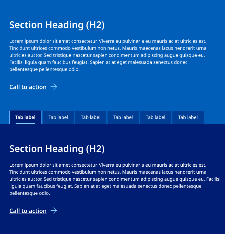
Section tabs
These are a form of in-page navigation and are placed at the top of a content pane displaying the main content destinations.
Full width section tabs are often used for pages within vertical navigation layouts to help the user separate out large sections of distinct but related content that they may need to switch between quickly.
Theses tabs commonly feature directly under a banner however they can also be placed before a separate content section.
It's recommended only one section tab be used on any page.
Please note the Section Tabs component is best previewed in a new window.
                <!-- Section tab example -->
<section class="qld__body qld__body--full-width qld__tab-section" id="tag-example">
    <div class="container-fluid">
        <!-- Tab container -->
        <div class="qld__tab-container qld__tab-container__fixed" id="tab-example">

            <!-- Scroll buttons -->
            <button class="qld__tab-nav__item-scroll tab-overflow-nav-button-left" aria-label="Scroll tab buttons left" tabindex="-1">
                <i class="fa-solid fa-chevron-left"></i>
            </button>
            <button class="qld__tab-nav__item-scroll tab-overflow-nav-button-right" aria-label="Scroll tab buttons right" tabindex="-1">
                <i class="fa-solid fa-chevron-right"></i>
            </button>

            <!-- Tab headers -->
            <div class="qld__tabs" role="tablist">
                <!-- Tab buttons -->
                <button role="tab" class="qld__tab-button active" data-tab="tab1-example" aria-selected="true" aria-controls="tab1-example-content" tabindex="0" id="tab1-example-button">
                    <span>
                        <i class="fa-regular fa-circle-info"></i>Title
                    </span>
                </button>
                <button  role="tab" class="qld__tab-button" data-tab="tab2-example" aria-selected="false" aria-controls="tab2-example-content" tabindex="-1" id="tab2-example-button">
                    <span>
                        <i class="fa-regular fa-circle-info"></i>Title 2
                    </span>
                </button>
                <!-- Repeat the same structure for the remaining tabs -->
                <!-- The 'active' class and aria-selected="true" should only be on the currently displayed tab -->
            </div>

            <!-- Tab contents -->
            <div data-tab="tab1-example" class="qld__tab-content active" role="tabpanel" aria-labelledby="tab1-example-button" id="tab1-example-content" tabindex="0">
                <h3>Tab 1 (Heading 3)</h3>
                <p>Lorem ipsum dolor sit amet consectetur...</p>
            </div>
            <div data-tab="tab2-example" class="qld__tab-content" role="tabpanel" aria-labelledby="tab2-example-button" id="tab2-example-content" tabindex="-1">
                <h3>Tab 2 (Heading 3)</h3>
                <p>Lorem ipsum dolor sit amet consectetur...</p>
            </div>
            <!-- Repeat the same structure for the remaining tab content -->
            <!-- The 'active' class should only be on the currently displayed tab -->
        </div>
    </div>
</section>
Usage guidelines
When to use
Use tabs to alternate between views within the same context, not to navigate to different areas or pages. Staying in place while alternating views is the primary functionality of this component.
Use tabs when:
- grouping related information into different categories, helping to reduce cognitive load
- you have 2 to 8 solid, similar categories with short names that fit in a single row
- the first section is more relevant than the others for most users
- users won't need to view all the sections at once
- the user needs to switch quickly between sections — tabs can show content without pushing other sections down the page, unlike accordions
- organising content, settings, and dashboards so a user doesn't have to navigate away from their workflow to complete their task.
When not to use
Don't use tabs:
- if the total amount of content will make the page slow to load
- if the user needs to read through all of the content in order, for example, to understand a step-by-step process
- when you want to compare information in different tabs. Having to memorise the information and switch backwards and forwards can be frustrating and difficult
- if your content is very short, consider using lists or paragraphs
- If your content is very long where the physical tabs become lost, consider breaking content into separate pages
- if your content isn't related and can't be ordered within by importance
- where there are very many tabs or the number of tabs are an unknown quantity
- to indicate progress. Use the progress indicator instead.
Consider if they are the right fit
Test your content without tabs first. Its best to consider alternatives first such as:
- simplifying and reduce the amount of content
- splitting the content across multiple pages
- keeping the content on a single page, separated by headings
- using page contents to let users navigate quickly to specific sections of content.
Anatomy of default tab
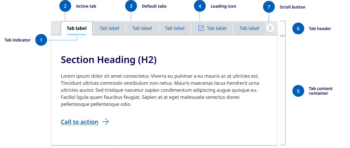
- Active tab
The currently selected tab button that represents the active section of content, it's visually connected to the content container below. - Tab indicator
A visual cue that shows which tab is currently selected, using a horizontal line. - Default tabs
The individual tab buttons that represent each section of content. - Leading icons
Tabs can be labelled as text or icons with text. - Tab header
This is the area that contains all the tab buttons. - Tab content
The area where the content corresponding to the active tab is displayed. - Horizontal scroll button
This button appears when there are too many tab items to fit in the container. It's used to indicate that there are hidden tabs as well as functionally to assist the user with horizonal scrolling.
Anatomy of section tab
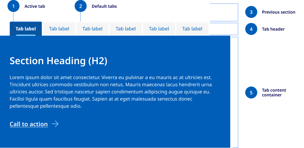
- Active tab
The currently selected tab button that represents the active section of content, it's visually connected to the content container below. In section tabs the colour is determined by the tab content container colour. - Default tabs
The individual tab buttons that represent each section of content. In Section tabs the default tab colours are determined by the colour of the previous section to ensure appropriate colour contrast. - Previous content section
Section tabs need to always sit below a content section or header as this is what defines the colour of the default tabs. - Tab header
For consistency it's important the design of the section tab header is exactly the same of default tabs, only the colours of the active and default tabs change. - Tab content container
The tab content container spans the full width of the content container. For this reason, this design isn't recommended to be used on standard content pages that include a left side menu.
Research and rationale
The design of this tab is based on the best practice research for tab design outlined by uk.gov design system and recommendations from the Nielsen Norman Group.
Some of the recommendations included:
- ensuring the active tab is visually connected to the content area and highlighted in multiple ways
- unselected tabs are visually distinct but still clearly clickable
- tabs should include iconography and make use of uniform spacing and padding
- tabs should be designed so they're visually distinct from primary navigation.
Metaphorically, using tabs is like leafing through index cards in a drawer of an old-fashioned card catalogue, so users must be able to tell at a glance what constitutes an "index card" (i.e., tab panel).
Responsive design
Our tab component also incorporates functionality inspired by IBM Carbon for how it responds on mobile devices. We conducted a review of 8 different designs system tab components to find out they dealt with multiple tabs on small screens and found the horizontal scroll option to be the easiest to operate and most familiar.
Other alternatives that were considered were overflow buttons with dropdown menus and vertical stacking. The disadvantages of these options were that the overflow button added interaction costs and vertical stacking pushed content far below the tab menu and made switching between content sections more difficult.
Colours and themes
The tab component builds on existing Design System styles including borders styles and icons and there are options for any background colour.
Development
The tab component requires a couple of javascript functions to work correctly. One to implement the standard tab functionality and another to handle how it responds on mobile.
TBC
Accessible tab requirements
Keep these considerations in mind if you're modifying the Design System or creating a custom component.
Please note there is complexity in terms of ARIA labelling and keyboard control that must be incorporated for accessibility. You can find more information on the W3C Example of Tabs with Manual Activation.
WCAG guidelines
1.4.3: Contrast (Minimum)
Make sure the tab component has sufficient colour contrast between text and background colours. The contrast ratio should be at least 4.5:1 for normal text and 3:1 for large text, ensuring that users with low vision can read the content easily (W3C, 2018).
1.4.4: Resize text
Ensure that the tab component's text can be resized up to 200% without loss of content or functionality, allowing users with low vision to read the content more easily (W3C, 2018).
1.3.1: Info and Relationships
Ensure that the tab component's structure and relationships between elements are clear and understandable. Use correct semantic markup like ARIA roles and properties to convey the purpose and state of each tab and tab panel (W3C, 2018).
2.1.2: No Keyboard Trap
Ensure that keyboard users do not get trapped within the tab component. Users should be able to navigate out of the component using the same means they used to enter it (W3C, 2018).
2.4.3: Focus Order
Ensure a logical focus order for the tab component. As users navigate through the component using a keyboard, the focus order should match the visual order, making the experience predictable and consistent (W3C, 2018).
2.4.7: Focus Visible
Provide a clear and visible focus indicator for the tab component. When a tab receives focus, it should be visually distinct from other tabs, making it easy for users to identify the currently focused tab (W3C, 2018).
4.1.2: Name, Role, Value
Ensure that the tab component's name, role, and current value are available to assistive technologies. Use ARIA attributes to provide appropriate names, roles, and values for each tab and tab panel, allowing screen reader users to understand the purpose and state of the component (W3C, 2018).
Assign appropriate ARIA roles:
- Set the role of the tablist container to "tablist".
- Set the role of each tab item to "tab".
- Set the role of each tab panel container to "tabpanel".
                <div role="tablist">
<button role="tab" type="button">Tab 1</button>
<button role="tab" type="button">Tab 2</button>
</div>

<div role="tabpanel"> Content for Tab 1 </div>
<div role="tabpanel"> Content for Tab 2 </div>
Set the relationship between tabs and tab panels using the "aria-controls" and "aria-labelledby" attributes:
- For each tab item, add the "aria-controls" attribute with the ID of its associated tab panel.
- For each tab panel, add the "aria-labelledby" attribute with the ID of its associated tab.
                <div role="tablist">
<button role="tab" type="button" id="tab1" aria-controls="tabpanel-1">Tab 1</button>
<button role="tab" type="button" id="tab2" aria-controls="tabpanel-2">Tab 2</button>
</div>
<div role="tabpanel" id="tabpanel-1" aria-labelledby="tab1"> Content for Tab 1 </div>
<div role="tabpanel" id="tabpanel-2" aria-labelledby="tab2"> Content for Tab 2 </div>
Set the "aria-selected" attribute to indicate the current active tab:
- For the active tab, set the "aria-selected" attribute to "true".
- For all other tabs, set the "aria-selected" attribute to "false".
                <div role="tablist">
<button role="tab" type="button" id="tab1" aria-controls="tabpanel-1" aria-selected="true">Tab 1</button>
<button role="tab" type="button" id="tab2" aria-controls="tabpanel-2" aria-selected="false">Tab 2</button>
</div>
Ensure that only the active tab panel is visible:
- For the active tab panel, set the "aria-hidden" attribute to "false".
- For all other tab panels, set the "aria-hidden" attribute to "true".
                <div role="tabpanel" id="tabpanel-1" aria-labelledby="tab1" aria-hidden="false"> Content for Tab 1 </div>
<div role="tabpanel" id="tabpanel-2" aria-labelledby="tab2" aria-hidden="true"> Content for Tab 2 </div>
References
GOV.UK Design System (2023) 'Tabs', GOV.UK Design System, accessed 2 August 2023.
Pickering, H. (2023) 'Tabbed Interfaces', Inclusive Components, accessed 2 August 2023.
Nielsen Norman Group (2023) 'Tabs, Used Right', Nielsen Norman Group, accessed 2 August 2023.
UX World (2022) 'Tabs Navigation Design: Best Practices', UXD World, accessed 2 August 2023.
Mullin, S. (2023) 'Tabbed Navigation: When to Use It, and How to Optimize It', CXL, accessed 2 August 2023.
Orbit (2023) 'Tabs component', Orbit, accessed 2 August 2023.
IBM (2023) 'Tabs', Carbon Design System, accessed 2 August 2023.
Web Accessibility Initiative (WAI) (2023) 'Example of Tabs with Manual Activation', Web Accessibility Initiative (WAI), accessed 2 August 2023.
W3C (2018) Web Content Accessibility Guidelines (WCAG) 2.1, World Wide Web Consortium, accessed 10 April 2023.