
Building on a foundation of best practice
Our philosophy with design is to always build on a foundation of best practice, we use only tested and accessible solutions and leverage work that has been done by other reputable sources wherever possible.
The foundations of the Queensland Government Design System primarily use the Digital Transformation Agency’s (DTA) Design System which provided a robust set well researched and tested components, patterns and guidelines that formed the basis of our Design System. This approach is similar to what other agencies in Australian have done.
That said, the Digital Transformation Agency’s Design System doesn't have every component or pattern required for the Queensland Government Design System. As a result, some components have been based on the best practice and research from other federal and state government Design Systems.
When an appropriate solution couldn't be found we also looked to other major commercial Design Systems such as Material Design, IBM Carbon, Microsoft Fluent and Atlassian for inspiration.
Adding new components
Our Design System is a complex organism made of many different parts such guidelines and principles, foundation elements, components, patterns and templates.
Its structure is based on a principal called atomic design, a methodology inspired by chemistry. In this methodology the smallest parts are known as atoms. Atoms are the base elements which everything builds on. In our Design System atoms are our guiding principles, policies, core styles and layout.
When we build a new component, we need to ensure its design is always built using these atoms. It should also always adhere to the vision which is to create a seamless, consistent and reliable website experience for all our diverse audience groups.
Our process always begins with research and before we start to develop any new component we always start with the following.
We like to ask these questions before making new components:
- Is it possible to use an existing component?
- Is it possible to meet this user need by customising an existing component?
If you can't use or modify an existing component we ask:
- Is it possible to use components that exist to make this (grid, buttons, responsive-media, body)?
- Can we build this component in a way that other products can benefit from it in the future?
- Is there research or discussion about similar patterns on other Design Systems?
- What functions and variables in core can I use in this component?
Our component design process
Our design process is based on the DTA design process and the The EightShapes Five Step System Workflow
 Design System Features, Step-by-Step
 GOLD Design System, previously known as the Australian Government Design System
The 5 steps in our process are:
- discovery
- design
- build
- document
- publish.
Although the steps suggest they're done in order it's actually common that multiple steps are done at the same time. The graph below illustrates how the process generally flows and where tasks overlap.
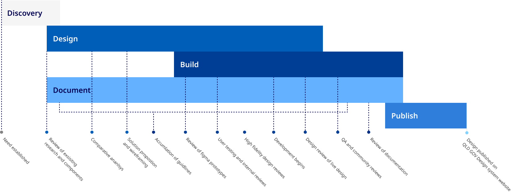
Discovery
Discovery clarifies the potential and the relevance of a new feature and decides whether or not to pursue it for our Design System. In this stage it identifies the problem that the new component is meant to solve, the requirements and constraints for the new component, and a plan is created for its development.
Tasks
Some typical tasks might involve, preliminary research, interviews, discussions with influential partners, gathering information about the target audience, user feedback, product and system analysis.
Design
Design involves researching and detailing the visual design, layout interactions states of a new component so that a build can be completed. This is an iterative stage that focuses on creating a solution that solves the problem in a way that is modular and agnostic.
Tasks
Typical tasks are, comparative reviews, analysis of research and industry best practice. Wire framing, high fidelity prototyping, user testing and stakeholder consultation.
Build
Build results in the codification of HTML, CSS, JavaScript, and other code. In this stage designs and code are tested and QA is performed to ensure components meet all success criteria such as browser compatibility and accessibility requirements.
Tasks
Tasks include font end development and testing that demonstrates the components features and capabilities. Design consultation feedback ensuring that it follows established design patterns and guidelines as well as documentation of specific coding conventions and requirements.
Document
One of the most important tasks is documentation. This focuses on communicating the research rationalisation and guidelines for a new component. It's contributed to by all members on the team including product owners, designers, developers and content experts.
Tasks
Typical tasks include the documentation of topics like when to use the component, accessibility consideration, content guidelines, features and variations, code examples and visual styling.
Publish
Once documentation is complete, the component is migrated to the publishing platform for release. This includes bringing the completed designs into our master Design System file and publishing the design and documentation to our website and code repository.
Tasks
Migrating copy onto our website, publishing new versions of our Design System library and detailing the update, finalising code and live examples and final review and testing.
About this page
References
ABC (Australian Broadcasting Corporation) (2020) Accessibility statement, ABC website, accessed 4 December 2020.