
Overview
A container for navigation links intended to be used as the primary means of getting around the website or application. It typically accommodates the top level of the information architecture.
The header displays across the top of all our sites and is crucial to:
- communicate to users what the page is about
- orient the user to where they are on the Queensland Health network
- communicate the sites relationship to the Queensland Government (see brand architecture)
- assisting in navigation.
It typically includes the site name or logo, Queensland Government attribution (Coat of Arms), the primary navigation menu, and other important components, such as search boxes, contact information, global navigation, calls-to-action and site-wide functionality.
Within our Design System there are 3 header variations for:
- horizontal navigation desktop pages
- vertical navigation desktop pages
- mobile and tablet viewports.
Open example in a new tab (recommended)


<!-- Main header container with banner role -->
<header class="qld__header horizontal-example" role="banner">

    <!-- Navigation bar for skip links -->
    <nav class="qld__skip-link" aria-label="skip links" tabindex="-1">
        <a class="qld__skip-link__link" href="#content">Skip to main content</a>
        <a class="qld__skip-link__link" href="#main-nav">Skip to main navigation</a>
    </nav>

    <!-- Pre-header section with logo and links -->
    <div class="qld__header__pre-header qld__header__pre-header--dark">
        <div class="container-fluid">

            <!-- Government link and logo used for mobile display -->
            <a href="https://www.qld.gov.au">
                <span class="qld__header__pre-header-url">qld.gov.au</span>
                <img class="qld__header__pre-header-brand-image" alt="Queensland Government" src="./?a=160271">
            </a>

            <!-- CTA wrapper for right aligned links in the preheader -->
            <div class="qld__header__cta-wrapper">
                <a class="qld__header__cta-link" href="javascript:void(0)">
                    <span class="qld__header__cta-link-icon">
                        <span class="qld__header__cta-link-icon">
                         <svg class="qld__icon" aria-hidden="true" xmlns="http://www.w3.org/2000/svg"><use href="./?a=169317:dist/mysource_files/img/QLD-icons.svg#phone"></use></svg>
                    </span>
                    </span>
                    <span class="qld__header__cta-link-text">Contact us</span>
                </a>
            </div>

            <!-- Main navigation controls (Search and Menu buttons on mobile and tablet screens) -->
            <div class="qld__header__main-nav-controls">
                <!-- Search button -->
                <button aria-controls="qld-header-search"
                    class="qld__header__toggle-main-nav qld__main-nav__toggle-search qld__main-nav__toggle-search--open"
                    aria-expanded="false">
                    <!-- Search and close icons -->
                    <svg aria-hidden="true" focusable="false" xmlns="http://www.w3.org/2000/svg"
                        class="qld__icon qld__main-nav__toggle-search-icon">
                        <use href="./?a=169317:dist/mysource_files/img/QLD-icons.svg#search"></use>
                    </svg>
                    <svg aria-hidden="true" focusable="false" xmlns="http://www.w3.org/2000/svg"
                        class="qld__icon qld__main-nav__toggle-search-close-icon">
                        <use href="./?a=169317:dist/mysource_files/img/QLD-icons.svg#close"></use>
                    </svg>
                    <!-- Search button label -->
                    <span class="qld__main-nav__toggle-text">Search</span>
                </button>

                <!-- Menu button -->
                <button aria-controls="main-nav" class="qld__header__toggle-main-nav qld__main-nav__toggle--open">
                    <!-- Menu icon -->
                    <svg aria-hidden="true" focusable="false" xmlns="http://www.w3.org/2000/svg"
                        class="qld__icon">
                        <use href="./?a=169317:dist/mysource_files/img/QLD-icons.svg#menu"></use>
                    </svg>
                    <!-- Menu button label -->
                    <span class="qld__main-nav__toggle-text">Menu</span>
                </button>
            </div>
        </div>
    </div>


    <!-- Main header section -->
    <div class="qld__header__main">
        <div class="container-fluid">

            <!-- Header brand section -->
            <div class="qld__header__brand">

                <a href="https://www.choreport.health.qld.gov.au">
                    <!-- QLD Government logo -->
                    <div class="qld__header__brand-image">
                    <img src="./?a=160263" alt="A logo representing the Queensland Government">
                    </div>
                    <!-- Site name and description -->
                    <div class="qld__header__site-name">
                        <span class="qld__header__heading">Header</span>
                        <span class="qld__header__subline">Subheading</span>
                    </div>
                </a>

            </div>

            <!-- Search form section -->
            <div class="qld__header__search" id="qld-header-search">
                <div class="qld__main-nav__focus-trap-top"></div>

                <div class="qld__search-form--wrapper">
                    <form role="search" aria-label="sitewide" class="qld__search-form" id="search-input-global-header" action="#">
                        <label for="search-input-global-header-query"
                            class="qld__label qld__display-lg qld__search-form__label">Search this website</label>
                        <div class="qld__search-form__inner">
                            <input type="search" id="search-input-global-header-query" name="query"
                                class="qld__text-input data-hj-allow" autocomplete="off">
                            <input type="text" id="name" name="name" autocomplete="off" tabindex="-1"
                                class="qld__text-input--validation">
                            <div class="qld__search-form__btn">
                                <button class="qld__btn qld__btn--search" type="submit" aria-label="Search">
                                    <span class="qld__btn__icon"></span>
                                    <span class="qld__btn__text">Search</span>
                                </button>
                            </div>
                        </div>
                    </form>
                </div>
                <div class="qld__main-nav__focus-trap-bottom"></div>
            </div>
        </div>
    </div>

</header>


<!-- Main navigation bar -->
<nav class="qld__main-nav qld__main-nav--mega" id="mainmenu">
    <div class="container-fluid">
        <!-- Main navigation content wrapper -->
        <div class="qld__main-nav__content" id="main-nav">
            <!-- Navigation menu wrapper -->
            <div class="qld__main-nav__menu">
                <!-- Inner navigation menu wrapper -->
                <div class="qld__main-nav__menu-inner">
                    <!-- Focus trap for accessibility purposes (keyboard navigation) -->
                    <div class="qld__main-nav__focus-trap-top"></div>
                    <!-- Navigation header which contains menu title and close button -->
                    <div class="qld__main-nav__header">
                        <h2 class="qld__main-nav__menu-heading" tabindex="-1">Menu</h2>
                        <!-- Close button for the menu -->
                        <button aria-controls="main-nav" class="qld__main-nav__toggle qld__main-nav__toggle--close">
                            <!-- SVG icon for the close button -->
                            <svg aria-hidden="true" focusable="false" xmlns="http://www.w3.org/2000/svg"
                                class="qld__icon qld__icon--md">
                                <use
                                     href="./?a=169317:dist/mysource_files/img/QLD-icons.svg#close">
                                </use>
                            </svg>
                            <span class="qld__main-nav__toggle-text">Close</span>
                        </button>
                    </div>
                    <!-- Navigation link list -->
                    <ul class="qld__link-list qld__link-list--flex">
                        <!-- Here is a navigation item example -->
                        <li class="qld__main-nav__item ">
                            <div class="qld__main-nav__item-title">
                                <a class="qld__main-nav__item-home qld__main-nav__item-link"  aria-label="Home" href="#">
                                    <!-- SVG icon for the link -->
                                    <span class="qld__main-nav__item-icon">
                                        <svg aria-hidden="true" focusable="false" xmlns="http://www.w3.org/2000/svg"
                                            class="qld__icon qld__icon--md">
                                            <use
                                            href="./?a=169317:dist/mysource_files/img/QLD-icons.svg#home">
                                            </use>
                                        </svg>
                                    </span>
                                    <span class="qld__main-nav__item-text" data-name="">Home</span>
                                </a>
                            </div>
                        </li>
                        <li class="qld__main-nav__item">
                            <div class="qld__main-nav__item-title">
                                <a class="qld__main-nav__item-link" href="#">Category page 1</a>
                            </div>
                        </li>
                        <li class="qld__main-nav__item">
                            <div class="qld__main-nav__item-title">
                                <a class="qld__main-nav__item-link" href="#">Category page 2</a>
                            </div>
                        </li>
                    </ul>
                    <!-- ... More elements like call-to-action or additional navigations could go here ... -->
                    <!-- Focus trap for accessibility purposes (keyboard navigation) -->
                    <div class="qld__main-nav__focus-trap-bottom"></div>
                </div>
            </div>
            <!-- Overlay element, which usually displayed when menu is open -->
            <div class="qld__main-nav__overlay" aria-controls="main-nav"></div>
        </div>
    </div>
</nav>
Header patterns
Horizontal navigation
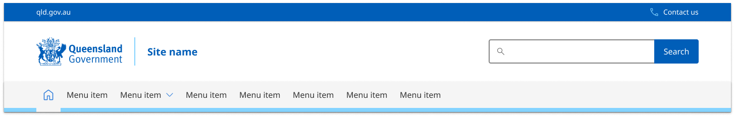
This style of header is the default for most sites. It's comprised of three parts:
- the global attribution bar (Pre-Header) which includes site-wide functionality and global navigation
- the header content area where branding, site name, search or taglines are located
- the primary navigation bar.
Vertical navigation

The header pattern for vertical navigation websites is similar to our default pattern. The only difference is it's justified to the left and right of the screen rather than centred. This is only visible on the xl screen sizes. The header pattern for all other screen sizes remains the same.
The style of this header is comprised of only two parts:
- the global attribution bar (Pre-Header) which includes site-wide functionality and global navigation
- the header content area where branding, site name, search or taglines are located.
Primary navigation is separate on vertical navigation style pages.
Mobile and tablet
Both vertical and horizontal navigation style pages default to the standard mobile and tablet header pattern.
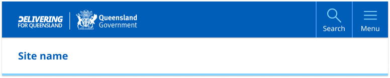
The mobile and tablet pattern is broken into two sections:
- the primary navigation component which contains site branding, search and the main menu
- the header content which contains only the the site name or on certain sites a tag-line.
The mobile and tablet patterns are identical in layout but the size of the tablet components are slightly larger to make a more balanced design when there's more screen space available.
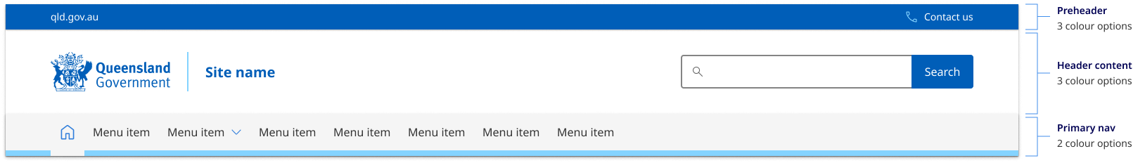
Header colour options
The header pattern has been designed to be versatile enough to cater for multiple types of brands with varying design and corporate ID requirements. There are currently three colour options for the content area, three for the primary attribution bar and two for the primary navigation. These options provide the best balance of customisation without adding too much complexity.
Colour choice implications
When choosing colours for the header pattern it's crucial to understand how your choices affect both the desktop and mobile layouts. The pre-header colour determines the mobile and tablet header colour. For this reason, it's recommended that your header content area and pre-header use different background colours see figma for more details.
Usage guidelines
The Design System header is a mandatory component and should be used on all pages of your site. However what header pattern and the layout options you should use is based on two factors:
- what form of navigation your site is using
- what brand category your site is.
Horizontal navigation
The most common header pattern used on most sites is the one designed to work with horizontal navigation. This is where the sites primary navigation sits within the header horizontal under the site title.
Vertical Navigation
If you have a vertical navigation site, you need to use the vertical navigation style header which has been designed specifically to compliment sites that use left hand side vertical navigation. It's also often a good choice for web apps and portals.
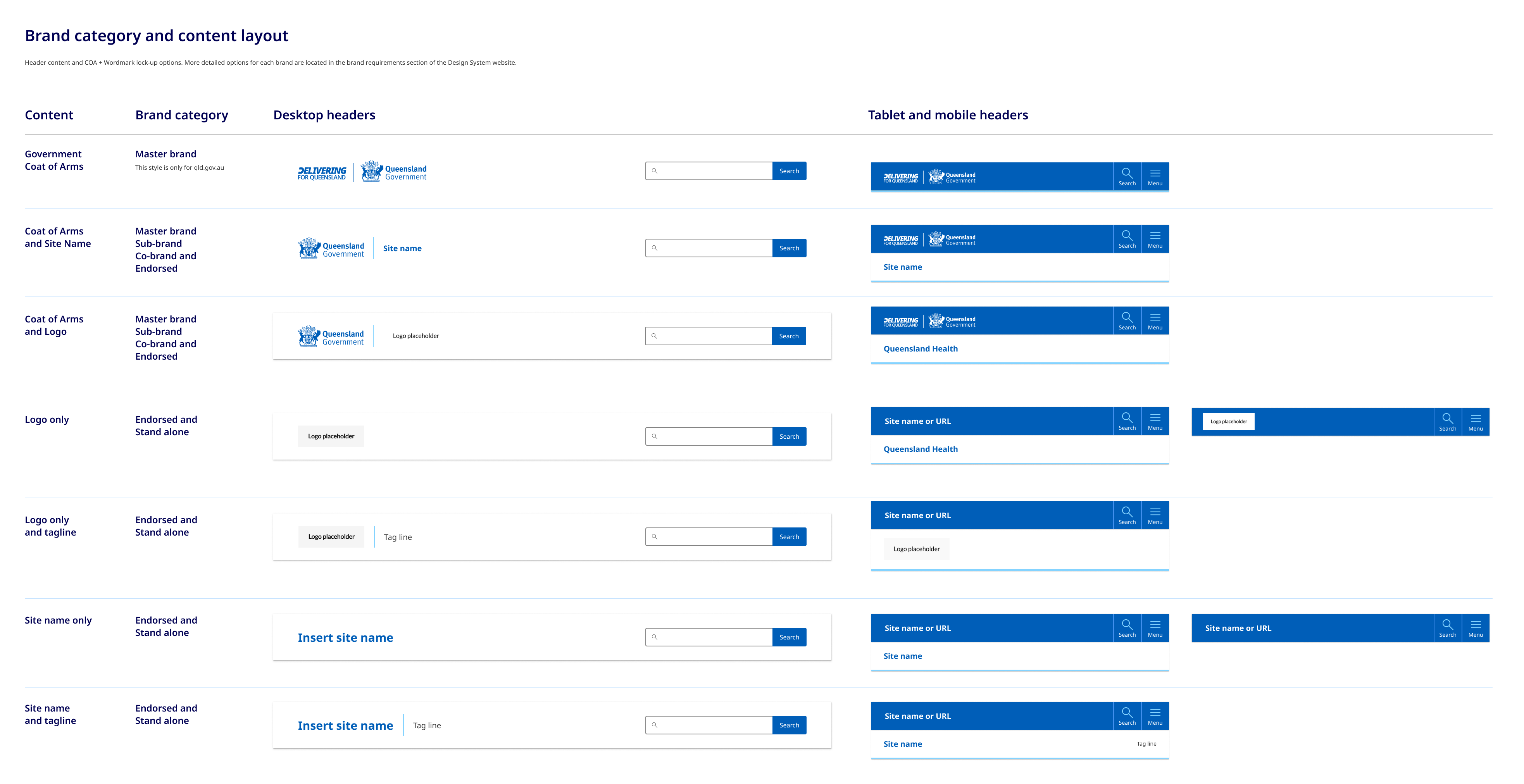
Brand category and content layout
How the government crest is positioned and what options you have in terms of incorporate tag lines and site logos is determined by what category of branding your site falls under. To work out what category your site is and what layout you should be using for your header see the brand architecture section.
There are a variety of layout options for the header content area that relate specifically to the different categories of brands detailed in our brand architecture. Below is a brief example of the layout options available, you can see more detailed visual guidelines in our figma file.
How to use headers
Do
- Your site title should be short and to the point, ideally no more than 70 characters. This makes it easy to read and remember
- Ideally any logos used should be the same size and shape of the Queensland Government Crest
Don't
- Use long taglines: Avoid taglines that are too long or difficult to read. This can be overwhelming for visitors and may detract from the impact of your message
- Don't over complicate the links in the master attribution bar, avoid too many features or options, try to limit it to 3 key actions
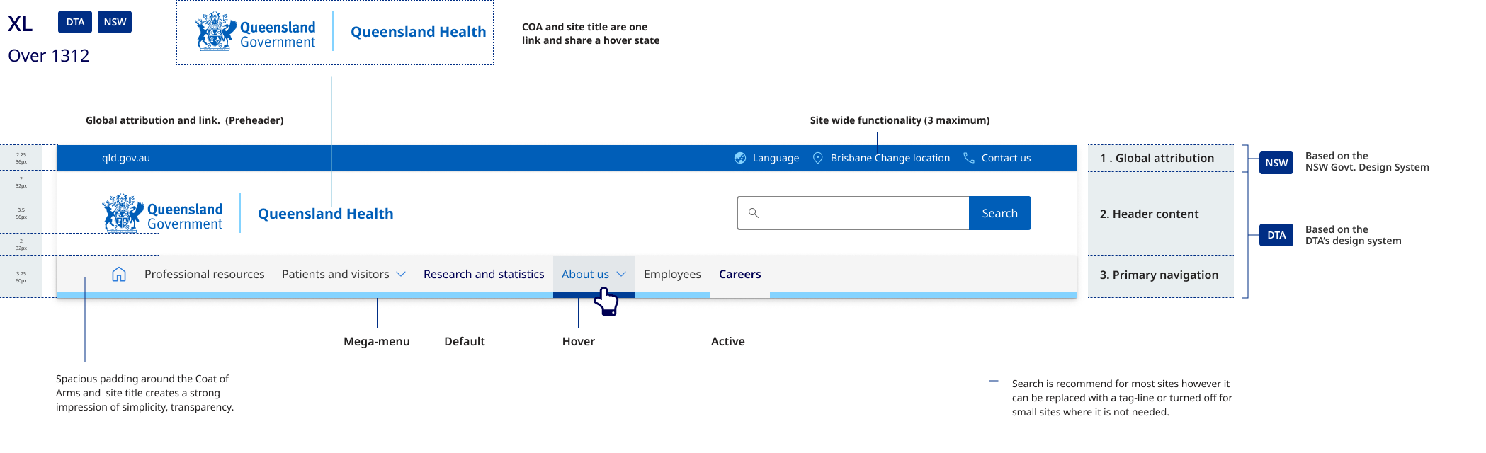
Desktop anatomy
The desktop header pattern is broken into 3 sections:
- the global attribution pre-header which includes site-wide functionality
- the header content area where branding, site name, search, and tertiary navigation links are located
- the primary navigation bar.
Mobile and tablet anatomy
- The primary navigation component contains branding with search and the main menu, where site-wide functionality is contained.
- The header content area contains only the site name, written in Meta FF. The example on the right shows how the mobile header easily adapts to longer site names.
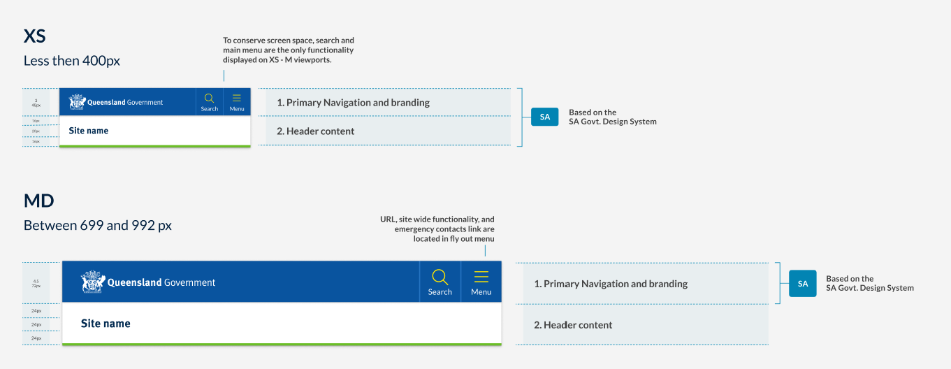
Differences between tablet and mobile
The header pattern for medium to large viewports is also based on the South Australian Design system and the smaller viewport pattern. As this pattern adopts a mobile first approach, those same benefits can be leveraged for this pattern as well. The primary difference is that the tablet pattern is slightly larger to make for a more balanced design when there is more screen space available.
Research and rationale
General overview
In developing the Queensland Health Design System header, we conducted an audit of the existing CUE header pattern to identify shortcomings as well as a brand audit of over 60 sites. We examined the compatibility of current assets and guidelines within Queensland Government and the viability of the DTA header we were using as a basis for our competent.
The current CUE pattern faced challenges in flexibility and consistency, including unnecessary height on desktop layouts, confusion caused by separate links for the Coat of Arms and site name, and inconsistencies in logo sizes and site name positioning. In our brand audit, we also found that many sites deviated from the recommended CUE pattern and struggled to apply corporate branding consistently.
To optimise a header solution that would work for multiple sites we realised it would need to:
- easily accommodate long site titles such as department names
- work for many different types of sites with a variety of logos and branding
- be mobile first, accessible and responsive
- enable cross site and global navigation and offer methods to navigate back to parent sites
- have a unified approach for applying corporate identity maintaining consistency across all government digital services
- build on the existing CUE pattern which was still heavily used.
The DTA and CUE patterns didn't offer solutions to resolve this so we explored other Design Systems and existing Queensland Government examples outside of the current CUE.
We analysed many other government Design Systems such as New South Wales, South Australia, and the UK as well as multiple sites in Queensland Government to identify the approaches they had taken and to see if we could adopt any of their patterns.
Our final solution was heavily inspired by the South Australian Design System for both our mobile and desktop layouts, this is because SA has a very similar logo to the Queensland Government and their patterns were already highly accessible and accommodated for long site names well on both mobile and desktop.
In addition to this, we also chose to include a global attribution (pre-header) component in our pattern which came from our review of NSW design header pattern. Incorporating a pre-header into our design allowed us to create a clear space for navigation back to the qld.gov.au from department websites and offered us room to feature key site utilities which in the existing CUE were previously featured alongside the search bar adding clutter and unnecessary high to the layout.
The final pattern offers increased flexibility on desktop devices as opposed to existing CUE patterns and the Initial DTA design. It easily accommodates longer names and includes a variety of layout options for the header content area that relate specifically to the different categories of brands detailed in our brand architecture.
Tablet and Mobile Pattern
The header patterns for both medium to large viewports (tablet pattern) and smaller viewports (mobile pattern) are based on the South Australian Design System. These patterns adopt a mobile-first approach, allowing the same benefits to be leveraged across different devices. Compared to the DTA's mobile header pattern, the South Australian Design System offered the following advantages:
- it takes up less vertical height, a premium on smaller viewports
- it easily accommodates longer site names
- it features a simple yet versatile design that can be easily adapted to any site within the brand architecture.
On mobile, site-wide functionality such as location and language are located in the hamburger menu, preserving screen space and prioritising the content area. This approach ensures a consistent and adaptable design for various screen sizes and devices.
Design of the attribution bar (preheader)
The pre-header component is placed the main header, in our Design System we used it to display secondary information and additional navigation options. The design of our pre-header is inspired by NSW Government, however there were a number of other factors we considered when designing our component.
Should be used for only secondary information: In our Design System the intention is that the pre-header is used to display secondary information like contact details, social media icons, or a secondary navigation menu. The placement of these things should be in the top right hand corner of the site. This prominent placement makes them always visible, and, in general, easier to notice and users look in that area for tools, especially for items such as Log in, Search, and My Account (Farrel S, 2015) .
Key links should be accompanied with Icons that include text labels: Studies have shown that while people enjoy seeing icons, they often struggle to comprehend and remember them. Additionally, websites tend to use icons inconsistently. Hover-text explanations (tool tips) that appear when the mouse hovers over an icon don't work on touch screens. To ensure good accessibility, understanding, and translation, it's recommended to use words, or a combination of words and icons (Harley A, 2014).
Minimalistic design: Our intention was to keep the pre-header simple and clean, with minimal visual elements. Since it's not the main focal point of the header we wanted to not overshadow the content in primary header.
Contrast with the main header: We chose to used differences in background colour to ensure there's enough visual distinction between the pre-header and the main header.
Responsive: Just like the main header, our pre-header adapts well to various screen sizes and devices. On mobile displays the however the site utilities and global navigation are combined into the hamburger menu.
Hamburger menu
Placement
The placement of our hamburger menu icon is on the top right. Placement of a hamburger menu item is a debated topic; we chose to place ours on the top right for the following reasons.
Familiarity: Many popular mobile applications, like Facebook and Instagram, place their menu icons in the top-right corner, so users may already be accustomed to looking for the icon in this location.
Thumb reachability: Approximate 70-90% of people in the world are right handed (Goldman, n014.). Placing the menu icon in the top-right corner can make it easier for users to reach with their thumbs.
Follows an existing tested pattern: This positing is consistent with the South Australian Design System which our header pattern has been heavily inspired by.
Separation from branding: Placing the hamburger menu icon in the top-right corner helps separate it from the site branding elements, which are typically found in the top-left corner. This separation can improve visual hierarchy and make it easier for users to find the menu icon.
Including the word menu
Researchers have found that the hamburger menu is used more when it is labelled Menu and has a border around it to make it look more like a button (Pernice and Budiu, 2016). This was also something that was part of the or original DTA hamburger menu design.
Search placement
For research and rationale on our search button placement and design on mobile and desktop see input fields search.
Navigation
The design rationale and requirements for primary navigation is covered within primary navigation section.
Classes
Global header classes
| Name | Description |
|---|---|
| Applies to <body> this class applies the vertical navigation header patterns. |
| Class that defines main header container and default styles |
Pre-header and mobile navigation controls
| Name | Description |
|---|---|
Pre-header | |
| Default style for pre-header container with not modifying class this is set to use the default light background colour. |
| Modifying class that changes the pre-header and any components within it to use the dark theme. |
| Modifying class that changes the pre-header and any components within it to use the dark-alt theme. |
| Use to apply styles to a group radio buttons. |
| On mobile the pre-header contains the primary brand identifier which in most cases is the Queensland Government Coat of Arms. |
| Right aligned container holds the pre-header site wide utility links. |
| Set the size and style for utility links in the pre-header |
| Defines the size and colour of utility link icons |
Mobile navigation | |
| Container for main navigation controls (Search and Menu buttons on mobile and tablet screens). These controls toggle the search or mobile menu. |
qld__main-nav__toggle-search | Defines the size and appearance of the 'search button' in the main nav control. |
qld__header__toggle-main-nav | Defines the size and appearance of the 'menu button' in the main nav control. |
qld__main-nav__toggle-text | Defines the style of labels for mobile menu buttons. |
Header content
| Name | Description |
|---|---|
| This is the class for the main content section of banner. |
| Modifier class that sets the content area to to use the dark theme |
| Modifier class that sets the content area to to use the dark-alt theme |
| Container for logo and site name |
| Defines size and shape of primary site logo on desktop. |
| Defines the position of site name |
| Defines the size and text style of site name |
| Defines the size and text style for subheadings in the site name |
| Class applied to the search form wrapper. See search field for more informaiton on search classes. |
Accessible header guidelines
Keep these considerations in mind if you are modifying the design system or creating a custom component.
Best practice
Semantic HTML elements
Use semantic HTML elements like <header>, <nav>, and <h1>-<h6> to create a clear, organised structure. This approach aids users with visual impairments in comprehending the content and purpose of the header (The A11Y Project, 2023).
Header images
Include alternative text for images in the header to describe their content and purpose, assisting users with visual impairments (W3C, 2018).
ARIA landmarks
Employ ARIA landmarks to label different sections of the header, offering additional context for assistive technologies (W3C 2016).
Keyboard accessibility
Ensure all interactive elements within the header are operable via a keyboard interface, without specific timings for individual keystrokes (WebAIM, 2022).
Touch targets
Make sure interactive elements in the header, such as buttons or dropdown menus, are large enough to be easily clicked or tapped on touchscreen devices (Mozilla, 2023).
Site title
The site title should be descriptive, concise, and accurately reflect the website's purpose and content. Code it as an H1 heading at the top of the page for clear understanding (W3C 2008).
Logo
The website logo should be descriptive and include alternative text. If it's a link to the homepage, ensure it's distinguishable from other links. The contrast between the logo and the background should meet minimum contrast ratio requirements (W3C 2018).
Site utility links
Site utility links like "Contact Us" or "Help" should be clearly labeled, easily identifiable, keyboard accessible, and have a focus state. Icons used for these links should have alternative text (W3C 2018).
WCAG Guidelines
1.3 Adaptable
Create content that can be presented in different ways (for example simpler layout) without losing information or structure. This is about ensuring that the structure of the header is accessible and meaningful for all users.
1.3.1 Info and Relationships
Information, structure, and relationships conveyed through presentation can be programmatically determined or are available in text. This means that the structure of the header (including any navigation menus, logos, or other elements) should be understandable not just visually, but also to assistive technologies like screen readers.
1.4.3 Contrast (Minimum)
Text in the header should have a contrast ratio of at least 4.5:1 with the background.
1.4.11 Non-text Contrast
Icons or other non-text elements in the header should have a contrast ratio of at least 3:1 against adjacent colours.
2.4 Navigable
Provide descriptive headings and labels where relevant.
2.4.6 Headings and Labels
Headings in the header should accurately describe the associated content.
2.4.10 Section Headings
Section headings are used to organise the content. This means that if your header includes multiple sections (like different navigation menus), they should each have a clear, descriptive heading.
3.1 Readable
Make text content readable and understandable. This includes the use of clear and understandable language in headers.
4.1.2 Name, Role, Value
All elements in the header should be properly labeled, and their function should be clear to both users and assistive technologies.
For example, the search form has a role of 'search', and it has a label 'Search this website'. All interactive elements such as buttons and links have clear names such as 'Contact us', 'Search', and 'Menu'.
References
Australian Government (2023) Headings | Style Manual, Australia Government Style Manual, accessed 17 July 2023.
Mozilla (2023) Mobile accessibility checklist - Accessibility | MDN, MDN Web Docs, accessed 17 July 2023.
Harley A (2014) Icon Usability, Nielsen Norman Group, accessed 17 July 2023.
Farrell S (2015) Utility Navigation: What It Is and How to Design It, Nielsen Norman Group, accessed 17 July 2023.
Pernice K and Budiu R (2016) Hamburger Menus and Hidden Navigation Hurt UX Metrics, Nielsen Norman Group, accessed 17 July 2023.
WebAIM (2022) 'Keyboard Accessibility', WebAIM, accessed 17 July 2023.
WebAIM (2021) Skip links, WebAIM, accessed 17 July 2023.
Digital NSW (n.d.) Header, NSW Design System, accessed 10 April 2023.
Digital Transformation Agency (2018) Header, Gold Design System (Formerly DTA), accessed 10 April 2023.