Overview
Text inputs are the fields used in forms. They allow a user to enter text in a structured format. Two common types of input fields are text boxes and text areas.
A text box is a single-line input field that allows users to enter a short amount of text, such as a name, email address, or password. Text boxes typically have a limited character count and may include additional features such as auto-complete and input validation.
A text area is a multi-line input field that allows users to enter longer blocks of text, such as comments, descriptions, or messages. Text areas typically have more space than text boxes and may include scrollbars to navigate through the text.
Text boxes
Text boxes are input fields typically used in forms that allow the user to enter text data in a structured format. Text inputs should always be accompanied by labels.
<div class="row">

    <div class="col-xs-6 col-lg-4">

        <!-- Default style text field -->
        <!-- Label for the input element -->
        <label class="qld__label" for="text-field-example">Label</label>

        <!-- Hint text associated via 'aria-describedby' -->
        <span class="qld__hint-text" id="text-field-example-hint">Hint text</span>

        <!-- Input field -->
        <input type="text" class="qld__text-input qld__text-input--block" id="text-field-example" name="input1" aria-describedby="text-field-example-hint">

    </div>

    <div class="col-xs-6 col-lg-4 qld__form-style-filled">

        <!-- Filled style text field -->
        <!-- Label for the input element -->
        <label class="qld__label" for="text-field-filled-example">Label</label>

        <!-- Hint text associated via 'aria-describedby' -->
        <span class="qld__hint-text" id="text-field-filled-example-hint">Hint text</span>

        <!-- Input field -->
        <input type="text" class="qld__text-input qld__text-input--block" id="text-field-filled-example" name="input2" aria-describedby="text-field-filled-example-hint">

    </div>

</div>
Valid and invalid states
<div class="row qld__row-gap-component">

 <div class="co-xs-12 col-lg-4">

     <!-- Example: Invalid field -->
     <!-- Label for the input element -->
     <label for="text-field-invalid-example" class="qld__label">Text-field label</label>

     <!-- Error message associated via 'aria-describedby' -->
     <span id="example-1-error-message" class="qld__input--error"><svg class="qld__icon qld__icon--lead qld__icon--sm" role="img" aria-label="Error: ">
         <use href="./?a=169317:dist/mysource_files/img/QLD-icons.svg#status-error">
       </svg>Error message</span>

     <!-- Text field -->
     <input type="text" id="text-field-invalid-example" placeholder="placeholder text" class="qld__text-input qld__text-input--block qld__text-input--error" aria-describedby="example-1-error-message">

 </div>


 <div class="qld__form-style-filled co-xs-12 col-lg-4">

   <!-- Example: Invalid field filled style -->
   <!-- Label for the input element -->
   <label for="text-field-invalid-filled-example" class="qld__label">Text-field label</label>

   <!-- Error message associated via 'aria-describedby' -->
   <span id="example-2-error-message" class="qld__input--error"><svg class="qld__icon qld__icon--lead qld__icon--sm" role="img" aria-label="Error: ">
        <use href="./?a=169317:dist/mysource_files/img/QLD-icons.svg#status-error">
      </svg>Error message</span>

   <!-- Text field -->
   <input type="text" id="text-field-invalid-filled-example" placeholder="placeholder text" class="qld__text-input qld__text-input--block qld__text-input--error" aria-describedby="example-2-error-message">

 </div>

</div>


<div class="row qld__row-gap-component qld__margin-t-component">

 <div class="co-xs-12 col-lg-4" >

   <!-- Example: Success field -->
   <!-- Label for the input element -->
   <label for="text-field-valid-example" class="qld__label">Text-field label</label>

   <!-- Hint text associated via 'aria-describedby' -->
   <span class="qld__hint-text" id="text-field-valid-example-hint">Hint text</span>

   <!-- Error message associated via 'aria-describedby' -->
   <span id="example-1-success-message" class="qld__input--success"><svg class="qld__icon qld__icon--lead qld__icon--sm" role="img" aria-label="Success: ">
        <use href="./?a=169317:dist/mysource_files/img/QLD-icons.svg#status-success">
   </svg>Success message</span>

   <!-- Text field -->
   <input type="text" id="text-field-valid-example" placeholder="placeholder text" class="qld__text-input qld__text-input--block qld__text-input--valid" aria-describedby="text-field-valid-example-hint example-1-success-message">

 </div>

 <div class="qld__form-style-filled co-xs-12 col-lg-4">

   <!-- Example: Success field filled style -->
   <!-- Label for the input element -->
   <label for="text-field-valid-filled-example" class="qld__label">Text-field label</label>

   <!-- Hint text associated via 'aria-describedby' -->
   <span class="qld__hint-text" id="text-field-valid-filled-example-hint">Hint text</span>

   <!-- Error message associated via 'aria-describedby' -->
   <span id="example-2-success-message" class="qld__input--success"><svg class="qld__icon qld__icon--lead qld__icon--sm" role="img" aria-label="Success: ">
       <use href="./?a=169317:dist/mysource_files/img/QLD-icons.svg#status-success">
      </svg>Success message</span>

   <!-- Text field -->
   <input type="text" id="text-field-valid-filled-example" placeholder="placeholder text" class="qld__text-input qld__text-input--block qld__text-input--valid" aria-describedby="text-field-valid-filled-example-hint example-2-success-message">

 </div>

</div>
Disabled
<div class="row">

    <div class="col-xs-6 col-lg-4 ">

        <!-- Disabled default style text field -->
        <!-- Label for the input element -->
        <label class="qld__label" for="disabled-text-field-example">Label</label>

        <!-- Hint text associated via 'aria-describedby' -->
        <span class="qld__hint-text" id="disabled-text-field-example-hint">Hint text</span>

        <!-- Input field -->
        <input type="text" class="qld__text-input qld__text-input--block" id="disabled-text-field-example" name="input1" aria-describedby="disabled-text-field-example-hint" disabled>

    </div>

    <div class="col-xs-6  col-lg-4 qld__form-style-filled">

        <!-- Disabled filled style text field -->
        <!-- Label for the input element -->
        <label class="qld__label" for="disabled-filled-text-field-example">Label</label>

        <!-- Hint text associated via 'aria-describedby' -->
        <span class="qld__hint-text" id="disabled-filled-text-field-example-hint">Hint text</span>

        <!-- Input field -->
        <input type="text" class="qld__text-input qld__text-input--block" id="disabled-filled-text-field-example" name="input2" aria-describedby="disabled-filled-text-field-example-hint" disabled>

    </div>

</div>
Usage guidelines for text boxes
Below are general guidelines for text-area fields, please see our form component for how to use text-boxes a more complete guide on how to structure and layout your forms. It's also recommended that you review the Australian Government style manual for more detailed advice on form content.
When to use
- When collecting short and specific information: Text boxes are best suited for collecting short and specific information such as names, email addresses, and phone numbers
- When only one answer is required: Text boxes are ideal when only one answer is required from the user
- When input validation is necessary: Text boxes allow for input validation, which means that the user's input can be checked for errors before being submitted
When not to use
- When long-form input is required: Text boxes aren't ideal for collecting long-form input such as paragraphs use text area instead
- When multiple answers are required: Text boxes aren't the best option when multiple answers are required from the user
- When the input needs to be limited: Text boxes shouldn't be used when the input needs to be limited to a specific range or set of values, such as selecting a date from a calendar. Consider using check boxes, radio boxes or select fields
Text area
A text area lets users enter long form text which spans over multiple lines. Overflow text wraps onto a new line and expands the text area.
<div class="row qld__row-gap-component">

    <div class="co-xs-12 col-lg-4">

    <!-- Default style textarea field -->
    <!-- Label for the textarea element -->
    <label for="textarea-example" class="qld__label"><abbr title="required">*</abbr>Text-area label</label>

    <!-- Hint text associated via 'aria-describedby' -->
    <span class="qld__hint-text" id="textarea-example-hint">Hint text</span>

    <!-- Textarea field -->
    <textarea id="textarea-example" class="qld__text-input qld__text-input--block" aria-required="true" aria-describedby="textarea-example-hint"></textarea>

    </div>


    <div class="co-xs-12 col-lg-4 qld__form-style-filled">

    <!-- Filled style textarea field -->
    <!-- Label for the textarea element -->
    <label for="textarea-filled-example" class="qld__label">Text-area label<span class="qld__label--optional"> (Optional)</span></label>

    <!-- Hint text associated via 'aria-describedby' -->
    <span class="qld__hint-text" id="textarea-filled-example-hint">Hint text</span>

    <!-- Textarea field -->
    <textarea id="textarea-filled-example" class="qld__text-input qld__text-input--block" aria-describedby="textarea-filled-example-hint"></textarea>

    </div>

</div>
Valid and invalid states
<div class="row qld__row-gap-component">

    <div class="co-xs-12 col-lg-4">

        <!-- Example: Invalid textarea field -->
        <!-- Label for the textarea element -->
        <label for="textarea-invalid-example" class="qld__label">Text-area label</label>

        <!-- Hint text associated via 'aria-describedby' -->
        <span id="textarea-invalid-example-message" class="qld__input--error"><svg class="qld__icon qld__icon--lead qld__icon--sm" role="img" aria-label="Error: ">
            <use href="./?a=169317:dist/mysource_files/img/QLD-icons.svg#status-error">
          </svg>Error message</span>

        <!-- Textarea field -->
        <textarea id="textarea-invalid-example" placeholder="placeholder text" class="qld__text-input qld__text-input--block qld__text-input--error" aria-describedby="textarea-invalid-example-message"></textarea>

    </div>

    <div class="qld__form-style-filled co-xs-12 col-lg-4">

       <!-- Example: Invalid field filled style -->
       <!-- Label for the textarea element -->
       <label for="textarea-filled-invalid-example" class="qld__label">Text-area label</label>

       <!-- Hint text associated via 'aria-describedby' -->
       <span id="textarea-filled-invalid-example-message" class="qld__input--error"><svg class="qld__icon qld__icon--lead qld__icon--sm" role="img" aria-label="Error: ">
           <use href="./?a=169317:dist/mysource_files/img/QLD-icons.svg#status-error">
         </svg>Error message</span>

       <!-- Textarea field -->
       <textarea id="textarea-filled-invalid-example" placeholder="placeholder text" class="qld__text-input qld__text-input--block qld__text-input--error" aria-describedby="textarea-filled-invalid-example-message"></textarea>

    </div>

</div>


<div class="row qld__row-gap-component qld__margin-t-component">

    <div class="co-xs-12 col-lg-4" >

      <!-- Example: valid field -->
       <!-- Label for the textarea element -->
       <label for="textarea-valid-example" class="qld__label">Text-area label</label>

       <!-- Hint text associated via 'aria-describedby' -->
       <span class="textarea-valid-example-hint" id="text-area-hint-success">Hint text</span>

       <!-- Success message text associated via 'aria-describedby' -->
       <span id="textarea-valid-message" class="qld__input--success"> <svg class="qld__icon qld__icon--lead qld__icon--sm" role="img" aria-label="Success: ">
          <use href="./?a=169317:dist/mysource_files/img/QLD-icons.svg#status-success">
         </svg>Success message</span>

       <textarea id="textarea-valid-example" placeholder="placeholder text" class="qld__text-input qld__text-input--block qld__text-input--valid" aria-describedby="textarea-valid-example-hint textarea-valid-message"></textarea>
    </div>


    <div class="qld__form-style-filled co-xs-12 col-lg-4">

      <!-- Example: valid field filled style -->
       <!-- Label for the textarea element -->
       <label for="textarea-filled-valid-example" class="qld__label">Text-area label</label>

       <!-- Hint text associated via 'aria-describedby' -->
       <span class="textarea-filled-valid-example-hint" id="text-area-hint-success-filled">Hint text</span>

       <!-- Success message text associated via 'aria-describedby' -->
       <span id="textarea-filled-valid-example-message" class="qld__input--success"> <svg class="qld__icon qld__icon--lead qld__icon--sm" role="img" aria-label="Success: ">
           <use href="./?a=169317:dist/mysource_files/img/QLD-icons.svg#status-success">
         </svg>Success message</span>

       <!-- Textarea field -->
       <textarea id="textarea-filled-valid-example" placeholder="placeholder text" class="qld__text-input qld__text-input--block qld__text-input--valid" aria-describedby="textarea-filled-valid-example-hint textarea-filled-valid-example-message"></textarea>
    </div>

</div>
Disabled
<div class="row qld__row-gap-component">

    <div class="co-xs-12 col-lg-4">

    <!-- Disabled default style textarea field -->
    <!-- Label for the textarea element -->
    <label for="disabled-textarea-example" class="qld__label">Text-area label</label>

    <!-- Hint text associated via 'aria-describedby' -->
    <span class="qld__hint-text" id="disabled-textarea-example-hint">Hint text</span>

    <!-- Textarea field -->
    <textarea id="disabled-textarea-example" class="qld__text-input qld__text-input--block" aria-required="true" aria-describedby="disabled-textarea-example-hint" disabled></textarea>

    </div>


    <div class="co-xs-12 col-lg-4 qld__form-style-filled">

    <!-- Disabled filled style textarea field -->
    <!-- Label for the textarea element -->
    <label for="disabled-textarea-filled-example" class="qld__label">Text-area label</label>

    <!-- Hint text associated via 'aria-describedby' -->
    <span class="qld__hint-text" id="disabled-textarea-filled-example-hint">Hint text</span>

    <!-- Textarea field -->
    <textarea id="disabled-textarea-filled-example" class="qld__text-input qld__text-input--block" aria-describedby="disabled-textarea-filled-example-hint" disabled></textarea>

    </div>

</div>
Usage guidelines
Below are general guidelines for text-area fields, please see our form component for how to use text-boxes a more complete guide on how to structure and layout your forms. It's also recommended that you review the Australian Government style manual for more detailed advice on form content.
When to use
- When you need users to enter a large amount of text: The text area input field is ideal when users need to enter a large amount of text, such as in a comment box or message field
- When you need users to enter formatted text: If you need users to enter formatted text, such as bold or italicised text, the text area input field is a good choice
- When you need to collect user feedback: The text area input field is an effective way to collect user feedback, as it allows users to provide detailed comments or suggestions
When not to use
- When you need users to enter a small amount of text: If you only need users to enter a small amount of text, such as a name or email address, a text area input field may be too large and take up unnecessary space on the page
- When you need users to enter specific types of information: If you need users to enter specific types of information, such as a date or phone number, a text area input field may not be the best choice. Instead, use a more specific input field, such as a date picker or phone number field
- When you need to limit the amount of text users can enter: If you need to limit the amount of text users can enter, such as in a Twitter post or comment field, a text area input field may not be the best choice. Instead, use a character limit or other form of input validation
Input field anatomy
The anatomy of input fields in our Design System consists of several elements:
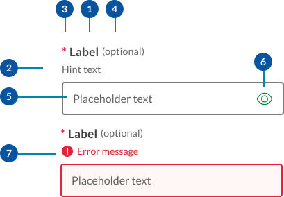
- Labels: Labels are headings that identify the purpose or context of the input field. For example, a label might say "First Name" to indicate that the user should enter their first name in the text field. Standard label alignment is left-aligned with the field underneath. Labels are mandatory on all fields with some exceptions such as search fields used in the header.
- Hint/Helper text: Helper text conveys additional guidance about the input field, such as how it will be used. It should only take up a single line and be persistently visible.
- Required field indicators: To indicate that a field is required, display an asterisk (*) next to the label text and mention at the start of the form that asterisks indicate required fields.
- Optional field indicators: Optional field indicators indicate that a field is optional. Clearly indicate optional fields by displaying the word ‘optional’ in parentheses next to the label text.
- Placeholder text: Hints at what goes into a field. Placeholder text is optional. It should always be avoided unless communicating complex formatting requirements.
- Trailing icons: Trailing icons are optional, they're often used to convey additional field functionality or options. This space should also be reserved to fit icons that some browsers might insert into the input (for example to show or generate a password) (UK.GOV n.d).
- Validation messages
- Error messages: When text input isn't accepted, an error message can display instructions on how to fix it. Error messages are displayed above the input line.
- Success messages: When text input is accepted, a message can display to the inform the user. This is useful in situations like password generation where you can let the user know their password has met syntax requirements.
Research and rationale
Like most of our components input fields started off using the DTA designs as a base, as our Design System progressed, we saw a need to include additional styles with less visual weight as well as to investigate this pattern as a whole to understand why other designs systems had diverged from the original DTA patterns.
For more information on our input text field design can be found in our forms component.
Classes
| Name | Description |
|---|---|
qld__form-style-filledCopy | Sets the form field style to use the filled variant. This must be applied to the enclosing div or form element. |
qld__labelCopy | This is applied to the <label> element applies the label styles for input fields. |
qld__hint-textCopy | Applied to a <span> element below the label this styles the hint text for the form field. |
qld__label--optionalCopy | This styles the word "(optional)" when used in optional fields. Optional text must be placed directly after the label in a <span> element and before any hint text. |
qld__body abbr Copy | This is the class styles required for the field indicator which is an asterisk. <abbr title="required">*</abbr> |
qld__text-inputCopy | This class is required for all input 'text' fields and 'textarea' fields. It applies the default styles for these fields. |
qld__text-input--numberCopy | This is a utility class can be used to apply tabular numbers to input fields that contain only numerals. |
qld__input--errorCopy | This styles the error messages on form fields. |
qld__input--successCopy | This styles the success messages on form fields. |
qld__text-input--errorCopy | This styles the error state on a form fields. |
qld__text-input--validCopy | This styles the valid/success state on a form fields. |
qld__form-groupCopy | This adds space between form elements when applied to a container div. |
qld__fieldsetCopy | Class applied to the <fieldset> element which is used to group related form fields. |
qld__fieldset__legendCopy | This class applies default style for the <legend> element. This element provides a caption or a title for the fieldset, describing the purpose or meaning of the form elements within it. |
qld__field-width--1-quarterCopy | Utility class applied to the form field that set the width to 1 quarter of the container. |
qld__field-width--halfCopy | Utility class applied to the form field that set the width to half the container. |
qld__field-width--3-quartersCopy | Utility class applied to the form field that set the width to 3 quarters of the container. |
qld__field-width--20charCopy | Utility class applied to the form field that set the width to approximately 20 characters. |
qld__field-width--10charCopy | Utility class applied to the form field that set the width to approximately 10 characters. |
qld__field-width--5charCopy | Utility class applied to the form field that set the width to approximately 5 characters. |
qld__field-width--4chaCopy | Utility class applied to the form field that set the width to approximately 4 characters. |
qld__field-width--3charCopy | Utility class applied to the form field that set the width to approximately 3 characters. |
qld__field-width--2chaCopy | Utility class applied to the form field that set the width to approximately 2 characters. |
Accessible form requirements
Keep these considerations in mind if you're designing forms.
General guidelines
Never disable a submit button, even if all of the required fields aren't filled in. Instead, describe what needs to be done using validation and error messages (Atlassian, n.d).
For text fields with interactive trailing icons, the accessibility label should clarify its function (Google, n.d).
If you have multiple inputs for a field, don’t auto tab between them. It causes users to make mistakes (Silver, 2019).
Use 'autocapitalize="none"', 'autocorrect="off"' and 'spellcheck="false"' to stop browsers automatically changing user input on fields that expect grammatically incorrect data—like email addresses and passwords (Silver, 2019).<input type="email" autocapitalize="none" autocorrect="off" spellcheck="false">
Use the <fieldset> and <legend> elements to group and associate related form controls (W3C,2019a).
Divide long forms into multiple smaller forms that constitute a series of logical steps or stages and inform users about their progress (W3C,2019a).
WCAG guidelines
Below details some of the guidelines for forms see the WCAG website for a more detailed accessibility guidance for each specific form element.
WCAG Guideline 1.3.5: Identify input purpose
This a Level AA criterion that aims to make web content more accessible for people with disabilities by enabling user agents and assistive technologies to understand the purpose of input fields, like select boxes, collecting user information.
To comply with this guideline, you need to ensure that:
- the input field serves a purpose listed in the 'Input Purposes for User Interface Components' section of the WCAG 2.1 specification
- the content is created using web technologies that support identifying the expected meaning of the input field.
Some browsers attempt to aid the user by automatically filling form controls rather than having the user reenter their information each time. For example, a field asking for the user's telephone number can be automatically filled with the user's phone number.
1.3.1, 4.1.2 Use appropriate input types
Use the correct input type for the specific purpose of the text input, such as email, tel, password, or number. This helps with accessibility and provides appropriate input controls for different devices (WCAG, 2018).
1.4.1 Use of Colour
Use icons alongside error messages so that colour alone isn't used as the only visual means of conveying information, indicating an action, prompting a response, or distinguishing a visual element (WCAG, 2018).
1.4.3 Contrast (Minimum)
All border colours should be accessible and meet a 3:1 minimum colour contrast ratio to the background (WCAG, 2018).
2.1.1 Keyboard accessibility
Ensure that users can interact with the text input using keyboard controls. By default, text inputs should be accessible with the Tab key to focus and the Enter or Space keys to submit the form (if applicable) (WCAG, 2018).
1.3.1, 3.3.2 Indicate Required Fields
Clearly indicate required fields with an asterisk (*) or other visual indicators, and add the required attribute to the text input. Additionally, provide textual information, such as "(required)," for screen reader users (WCAG, 2018).
3.3.1, 3.3.3 Implement Accessible Error Messages
If an input error is automatically detected, the item that is in error is identified and the error is described to the user in text. (Level A).
When displaying error messages, ensure they're clear, concise, and accessible to all users. Use the 'aria-describedby' attribute to associate error messages with the corresponding input field (Level AA) (WCAG, 2018).
3.3.4 Error Prevention (Legal, Financial, Data)
For web pages that cause legal commitments or financial transactions for the user to occur, that modify or delete user-controllable data in data storage systems, or that submit user test responses, at least one of the following is true: Reversible, Checked, Confirmed (Level AA) (WCAG, 2018).
3.3.2 Provide Clear Instructions
Ensure that any instructions or guidelines for filling out the text input are clear and easily understandable. This helps users avoid mistakes and better understand the expected input format. This is commonly seen in the form of hint text that appears below the labe (W3C 2019b).
References
IBM (n.d. a) Forms: Optional vs. Required Fields IBM Carbon Design System, accessed March 7, 2023.
IBM (n.d b) Text input, IBM Carbon Design System, accessed March 7, 2023.
MOD.UK (n.d.) Forms, MOD.UK Design System, Ministry of Defence, accessed March 7, 2023.
GOV.UK (n.d a) Text input, GOV.UK Design System, accessed March 9, 2023.
GOV.UK (n.d b) Error message, GOV.UK Design System, accessed 30 July 2023.
Roselli A (2022) Avoid messages under fields, accessed March 9, 2023.
Google (n.d) Text fields, Material Design System 2, accessed March 7, 2023.
Whitenton K (2016) Website Forms Usability: Top 10 Recommendations, Neilson and Norman group, accessed March 7, 2023.
Babich N (2020) ‘Best Practices: Structure, Inputs & Labels’, Adobe XD Ideas, Adobe, accessed March 7, 2023.
Kaplan K (2022) Hostile Patterns in Error Messages, Nielsen Norman Group, accessed 30 July 2023.
Krause R (2019) How to Report Errors in Forms: 10 Design Guidelines, Nielsen Norman Group, accessed 30 July 2023.
Adobe (2022) Text-fields, Adobe Spectrum Design System, accessed March 7, 2023.
Atlassian (n.d) Form usage, Atlassian Design System, accessed March 7, 2023.
Silver A (n.d) Text box, No Style Design system, accessed 9 March 2023.
Silver A (2019) Form design from zero to hero all in one blog post, Adam Silver Website, accessed March 7, 2023.
W3C (2018) Web Content Accessibility Guidelines (WCAG) 2.1World Wide Web Consortium, accessed March 7, 2023.
W3C (2019a) Forms concepts, Web accessibility tutorials, World Wide Web Consortium, accessed March 7, 2023.
W3C (2019b) Form instructions, Web accessibility tutorials, World Wide Web Consortium, accessed March 7, 2023.
W3C (2019c) Understanding Success Criterion 1.4.11: Non-text Contrast,World Wide Web Consortium, accessed March 7, 2023.
W3C (2019d) Contrast (Minimum) - Low Vision Accessibility Task Force World Wide Web Consortium, accessed March 7, 2023.
Bargas-Avila JA, Brenzikofer O, Roth SP, Tuch AN, Orsini S and Opwis K (2011) 'Simple but Crucial User Interfaces in the World Wide Web: Introducing 20 Guidelines for Usable Web Form Design', Semantic Scholar, University of Basel, Faculty of Psychology, Department of Cognitive Psychology and Methodology, Switzerland.
Digital NSW (2022) Forms, Components, NSW Government Design System, accessed March 7, 2023.
Digital Transformation Agency (2018) Text-inputs, Gold Design System (Formerly DTA), accessed 10 April 2023.
Microsoft (2022) Forms Controls and patterns, Microsoft Fluent Design System, accessed March 7, 2023.
Birkett A (2019) Form design: 13 empirically backed best practices, accessed 30 April 2020.