
Overview
Breadcrumbs are a navigational aid that display a user's location on a website as a row of links, usually located at the top of the page.
Breadcrumbs show users where they are in the website hierarchy and how to navigate back or up to previous levels or content.
Our Design System has 2 styles of breadcrumbs one for desktop resolutions and one for mobile and tablet resolutions.
Desktop and tablet
For resolutions over 992.

Overflow content for desktop and tablet
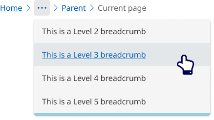
When page titles are long and complex, it is better to collapse links into an overflow menu. Interacting with the overflow menu still provides the access to location hierarchy. Using an overflow menu provides the best user experience by effectively managing space and keeping the interface clean and easy to navigate.
Breadcrumbs should never wrap onto a second line.
Breadcrumbs will collapse into an overflow menu when there is not enough room to display all levels of the breadcrumb list or there are more then 5 levels of breadcrumbs.
Mobile
For resolutions below 992px.

                <!-- Breadcrumb - Desktop -->
                <nav class="qld__breadcrumbs" aria-label="breadcrumb" data-path=".https://www.designsystem.qld.gov.au/?a=169317:dist/mysource_files/img/QLD-icons.svg" style="max-width: 951px;">
                <ol class="qld__breadcrumbs__list--desktop qld__link-list qld__link-list--inline" style="max-width: 951px;">

                        <li class="qld__breadcrumbs__item"><a href="" class="qld__breadcrumbs__link">Home</a>
                        </li>
                                <svg class="qld__icon" xmlns="http://www.w3.org/2000/svg"><use href="./?a=169317:dist/mysource_files/img/QLD-icons.svg#chevron-right"></use></svg>
                        <li class="qld__breadcrumbs__item"><a href="" class="qld__breadcrumbs__link">Level 2 Breadcrumb</a>
                        </li>
                                <svg class="qld__icon" xmlns="http://www.w3.org/2000/svg"><use href="./?a=169317:dist/mysource_files/img/QLD-icons.svg#chevron-right"></use></svg>
                        <li class="qld__breadcrumbs__item"><a href="" class="qld__breadcrumbs__link">Level 3 Breadcrumb</a>
                        </li>
                                <svg class="qld__icon" xmlns="http://www.w3.org/2000/svg"><use href="./?a=169317:dist/mysource_files/img/QLD-icons.svg#chevron-right"></use></svg>
                        <li class="qld__breadcrumbs__item"><a href="" class="qld__breadcrumbs__link">Parent page</a>
                        </li>
                                <svg class="qld__icon" xmlns="http://www.w3.org/2000/svg"><use href="./?a=169317:dist/mysource_files/img/QLD-icons.svg#chevron-right"></use></svg>
                        <li aria-current="page" class="qld__breadcrumbs__item">
                                Current page
                        </li>
                </ol>
                <!-- Breadcrumbs - Tablet -->
                <div class="qld__breadcrumbs__list--tablet qld__link-list qld__link-list--inline">
                        <div class="qld__breadcrumbs__item">
                                <svg class="qld__icon" xmlns="http://www.w3.org/2000/svg"><use href="./?a=169317:dist/mysource_files/img/QLD-icons.svg#chevron-left"></use></svg>
                                <a href="" class="qld__breadcrumbs__link">
                                        Parent page
                                </a>
                        </div>
                </div>
                <!-- Breadcrumbs - Mobile -->
                <div class="qld__breadcrumbs__list--mobile qld__link-list qld__link-list--inline">
                        <div class="qld__breadcrumbs__item">
                                <svg class="qld__icon" xmlns="http://www.w3.org/2000/svg"><use href="./?a=169317:dist/mysource_files/img/QLD-icons.svg#chevron-left"></use></svg>
                                <a href="" class="qld__breadcrumbs__link">
                                        Parent page
                                </a>
                        </div>
                </div>
                </nav>
Guidelines for usage
Breadcrumbs should be included on all pages except the home page for consistently across the site. They should always be placed at the top left of a page, before the main element. The breadcrumb should start with your ‘home’ page and end with the parent section of the current page. (GOV.UK, n.d.)
When to use
Use the breadcrumbs component when you need to help users understand and move between the multiple levels of a website or task.
When not to use
Don't use breadcrumbs for:
- Simple websites with flat structure: If your website has a simple hierarchy with a flat structure, breadcrumbs may not be necessary and could clutter the design
- Homepages: Breadcrumbs aren't needed on the homepage since users can easily return to it by clicking on the site logo or home button
How to use breadcrumbs
Do
- Display above the current page title (h1) in the content area
- Always start with Home for basic navigation structures.
- Each breadcrumb link should clearly describe the content of the page it leads to.
- Breadcrumbs should not be overly long or complex. Stick to the essential levels of the hierarchy.
Don't
- Shorten breadcrumb links if possible.
- Wrap over two lines. Instead, use the overflow menu if a full path can’t be shown.
- Use abbreviations or vague terms within breadcrumb links or page titles.
Anatomy
The anatomy of file breadcrumb consists of several elements:
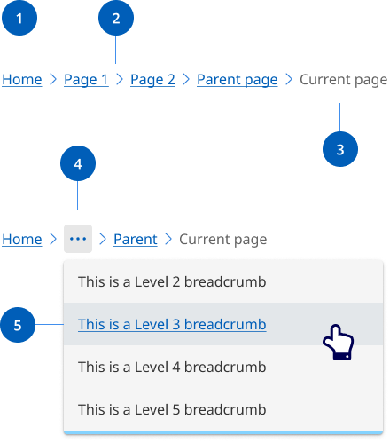
- Page link: Each segment within a breadcrumb is styled as a link, and directs users to the parent level page.
- Separator: Visual separator to distinguish between links.
- Current page title: Indicates the current page being viewed and is not styled as a link.
- Overflow menu: When space becomes limited due to viewport or long page titles, an overflow menu is used to reduce the number of breadcrumbs. The first and last page links are always shown, but remaining breadcrumbs are condensed into an overflow menu as required to fit the space.
- Overflow menu container: Contains the breadcrumb links that are been collapsed within the overflow menu when space is limited.
Research and rationale
Our breadcrumb design was based on the research and designs from DTA Design System that use a location based breadcrumb style which shows users where their current page stands in the hierarchy of a website.
The final item in our breadcrumb list isn’t a link. Another way to approach breadcrumbs is making the last item a link with the aria-current="page" attribute. Screen readers will announce to the user that they're on the current page.
Where our design differs from the DTA’s design is on mobile and table devices. On resolutions below 992 the breadcrumb shows a link to the immediate parent only. This is called single-level breadcrumb or back button breadcrumb and is an effective and intuitive design pattern for mobile. The choice was made to reduce complexity and vertical height in mobile designs (Laubheimer P, 2018).
Overflow behaviour
To reduce the proliferation of websites, we often have large websites with deep content. This can result in long breadcrumbs that break over multiple lines, taking up vertical space and adding cognitive load.
After considering various options, we found that an overflow menu provides the best user experience to solve this issue. An overflow menu manages space effectively and keeps the interface clean and easy to navigate.
Our approach ensures that all navigation paths are accessible without overwhelming users with lengthy or heavily truncated breadcrumb trails.
We chose the overflow menu because it is a familiar pattern in modern interfaces (used by IBM Carbon Design System, Atlassian Design System, Microsoft Fluent 2, Material Design), making it intuitive, accessible, and user-friendly.
Classes
| Name | Description |
|---|---|
| Style for breadcrumbs. |
| Default list Queensland Government list style. |
| Override class to set list for format as a single line. |
Accessible breadcrumb requirements
Keep these considerations in mind if you're modifying the Design System or creating a custom component.
Best practice
The current page should be indicated by using aria-current="page".
Each link in the breadcrumb is implemented as an unordered list item so that screen readers provide more context (IBM Carbon Design System, 2023).
WCAG guidelines
1.3.1 Info and Relationships
Use appropriate semantic elements such as the 'nav' element for the breadcrumb container and list elements for individual breadcrumbs (W3C, 2018).
2.4.1 Bypass Blocks
Provide a way for users to skip over the breadcrumb navigation, using a "Skip to main content" link. Example: Add a link at the beginning of the page that allows users to skip the breadcrumb and navigate directly to the main content (W3C, 2018).
2.4.4 Link Purpose
Ensure that the purpose of each breadcrumb link can be determined from its link text or the link text together with its programmatically determined link context (W3C, 2018).
Example: Use descriptive and concise text for breadcrumb links, such as "Home > Products > Laptops" instead of generic text like "Page 1 > Page 2 > Page 3" .
4.1.2 Name, Role, Value:
For all user interface components, ensure that the name, role, and value can be programmatically determined, and that states, properties, and values can be set programmatically (W3C, 2018).
Example: Use the 'aria-label' attribute to provide a descriptive label for the breadcrumb container (e.g., 'aria-label="Breadcrumb"'), and the 'aria-current' attribute to indicate the current page (e.g., 'aria-current="page"').
Related
References
Digital Transformation Agency (2018) Breadcrumbs, Gold Design System (Formerly DTA), accessed 10 April 2023.
GOV.UK Design System (n.d.) Breadcrumbs, GOV.UK Design System, accessed 11 April 2023.
Nielsen J (2007) Breadcrumb Navigation Increasingly Useful, Nielsen Norman Group, accessed 11 April 2023.
Laubheimer P (2018) Breadcrumbs: 11 Design Guidelines for Desktop and Mobile, Nielsen Norman Group, accessed 11 April 2023.
IBM Carbon Design System (2023) Breadcrumb - Accessibility, Carbon Design System, accessed 11 April 2023.
W3C (2018) Web Content Accessibility Guidelines (WCAG) 2.1, World Wide Web Consortium, accessed 10 April 2023.