Overview
The card component is used to provide a brief summary of content or a task, often with a link to more detail.
Cards are frequently displayed alongside other cards and group related content or tasks.
Cards are used to organise information related to a single topic. Cards can contain multiple elements, such as images, links, actions, text, tags and more.
There are 3 primary types of cards current available in our Design System:
- No action (Non-clickable cards)
- Single action
- Multiple action.
Each of these cards has a number of variations available such as colour, call to actions, tags and image.
-
No action card
The text used here is card description text. It should be no more than 2-3 lines long.
-
Single action card
The text used here is card description text. It should be no more than 2-3 lines long.
-
Multi action card
The text used here is card description text. It should be no more than 2-3 lines long.
<ul class="qld__card-list qld__card-list--row">

    <li class="col-xs-12 col-md-6 col-lg-4 qld__card-list--matchheight qld__card-list--col">

        <!-- QLD No action default with image -->
        <div class="qld__card qld__card--image">
            <!-- Image -->
            <div class="qld__responsive-media-img--bg" role="img" aria-label="A customer smiling at his two children" style="background-image: url('./?a=110276');">
            </div>
            <!-- Card Inner -->
            <div class="qld__card__inner">
                <!-- Card Content -->
                <div class="qld__card__content">
                    <div class="qld__card__content-inner">
                        <!-- Card Ttile -->
                        <h3 class="qld__card__title">
                            No action card
                        </h3>
                        <!-- Card Description -->
                        <p class="qld__card__description">
                            The text used here is card description text. It should be no more than 2-3 lines long.
                        </p>
                    </div>
                </div>
            </div>
        </div>
     </li>
     <li class="col-xs-12 col-md-6 col-lg-4 qld__card-list--matchheight qld__card-list--col">

    <!-- QLD Single action default with image -->
    <div class="qld__card qld__card__action qld__card--image">
        <!-- Image -->
        <div class="qld__responsive-media-img--bg" role="img" aria-label="A customer smiling at his two children" style="background-image: url('./?a=110276');">
        </div>
        <!-- Card Inner -->
        <div class="qld__card__inner">
            <!-- Card Content -->
            <div class="qld__card__content">
                <div class="qld__card__content-inner">
                    <!-- Card Ttile -->
                    <h3 class="qld__card__title">
                        <a class="qld__card--clickable__link" href="#section__usage-guidelines">Single action card</a>
                    </h3>
                    <!-- Card Description -->
                    <p class="qld__card__description">
                        The text used here is card description text. It should be no more than 2-3 lines long.
                    </p>
                </div>
            </div>
        </div>
    </div>
    </li>

    <li class="col-xs-12 col-md-6 col-lg-4 qld__card-list--matchheight qld__card-list--col">
     <!-- QLD Multi-action card with image and links -->
     <div class="qld__card qld__card--image qld__card__multi-action">
        <!-- Image -->
        <div class="qld__responsive-media-img--bg" role="img" aria-label="A customer smiling at his two children" style="background-image: url('./?a=110276');">
        </div>
        <!-- Card Inner -->
        <div class="qld__card__inner">
            <!-- Card Content -->
            <div class="qld__card__content">
                <div class="qld__card__content-inner">
                    <!-- Card Ttile -->
                    <h3 class="qld__card__title">
                        <a class="qld__card--clickable__link" href="#section__usage-guidelines">Multi action card</a>
                    </h3>
                    <!-- Card Description -->
                    <p class="qld__card__description">
                        The text used here is card description text. It should be no more than 2-3 lines long.
                    </p>
                </div>
            </div>
            <!-- Card Footer -->
            <div class="qld__card__footer">
                <hr class="qld__horizontal-rule">
                <!-- Card Footer text -->
                <div class="qld__card__footer-inner">
                    <!-- Card Footer Links -->
                    <ul class="qld__link-list">
                        <li>
                            <a href="#section__usage-guidelines" class="qld__card__footer-link">
                                <i class="qld__card__footer-link-icon fal fa-directions" aria-hidden="true"></i>
                                <span>Card link one</span>
                            </a>
                        </li>
                        <li>
                            <a href="#section__usage-guidelines" class="qld__card__footer-link">
                                <i class="qld__card__footer-link-icon fal fa-car-side" aria-hidden="true"></i>
                                <span>Card link two</span>
                            </a>
                        </li>
                        <li>
                            <a href="#section__usage-guidelines" class="qld__card__footer-link">
                                <i class="qld__card__footer-link-icon fal fa-stethoscope" aria-hidden="true"></i>
                                <span>Card link three</span>
                            </a>
                        </li>
                    </ul>
                </div>
            </div>
        </div>
    </div>

    </li>

</ul>
Usage guidelines
When to use cards
- Cards are better suited when users browse for information than when they search, this is because card layouts are less scannable than lists (Laubheimer, 2016)
- Cards are an excellent choice for dashboard applications and for social or aggregation sites that display a variety of content types at the same time on the same page (Laubheimer, 2016)
When not to use cards
- Avoid using cards instead of table rows for organised information
- If the reader needs to read the content in order, use a list or simple paragraphs with headings
- Cards are also a poor choice when users need to compare between multiple options, since cards often aren't structured in a predictable way from item to item (Nielson, 2013)
- You have many sections with little information in each—use a table
- to link to content lower down on the page, consider in-page navigation
How to use cards
Do
- Display cards together in a grid or vertical list
- Keep to one concept per card: You can use multiple elements such as images, text, links and icons but they should all constitute one thought or action
- Consider and choose text and visual elements carefully: Test your cards with minimal content and only add additional content or graphics where they give needed context to the user
- Keep text short and concise: According to Google's Material Design guidelines, cards should "display a small amount of information at a glance, usually no more than 2-3 lines of text" (Material Design, n.d.)
Don't
- Overload with information as the card links to content that contains more detail
- Use multiple different styles of cards in the same section. This can create conflicting visual messages, and cause visually cluttered page
- Don’t include inline links. A card should be a singular link or provide a limited set of actions
Single action cards
Single action cards display content and actions on a single topic.
These are the default cards and should always have some form of interactive element or action. Single action cards have only one primary link or action. Only single actions cards have changes in their hover state. For single action cards the hit area for the card wraps the entire card.
Single action cards are available in 5 varieties
- Default: default card used to organise information related to a single topic.
- Leading icon: a variant where an icon is placed on left of the content.
- Stacked icon: a variant of the default card where an icon is placed at the top of the card.
- Arrow card: a variant of the default card where a trailing arrow icon is placed after the heading.
- Image card: a variant of the default card using an image.
-
Default card
The text used here is card description text. It should be no more than 2-3 lines long.
Card with arrow
The text used here is card description text. It should be no more than 2-3 lines long.
-
Card with image and footer
The text used here is card description text. It should be no more than 2-3 lines long.
Card with footer
The text used here is card description text. It should be no more than 2-3 lines long.
<ul class="qld__card-list qld__card-list--row">
    <li class="col-xs-12 col-md-6 qld__card-list--col">
        <!-- QLD Single action -->
        <div class="qld__card qld__card__action qld__card__action">
            <!-- Card Inner -->
            <div class="qld__card__inner">
                <!-- Card Content -->
                <div class="qld__card__content">
                    <div class="qld__card__content-inner">
                        <!-- Card Ttile -->
                        <h3 class="qld__card__title">
                            <a class="qld__card--clickable__link" href="javascript:void(0);">Default card</a>
                        </h3>
                        <!-- Card Description -->
                        <p class="qld__card__description">
                            The text used here is card description text. It should be no more than 2-3 lines long.
                        </p>
                    </div>
                </div>
            </div>
        </div>
        <!-- QLD Single action arrow card -->
        <div class="qld__card qld__card__action qld__card--arrow">
            <div class="qld__card__inner">
                <!-- Card Content -->
                <div class="qld__card__content">
                    <div class="qld__card__content-inner">
                        <!-- Card Title -->
                        <h3 class="qld__card__title">
                            <a class="qld__card--clickable__link" href="javascript:void(0);">Card with arrow</a>
                        </h3>
                        <!-- Card Description -->
                        <p class="qld__card__description">
                            The text used here is card description text. It should be no more than 2-3 lines long.
                        </p>
                    </div>
                    <!-- Arrow icon -->
                    <div class="qld__card__arrow"></div>
                </div>
            </div>
        </div>
        <!-- QLD Single action vertical icon card -->
        <div class="qld__card qld__card__action qld__card--icon">
            <!-- Icon -->
            <div class="qld__card__icon">
                <i class="fa-light fa-alicorn" aria-hidden="true"></i>
            </div>
            <!-- Card Inner -->
            <div class="qld__card__inner">
                <div class="qld__card__content">
                    <div class="qld__card__content-inner">
                        <!-- Card Ttile -->
                        <h3 class="qld__card__title">
                            <a class="qld__card--clickable__link" href="javascript:void(0);">Card with stacked icon</a>
                        </h3>
                        <!-- Card Description -->
                        <p class="qld__card__description">
                            The text used here is card description text. It should be no more than 2-3 lines long.
                        </p>
                    </div>
                </div>
            </div>
        </div>
        <!-- QLD Single action leading icon card -->
        <div class="qld__card qld__card__action qld__card--icon qld__card--icon-left">
            <!-- Icon -->
            <div class="qld__card__icon">
                <i class="fa-light fa-alicorn" aria-hidden="true"></i>
            </div>
            <!-- Card Inner -->
            <div class="qld__card__inner">
                <div class="qld__card__content">
                    <div class="qld__card__content-inner">
                        <!-- Card Ttile -->
                        <h3 class="qld__card__title">
                            <a class="qld__card--clickable__link" href="javascript:void(0);">Card with leading icon</a>
                        </h3>
                        <!-- Card Description -->
                        <p class="qld__card__description">
                            The text used here is card description text. It should be no more than 2-3 lines long.
                        </p>
                    </div>
                </div>
            </div>
        </div>
    </li>
    <li class="col-xs-12 col-md-6 qld__card-list--matchheight qld__card-list--col">
        <!-- QLD Single action default with image -->
        <div class="qld__card qld__card__action qld__card--image">
            <!-- Image -->
            <div class="qld__responsive-media-img--bg"
                role="img"
                aria-label="A customer smiling at his two children"
                style="background-image: url('./?a=110276');"
            ></div>
            <!-- Card Inner -->
            <div class="qld__card__inner">
                <!-- Card Content -->
                <div class="qld__card__content">
                    <div class="qld__card__content-inner">
                        <!-- Card Ttile -->
                        <h3 class="qld__card__title">
                            <a class="qld__card--clickable__link" href="javascript:void(0);">Card with image and footer</a>
                        </h3>
                        <!-- Card Description -->
                        <p class="qld__card__description">
                            The text used here is card description text. It should be no more than 2-3 lines long.
                        </p>
                    </div>
                </div>
            </div>
        </div>
        <div class="qld__card qld__card__action qld__card--image">
            <!-- Image -->
            <div
                class="qld__responsive-media-img--bg"
                role="img"
                aria-label="A customer smiling at his two children"
                style="background-image: url('./?a=110276');"
            ></div>
            <!-- Card Inner -->
            <div class="qld__card__inner">
                <!-- Card Content -->
                <div class="qld__card__content">
                    <div class="qld__card__content-inner">
                        <!-- Card Ttile -->
                        <h3 class="qld__card__title">
                            <a class="qld__card--clickable__link" href="javascript:void(0);">Card with footer</a>
                        </h3>
                        <!-- Card Description -->
                        <p class="qld__card__description">
                            The text used here is card description text. It should be no more than 2-3 lines long.
                        </p>
                    </div>
                </div>
                <!-- Card Footer -->
                <div class="qld__card__footer">
                    <hr class="qld__horizontal-rule">
                    <!-- Card Footer text -->
                    <div class="qld__card__footer-inner">
                        This is card footer text
                    </div>
                </div>
            </div>
        </div>
    </li>
</ul>
Usage guidelines
When to use
Use single action cards when a card links to a single piece of content. Single action cards are useful to present a collection of related groups of content, like articles or sections of a website. Single action cards are often used as a preview of the full content available such as for an article or blog post.
When not to use
- Alone with as an individual call to action. Use a button instead
- When you need to have multiple links within the card element use a multi-action card instead
- As the only form of navigation, while cards can be a useful navigation tool, relying solely on cards for navigation can be limiting. It's important to provide other forms of navigation to help users find what they're looking for.
Multi-action cards
Multiple action cards contain more than one link.
Their design is different to single action cards because they need to accommodate for different hover, focus states and keyboard navigation.
Multiple action cards have no shadows on desktop, but they do have a subtle shadow on mobile. Multiple action cards are commonly used for, news cards and facility cards.
Multi action cards are available in 4 varieties
- Default Default: card used to organise information related to a single topic.
- Leading icon: A variant of the default card where an icon is placed on left of the content. This is a good option for when cards need to be placed in a vertical list or where vertical height is limited.
- Stacked icon: A variant of the default card where an icon is placed at the top of the card.
- Image card: A variant of the default card using an image.
-
Default card
The text used here is card description text. It should be no more than 2-3 lines long.
-
Card with image and links
The text used here is card description text. It should be no more than 2-3 lines long.
Card with image and tags
The text used here is card description text. It should be no more than 2-3 lines long.
<ul class="qld__card-list qld__card-list--row">

    <li class="col-xs-12 col-md-6 qld__card-list--col">
        <!-- QLD Multi-action action with links-->
        <div class="qld__card qld__card__multi-action">
            <!-- Card Inner -->
            <div class="qld__card__inner">
                <!-- Card Content -->
                <div class="qld__card__content">
                    <div class="qld__card__content-inner">
                        <!-- Card Ttile -->
                        <h3 class="qld__card__title">
                            <a class="qld__card--clickable__link" href="javascript:void(0);">Default card</a>
                        </h3>
                        <!-- Card Description -->
                        <p class="qld__card__description">
                            The text used here is card description text. It should be no more than 2-3 lines long.
                        </p>
                    </div>
                    <div class="qld__card__footer">
                        <hr class="qld__horizontal-rule">
                        <!-- Card Footer text -->
                        <div class="qld__card__footer-inner">
                            <!-- Card links -->
                            <ul class="qld__link-list">
                                <li>
                                    <a href="javascript:void(0);" class="qld__card__footer-link">
                                        <i class="qld__card__footer-link-icon fal fa-directions" aria-hidden="true"></i>
                                        <span>Card link one</span>
                                    </a>
                                </li>
                                <li>
                                    <a href="javascript:void(0);" class="qld__card__footer-link">
                                        <i class="qld__card__footer-link-icon fal fa-car-side" aria-hidden="true"></i>
                                        <span>Card link two</span>
                                    </a>
                                </li>
                                <li>
                                    <a aria-label="Our services, Our services" href="javascript:void(0);" class="qld__card__footer-link">
                                        <i class="qld__card__footer-link-icon fal fa-stethoscope" aria-hidden="true"></i>
                                        <span>Card link three</span>
                                    </a>
                                </li>
                            </ul>
                        </div>
                    </div>
                </div>
            </div>
        </div>

        <!-- QLD Multi-action action vertical icon card with tags -->
        <div class="qld__card qld__card__multi-action qld__card--icon">
            <!-- Icon -->
            <div class="qld__card__icon"><i class="fa-light fa-alicorn" aria-hidden="true"></i></div>
            <!-- Card Inner -->
            <div class="qld__card__inner">
                <div class="qld__card__content">
                    <div class="qld__card__content-inner">
                        <!-- Card Ttile -->
                        <h3 class="qld__card__title">
                            <a class="qld__card--clickable__link" href="javascript:void(0);">Card with stacked icon</a>
                        </h3>
                        <!-- Card Description -->
                        <p class="qld__card__description">
                            The text used here is card description text. It should be no more than 2-3 lines long.
                        </p>
                    </div>
                </div>
                <div class="qld__card__footer">
                    <hr class="qld__horizontal-rule">
                    <!-- Card Footer text -->
                    <div class="qld__card__footer-inner">
                        <ul class="qld__card__tags qld__tag-list">
                            <li>
                                <a class="qld__tag qld__tag--link" href="#?tag=tag_1">Tag 1</a>
                            </li>
                            <li>
                                <a class="qld__tag qld__tag--link" href="#?tag=tag_2">Tag 2</a>
                            </li>
                            <li>
                                <a class="qld__tag qld__tag--link" href="#?tag=tag_3">Tag 3</a>
                            </li>
                        </ul>
                    </div>
                </div>

            </div>
        </div>

        <!-- QLD Multi-action leading icon card with tags -->
        <div class="qld__card qld__card__multi-action qld__card--icon qld__card--icon-left">
            <!-- Icon -->
            <div class="qld__card__icon"><i class="fa-light fa-alicorn" aria-hidden="true"></i></div>
            <!-- Card Inner -->
            <div class="qld__card__inner">
                <div class="qld__card__content">
                    <div class="qld__card__content-inner">
                        <!-- Card Ttile -->
                        <h3 class="qld__card__title">
                            <a class="qld__card--clickable__link" href="javascript:void(0);">Card with leading icon</a>
                        </h3>
                        <!-- Card Description -->
                        <p class="qld__card__description">
                            The text used here is card description text. It should be no more than 2-3 lines long.
                        </p>
                    </div>
                </div>
                <div class="qld__card__footer">
                    <hr class="qld__horizontal-rule">
                    <!-- Card Footer text -->
                    <div class="qld__card__footer-inner">
                        <ul class="qld__card__tags qld__tag-list">
                            <li>
                                <a class="qld__tag qld__tag--link" href="#?tag=tag_1">Tag 1</a>
                            </li>
                            <li>
                                <a class="qld__tag qld__tag--link" href="#?tag=tag_2">Tag 2</a>
                            </li>
                            <li>
                                <a class="qld__tag qld__tag--link" href="#?tag=tag_3">Tag 3</a>
                            </li>
                        </ul>
                    </div>
                </div>
            </div>
        </div>
    </li>

    <li class="col-xs-12 col-md-6 qld__card-list--matchheight qld__card-list--col">
        <!-- QLD Multi-action card with image and links -->
        <div class="qld__card qld__card--image qld__card__multi-action">
            <!-- Image -->
            <div class="qld__responsive-media-img--bg" role="img" aria-label="A customer smiling at his two children" style="background-image: url('./?a=110276');">
            </div>
            <!-- Card Inner -->
            <div class="qld__card__inner">
                <!-- Card Content -->
                <div class="qld__card__content">
                    <div class="qld__card__content-inner">
                        <!-- Card Ttile -->
                        <h3 class="qld__card__title">
                            <a class="qld__card--clickable__link" href="javascript:void(0);">Card with image and links</a>
                        </h3>
                        <!-- Card Description -->
                        <p class="qld__card__description">
                            The text used here is card description text. It should be no more than 2-3 lines long.
                        </p>
                    </div>
                </div>
                <!-- Card Footer -->
                <div class="qld__card__footer">
                    <hr class="qld__horizontal-rule">
                    <!-- Card Footer text -->
                    <div class="qld__card__footer-inner">
                        <!-- Card Footer Links -->
                        <ul class="qld__link-list">
                            <li>
                                <a href="javascript:void(0);" class="qld__card__footer-link">
                                    <i class="qld__card__footer-link-icon fal fa-directions" aria-hidden="true"></i>
                                    <span>Card link one</span>
                                </a>
                            </li>
                            <li>
                                <a href="javascript:void(0);" class="qld__card__footer-link">
                                    <i class="qld__card__footer-link-icon fal fa-car-side" aria-hidden="true"></i>
                                    <span>Card link two</span>
                                </a>
                            </li>
                            <li>
                                <a aria-label="Our services, Our services" href="javascript:void(0);" class="qld__card__footer-link">
                                    <i class="qld__card__footer-link-icon fal fa-stethoscope" aria-hidden="true"></i>
                                    <span>Card link three</span>
                                </a>
                            </li>
                        </ul>
                    </div>
                </div>
            </div>
        </div>
        <!-- QLD Multi-action card with image and tags -->
        <div class="qld__card qld__card__multi-action qld__card--image ">
            <!-- Image -->
            <div class="qld__responsive-media-img--bg" role="img" aria-label="A customer smiling at his two children" style="background-image: url('./?a=110276');">
            </div>
            <!-- Card Inner -->
            <div class="qld__card__inner">
                <!-- Card Content -->
                <div class="qld__card__content">
                    <div class="qld__card__content-inner">
                        <!-- Card Ttile -->
                        <h3 class="qld__card__title">
                            <a class="qld__card--clickable__link" href="javascript:void(0);">Card with image and tags</a>
                        </h3>
                        <!-- Card Description -->
                        <p class="qld__card__description">
                            The text used here is card description text. It should be no more than 2-3 lines long.
                        </p>
                    </div>
                </div>
                <!-- Card Footer -->
                <div class="qld__card__footer">
                    <hr class="qld__horizontal-rule">
                    <!-- Card Footer text -->
                    <div class="qld__card__footer-inner">
                        <!-- Card Footer tags -->
                        <ul class="qld__card__tags qld__tag-list">
                            <li>
                                <a class="qld__tag qld__tag--link" href="#?tag=tag_1">Tag 1</a>
                            </li>
                            <li>
                                <a class="qld__tag qld__tag--link" href="#?tag=tag_2">Tag 2</a>
                            </li>
                            <li>
                                <a class="qld__tag qld__tag--link" href="#?tag=tag_3">Tag 3</a>
                            </li>
                        </ul>
                    </div>
                </div>
            </div>
        </div>
    </li>

</ul>
Feature cards
A variant where the media sits on the right or left of the content. Feature cards are multiple interaction cards with the image aligned to the left or right. Feature cards are designed to promote content and use the most real estate on a screen. Feature cards can be used within sets of card groups to highlight the latest content or most important content. Feature cards have a different image layout when they span the full width of a container on desktop screens.
Feature card example with left aligned image
The text used here is card description text. It should be no more than 2-3 lines long.
Feature card example with right aligned image
The text used here is card description text. It should be no more than 2-3 lines long.
<div class="row">
    <div class="col-xs-12 qld__display-flex qld__flex-column qld__row-gap-component">

        <!-- QLD Multi-action Feature card with left aligned image-->
        <div class="qld__card qld__card__multi-action qld__card--image  qld__card__multi-action--feature">
            <!-- Image -->
             <div class="qld__card__image-wrapper">
                <div class="qld__responsive-media-img--bg" role="img" aria-label="A customer smiling at his two children" style="background-image: url('https://www.design-system.health.qld.gov.au/__data/assets/image/0017/110276/Hero-placeholder-Crop.jpg');">
                </div>
            </div>
            <!-- Card Inner -->
            <div class="qld__card__inner">
                <!-- Card Content -->
                <div class="qld__card__content">
                    <div class="qld__card__content-inner">
                        <!-- Card Ttile -->
                        <h3 class="qld__card__title">
                            <a class="qld__card--clickable__link" href="#">Feature card example with left aligned image</a>
                        </h3>
                        <!-- Card Description -->
                        <p id="Feature-description" class="qld__card__description">
                            The text used here is card description text. It should be no more than 2-3 lines long.
                        </p>
                    </div>
                </div>
                <!-- Card Footer -->
                <div class="qld__card__footer">
                    <hr class="qld__horizontal-rule">
                    <div class="qld__card__footer-inner">
                        <!-- Card Footer Links -->
                        <ul class="qld__link-list">
                            <li>
                                <a href="javascript:void(0);" class="qld__card__footer-link">
                                    <i class="qld__card__footer-link-icon fal fa-directions" aria-hidden="true"></i>
                                    <span>Card link one</span>
                                </a>
                            </li>
                            <li>
                                <a href="javascript:void(0);" class="qld__card__footer-link">
                                    <i class="qld__card__footer-link-icon fal fa-car-side" aria-hidden="true"></i>
                                    <span>Card link two</span>
                                </a>
                            </li>
                            <li>
                                <a href="javascript:void(0);" class="qld__card__footer-link">
                                    <i class="qld__card__footer-link-icon fal fa-stethoscope" aria-hidden="true"></i>
                                    <span>Card link three</span>
                                </a>
                            </li>
                        </ul>
                    </div>
                </div>
            </div>
        </div>

        <!-- QLD Multi-action Feature card with right aligned image-->
        <div class="qld__card qld__card__multi-action qld__card--image qld__card__multi-action--feature qld__card__multi-action--image-right">
            <!-- Image -->
             <div class="qld__card__image-wrapper">
                <div class="qld__responsive-media-img--bg" role="img" aria-label="A customer smiling at his two children" style="background-image: url('https://www.design-system.health.qld.gov.au/__data/assets/image/0017/110276/Hero-placeholder-Crop.jpg');">
                </div>
            </div>
            <!-- Card Inner -->
            <div class="qld__card__inner">
                <!-- Card Content -->
                <div class="qld__card__content">
                    <div class="qld__card__content-inner">
                        <!-- Card Ttile -->
                        <h3 class="qld__card__title">
                            <a class="qld__card--clickable__link" href="javascript:void(0);">Feature card example with right aligned image</a>
                        </h3>
                        <!-- Card Description -->
                        <p id="Feature-description" class="qld__card__description">
                            The text used here is card description text. It should be no more than 2-3 lines long.
                        </p>
                    </div>
                </div>
                <!-- Card Footer -->
                <div class="qld__card__footer">
                    <hr class="qld__horizontal-rule">
                    <div class="qld__card__footer-inner">
                        <!-- Card Footer Links -->
                        <ul class="qld__link-list">
                            <li>
                                <a href="javascript:void(0);" class="qld__card__footer-link">
                                    <i class="qld__card__footer-link-icon fal fa-directions" aria-hidden="true"></i>
                                    <span>Card link one</span>
                                </a>
                            </li>
                            <li>
                                <a href="javascript:void(0);" class="qld__card__footer-link">
                                    <i class="qld__card__footer-link-icon fal fa-car-side" aria-hidden="true"></i>
                                    <span>Card link two</span>
                                </a>
                            </li>
                            <li>
                                <a href="javascript:void(0);" class="qld__card__footer-link">
                                    <i class="qld__card__footer-link-icon fal fa-stethoscope" aria-hidden="true"></i>
                                    <span>Card link three</span>
                                </a>
                            </li>
                        </ul>
                    </div>
                </div>
            </div>
        </div>

    </div>
</div>
Usage guidelines
When to use
Use multi-action cards when a card contains multiple options or actions related to a single concept or task. However, it's important to keep in mind that too many links can be overwhelming and confusing for users, so it's important to design cards with a clear hierarchy of information and actions.
When not to use
- If there is only one action, use a single action card instead
- If you need to present the user with more then three actions or links
How to use
Do
- Display cards together in a grid or vertical list.
- One concept per card: you can use multiple elements such as images, text, links and icons but they should all constitute one thought or action.
- Consider and choose text and visual elements carefully: test your cards with minimal content and only add additional content or graphics where they give needed context to the user.
- Keep text short and concise: According to Google's Material Design guidelines, cards should "display a small amount of information at a glance, usually no more than 2-3 lines of text" (Material Design, n.d.)
Don't
- Overload with information as the card links to content that contains more detail.
- Use multiple different styles of cards in the same section. This can create conflicting visual messages, and cause. visually cluttered page.
- Don’t duplicate links to the same URL. For example, using the same URL for a card title and a ‘Read more’ link. Duplicating links is confusing and time wasting for users, who assume each link directs them to a different place. It’s also frustrating for people who use keyboard navigation with the additional and unnecessary tab stops ( Loranger, 2016).
No action cards
No action cards are simple content containers designed to group similar content and assist the user to scan content on a page.
No action cards have no interactive elements and don't have shadows or hover states. No action cards can help to break up content on a page, this content should always be self contained.
No action cards are available in 4 varieties
- Default: default card used to organise information related to a single topic.
- Leading icon: a variant of the default card where an icon is placed on left of the content.
- Stacked icon: a variant where an icon is placed at the top of the card.
- Image card: a variant using an image.
-
Default no action card
The text used here is card description text. It should be no more than 2-3 lines long.
-
No action with image
The text used here is card description text. It should be no more than 2-3 lines long.
No action with image and footer
The text used here is card description text. It should be no more than 2-3 lines long.
<ul class="qld__card-list qld__card-list--row">
    <li class="col-xs-12 col-md-6 qld__card-list--col">
        <!-- QLD No action vertical icon card -->
        <div class="qld__card">
            <!-- Card Inner -->
            <div class="qld__card__inner">
                <!-- Card Content -->
                <div class="qld__card__content">
                    <div class="qld__card__content-inner">
                        <!-- Card Ttile -->
                        <h3 class="qld__card__title">
                            Default no action card
                        </h3>
                        <!-- Card Description -->
                        <p class="qld__card__description">
                            The text used here is card description text. It should be no more than 2-3 lines long.
                        </p>
                    </div>
                </div>
            </div>
        </div>
        <div class="qld__card qld__card--icon">
            <!-- Icon -->
            <div class="qld__card__icon">
                <i class="fa-light fa-alicorn" aria-hidden="true"></i>
            </div>
            <!-- Card Inner -->
            <div class="qld__card__inner">
                <div class="qld__card__content">
                    <div class="qld__card__content-inner">
                        <!-- Card Ttile -->
                        <h3 class="qld__card__title">No action card with stacked icon</h3>
                        <!-- Card Description -->
                        <p class="qld__card__description">
                            The text used here is card description text. It should be no more than 2-3 lines long.
                        </p>
                    </div>
                </div>
            </div>
        </div>
        <!-- QLD No action leading icon card -->
        <div class="qld__card qld__card--icon qld__card--icon-left">
            <!-- Icon -->
            <div class="qld__card__icon">
                <i class="fa-light fa-alicorn" aria-hidden="true"></i>
            </div>
            <!-- Card Inner -->
            <div class="qld__card__inner">
                <div class="qld__card__content">
                    <div class="qld__card__content-inner">
                        <!-- Card Ttile -->
                        <h3 class="qld__card__title">
                            No action with leading icon
                        </h3>
                        <!-- Card Description -->
                        <p class="qld__card__description">
                            The text used here is card description text. It should be no more than 2-3 lines long.
                        </p>
                    </div>
                </div>
            </div>
        </div>
        <!-- QLD No action icon card -->
    </li>
    <li class="col-xs-12 col-md-6 qld__card-list--matchheight qld__card-list--col">
        <!-- QLD No action default with image -->
        <div class="qld__card qld__card--image">
            <!-- Image -->
            <div
                class="qld__responsive-media-img--bg"
                role="img"
                aria-label="A customer smiling at his two children"
                style="background-image: url('./?a=110276');"
            ></div>
            <!-- Card Inner -->
            <div class="qld__card__inner">
                <!-- Card Content -->
                <div class="qld__card__content">
                    <div class="qld__card__content-inner">
                        <!-- Card Ttile -->
                        <h3 class="qld__card__title">
                            No action with image
                        </h3>
                        <!-- Card Description -->
                        <p class="qld__card__description">
                            The text used here is card description text. It should be no more than 2-3 lines long.
                        </p>
                    </div>
                </div>
            </div>
        </div>
        <div class="qld__card qld__card--image">
            <!-- Image -->
            <div
                class="qld__responsive-media-img--bg"
                role="img"
                aria-label="A customer smiling at his two children"
                style="background-image: url('./?a=110276');"
            ></div>
            <!-- Card Inner -->
            <div class="qld__card__inner">
                <!-- Card Content -->
                <div class="qld__card__content">
                    <div class="qld__card__content-inner">
                        <!-- Card Ttile -->
                        <h3 class="qld__card__title">
                            No action with image and footer
                        </h3>
                        <!-- Card Description -->
                        <p class="qld__card__description">
                            The text used here is card description text. It should be no more than 2-3 lines long.
                        </p>
                    </div>
                </div>
                <!-- Card Footer -->
                <div class="qld__card__footer">
                    <hr class="qld__horizontal-rule">
                    <!-- Card Footer text -->
                    <div class="qld__card__footer-inner">
                        This is card footer text
                    </div>
                </div>
            </div>
        </div>
    </li>
</ul>
No action cards guidelines
When to use
Use this style of cards if you want to share a discrete piece of information to your audience that doesn't include a link. For instance, you can use this style of card to share a quote, statistic, definition or visual aid.
When not to use
- For large sections of text
- To draw attention to text within content use a callout instead
- If your card contains a link or multiple links
Card anatomy
All cards follow a similar anatomy and structure and are available in 4 colours.
Colour
Unlike other components where the colour is determined by their content containers a cards colour is controlled independently from the background. Cards can use any of the 5 primary background colours as their base colour. The outer border colour however will respond to the background.
-
Default (no class)
This card has no colour modifying class applied.
-
Light
This card has the class qld__card--light applied.
-
Alt
This card has the class qld__card--alt applied.
-
Dark
This card has the class qld__card--dark applied.
-
Dark alt
This card has the class qld__card--dark-alt applied.
<ul class="qld__card-list qld__card-list--row">
    <li class="col-xs-12 col-md-6 col-lg-4 qld__card-list--matchheight qld__card-list--col">
        <!-- Default color card -->
        <div class="qld__card qld__card__action">
            <!-- Card Inner -->
            <div class="qld__card__inner">
                <!-- Card Content -->
                <div class="qld__card__content">
                    <div class="qld__card__content-inner">
                        <!-- Card Ttile -->
                        <h3 class="qld__card__title">
                            <a class="qld__card--clickable__link" href="javascript:void(0)">Default (no class)</a>
                        </h3>
                        <!-- Card Description -->
                        <p class="qld__card__description">
                            This card has no colour modifying class applied.
                        </p>
                    </div>
                </div>
            </div>
        </div>
    </li>
    <li class="col-xs-12 col-md-6 col-lg-4 qld__card-list--matchheight qld__card-list--col">
         <!-- Light color card -->
        <div class="qld__card qld__card--light qld__card__action">
            <!-- Card Inner -->
            <div class="qld__card__inner">
                <!-- Card Content -->
                <div class="qld__card__content">
                    <div class="qld__card__content-inner">
                        <!-- Card Ttile -->
                        <h3 class="qld__card__title">
                            <a class="qld__card--clickable__link" href="javascript:void(0)">Light</a>
                        </h3>
                        <!-- Card Description -->
                        <p class="qld__card__description">
                            This card has the class <strong>qld__card--light</strong> applied.
                        </p>
                    </div>
                </div>
            </div>
        </div>
    </li>
    <li class="col-xs-12 col-md-6 col-lg-4 qld__card-list--matchheight qld__card-list--col">
        <!-- Alt color card -->
        <div class="qld__card qld__card--alt qld__card__action">
            <!-- Card Inner -->
            <div class="qld__card__inner">
                <!-- Card Content -->
                <div class="qld__card__content">
                    <div class="qld__card__content-inner">
                        <!-- Card Ttile -->
                        <h3 class="qld__card__title">
                            <a class="qld__card--clickable__link" href="javascript:void(0)">Alt</a>
                        </h3>
                        <!-- Card Description -->
                        <p class="qld__card__description">
                            This card has the class <strong>qld__card--alt</strong> applied.
                        </p>
                    </div>
                </div>
            </div>
        </div>
    </li>
    <li class="col-xs-12 col-md-6 col-lg-4 qld__card-list--matchheight qld__card-list--col">
        <!-- Dark color card -->
        <div class="qld__card qld__card--dark qld__card__action">
            <!-- Card Inner -->
            <div class="qld__card__inner">
                <!-- Card Content -->
                <div class="qld__card__content">
                    <div class="qld__card__content-inner">
                        <!-- Card Ttile -->
                        <h3 class="qld__card__title">
                            <a class="qld__card--clickable__link" href="javascript:void(0)">Dark</a>
                        </h3>
                        <!-- Card Description -->
                        <p class="qld__card__description">
                            This card has the class <strong>qld__card--dark</strong> applied.
                        </p>
                    </div>
                </div>
            </div>
        </div>
    </li>
    <li class="col-xs-12 col-md-6 col-lg-4 qld__card-list--matchheight qld__card-list--col">
        <!-- Dark-alt color card -->
        <div class="qld__card qld__card--dark-alt qld__card__action">
            <!-- Card Inner -->
            <div class="qld__card__inner">
                <!-- Card Content -->
                <div class="qld__card__content">
                    <div class="qld__card__content-inner">
                        <!-- Card Ttile -->
                        <h3 class="qld__card__title">
                            <a class="qld__card--clickable__link" href="javascript:void(0)">Dark alt</a>
                        </h3>
                        <!-- Card Description -->
                        <p class="qld__card__description">
                            This card has the class <strong>qld__card--dark-alt</strong> applied.
                        </p>
                    </div>
                </div>
            </div>
    </li>
</ul>
Card structure
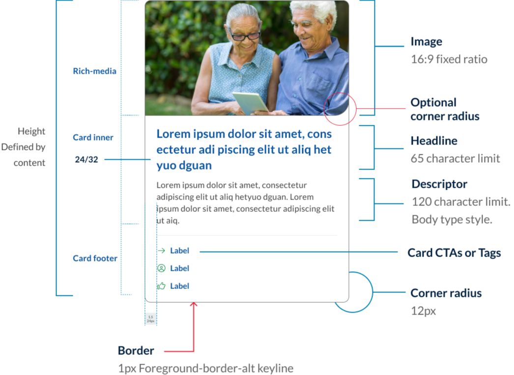
A card is container for a few short, related pieces of information. It roughly resembles a playing card in size and shape, and is intended as a linked, short representation of a conceptual unit (Nielsen Norman Group, 2016). All cards share anatomy that is comprised of 3 main sections, rich-media, card Inner and card footer.
The rich media section houses card images, icons or video thumbnails. Cards images use fixed image ratio of 16:9 and the Qld responsive image class.
The section houses the card title, description and in news cards a date.
The card footer is used to guide users to the call to action or to tags that may support the article content.
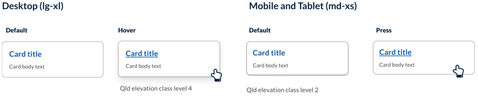
Card elevation
On desktop, cards have a shadow on hover. This is reversed on mobile. The subtle shadow on mobile helps to indicate that the card is an interactive component.
Icons and images
Using visual elements (such as images or icons) in cards allows for different content to stand out and provide additional context. It helps users visualise different pieces of information and quickly distinguish between content to find information easily (Digital NSW n.d.).
In our Design System you can choose to use custom iconography in the rich-media section.
Any visual elements should:
- re-enforce the content to the user
- be easily identified
- not be used for decorative purposes only.
Research and rationale
The design of our components started with DTA as a foundation, functionality and features were added after an extensive review of other Design Systems and best practice research. Our visual designs were heavily influenced by Victoria’s ripple Design System (State Government of Victoria, 2022) and Google’s Material Design (Material Deign, n.d.) and Nielson Norman UI-Component Definition (Laubheimer, 2016).
Some of the key areas we investigated when designing our cards was the use of curved edges, behaviour of single action vs multiple action cards, hover states and elevation styles, integrating action buttons and designing cards for articles and new page layouts.
Curved edges
We've used curved edges in our card design to help create a softer, more approachable look for cards. The curved edge creates a stronger visual distinction between cards and other design elements on a page, making it easier for users to identify and interact with cards.
Furthermore, Plasq designer, Keith Lang in his article on rounded corners offers a quote from Professor Jürg Nänni an authority on visual cognition who states
A rectangle with sharp edges takes indeed a little bit more cognitive visible effort than for example an ellipse of the same size. Our “fovea-eye” is even faster in recording a circle. Edges involve additional neuronal image tools. The process is therefore slowed down.”
Professor Nänni is saying that rounded corners have been found to take less cognitive load to see than it does to see sharp-cornered ones and are more computationally efficient for the human brain.
You may also notice that image cards have an intern curved edge on the bottom right corner. This was an intentional design choice to help visually connect the image with the description. It also creates a very subtle visual design similar to that of a speech bubble whilst giving our Design System cards their own unique flare.
Multi-action behaviour
Best practice and research conducted by the DTA indicated that when a card had a single link the whole region of the card must be clickable and however what we encountered was need from our users to have cards that included multiple clickable regions for links like news articles that included clickable tags or facility cards that had multiple navigational options (Digital Transformation Agency, 2018).
Our solution was to a create a new variety of cards which we tabled multi-action. The behaviour of these cards included having different hover, focus states and keyboard navigation. Unlike single action cards, only the actions within the card have a hover state and the entire card no longer has an elevation on hover.
Card actions, tags and buttons
Material Design guidelines by Google recommend limiting the number of actions in a card to no more than four or five (Material Design, n.d.). And Microsoft fluent suggest a best practice, include 1-3 actions (Microsoft, 2021). This is based on the principle that "less is more" when it comes to user interface design, and that too many options can lead to decision paralysis and user frustration.
Similarly, the Human Interface Guidelines recommend limiting the number of actions in a card to a small, manageable set that is essential to the user's task. They suggest grouping related actions together and presenting them in a clear and organised way to help users quickly find and access the functionality they need (Apple Inc., n.d.).
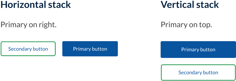
For these reasons we have based our card action designs around 3 modified CTA style links that can include an icon and are placed in a list within the footer of the card. These are known as supplemental actions or secondary actions. Research from both our comparative review and material design also suggested that the best placement for these was on the bottom left of the card this placement supported by both material design and the original DTA card structure. As an alternative to the card actions, users can also include clickable or clickable tags in the footer area. These were included to support the best practice approach to the design of new article cards which we established in our comparative review of card designs.
If a user wants to include buttons in their card it's important that these are also placed in the footer. If a secondary and primary action button are included the best practice research as well as our comparative review suggests that in small windows, the primary action button should be placed at the bottom right while the secondary action appears on the left.
However if the action is destructive, rather than reducing friction and making it easy for the user to execute the action, destructive actions should introduce friction to make the user pause before continuing, and alternative approaches should be sort for these situations such as requiring the the user to confirm the action or take an extra step such as writing the word DELETE to ensure they really want to take a destructive action (Carlson B, n.d).
Arrow links
One of the new styles we added to our cards was what are called Arrow links. In our Design System we have developed a consistent approach to the use of arrows and chevrons. In all cases where an arrow is used this indicates a link that takes you from page to page. Because this is a common function of a card and was also a common pattern found on cards in our comparative review, we added a trailing arrow icon to our default action cards as a new option for users.
Elevation
Our card elevation patterns and style take direction from material design but use our Design System elevation styles. Material design suggests having 2 distinct forms of elevation for mobile and desktop.
On desktop, cards by default have no resting elevation rather using an outline to indicate the card component. These cards only have an elevation on hover. On mobile, cards have a small default elevation which helps reintroduce visual depth as a signifier of click-ability (Laubheimer P 2016).
Classes
| Name | Description |
|---|---|
| Default card using white colour. |
| Sets card to use light background. |
| Sets card to use light alt background. |
| Sets card to use dark background. |
| Sets card to use dark alt background. |
| Sets card to be clickable (single action). |
| Sets card to use clickable links (multi action). |
| Variations of multi-action with image on left. |
| Variations of multi-action with image on right. |
| Vertical icon style card. |
| Leading icon style card. |
| Image style card. |
| Arrow style card. |
| Applied to <UL> to arrange cards in list. |
| Applied to <UL> to order cards a row. |
| Applied to <UL> to order cards a col. |
| Applied to <UL> to set all cards to have a matching height. |
| Applied to <a> within card footers to style links using the unique card action link appearance. |
Accessible card requirements
Keep these considerations in mind if you are modifying the Design System or creating a custom component.
Best practice
Card lists
To improve accessibly, use unordered lists and list items. Each card should be contained in an <li> element within a <ul> element. This allows screen readers to read the items in the card group and enables shortcuts between list items.
Card links
Having an anchor tag wrapping these contents has the benefit of having a large click area. A user is able to click anywhere in this card and view the full article or blog post.
However this can cause difficulties for screen readers. When a screen reader user focuses on this anchor tag, the entire contents of the card are read out. This can be a frustrating experience, particularly when there is a lot of content inside the cards. Furthermore when there is a large amount of cards (wrapped by anchors) on a single page, the links landmark menu of screen readers can get extremely convoluted.
Given this, the alternative is to have a single anchor tag inside the card, and have the hit area of this anchor tag wrap the card. This approach yields the benefits of having a large click area, but avoids issues for screen readers.
WCAG guidelines
1.1.1 Non-Text Content
Provide alternatives for any non-text content so it can be changed into other forms, like large text, braille, speech, symbols, or simpler language (W3C, 2018). This includes images, icons, etc. contained in the card. Use alt tags for images.
Background image example:
<div class="qld__responsive-media-img--bg" role="img" aria-label="Description of image"></div>
Standard image element example:
<img src="card_image.jpg" alt="Description of image">
1.3.2 Meaningful Sequence
When a sequence affects the meaning, it must be determined programmatically or available in text (W3C, 2018). This means the order of elements within the card should make sense when read by a screen reader. Make sure to use the appropriate heading level for your page to ensure card headings are in the correct order.
1.4.3 Contrast (Minimum)
The visual presentation of text and images of text has a contrast ratio of at least 4.5:1 (W3C, 2018). Check text-colour to background-colour contrast.
2.1.1 Keyboard
All content should be operable through a keyboard interface, without needing specific timings for individual keystrokes (W3C, 2018). This includes all interactive elements within the card.
2.4.4 Link Purpose (In Context)
The purpose of each link should be clear from the link text or its context (W3C, 2018). If links are present, their purpose should be understandable.
References
United States Web Design System (2015) Card, U.S. Web Design System, accessed 11 July 2023.
Digital NSW (n.d.) Cards, NSW Design System, accessed 10 April 2023.
Laubheimer P (2016) Cards: UI-Component Definition, Nielsen Norman Group, accessed 11 July 2023.
Scott E (2022) Readability: The Optimal Line Length, Baymard Institute, accessed 11 July 2023.
Material Design (n.d.) Cards – Material Design 3, Material Design, accessed 11 July 2023.
State Government of Victoria (2022) Card components, Ripple Design System.
Coyl A (2021) Design better cards, Medium, accessed March 5 2023.
Digital Transformation Agency (2018) Cards, Gold Design System (Formerly DTA), accessed 10 April 2023.
Lang K (2016) Rounded Corners and Why They Are Here to Stay, Designmodo. accessed 10 April 2023.
Microsoft (2023) Designing Adaptive Cards for your app - Teams, Microsoft Teams Developer documentation, Microsoft Learn, accessed 11 July 2023.
Carlson, B. (n.d.) Designing for Action: Best Practices for Effective Buttons, Balsamiq Wireframing Academy, Balsamiq, accessed 11 July 2023.
Nielsen J (2013) Explicitly State the Difference Between Options - Nielsen Norman Group usability research, Nielsen Norman Group, accessed 11 July 2023.
Loranger H (2016) The Same Link Twice on the Same Page: Do Duplicates Help or Hurt? , Nielsen Norman Group, accessed 27 Nov 2024.
Apple Inc. (n.d.) Human Interface Guidelines, Apple Developer Documentation, accessed 11 July 2023.