
Overview
Images should be clear and simple to help users, but it's important to ensure accessibility for all users and to avoid using images for unnecessary decoration. Only use images when there is a real user need, and utilise the Design System's classes and best practice guidelines for styling and using images effectively.
Types of images include:
- photographs and decorative images
- charts, graphs and maps
- diagrams or infographics
- drawings
- icons.
When using any of the images listed above the main thing you need to consider is whether or not the image is informative or decorative.
Informational websites may contain some images that help explain their content. These are informational images (Charts, graphs diagrams, infographics, maps etc).
Services should not contain any imagery, unless including informational imagery is absolutely necessary in aiding understanding. An example may be a diagram of a Queensland Driver’s Licence highlighting the card number.
Campaign or promotional websites generally use many images for maximum visual impact and decoration. These are decorative images.
Informative images
When using images, make sure they aid in comprehension and do not solely rely on them to convey information. Use text instead of embedded words in images and provide descriptions of images in the main text, not in the 'Alt text'. Keep images simple and easily describable. If a person is depicted in an image, include their name in the caption (Government Digital Service, 2023).
For guidelines on how to write alt text you can view the Australian Government Style advice.
Below is an example of how to correctly add an information image that includes alt-text and a caption.
Culex annulirostris
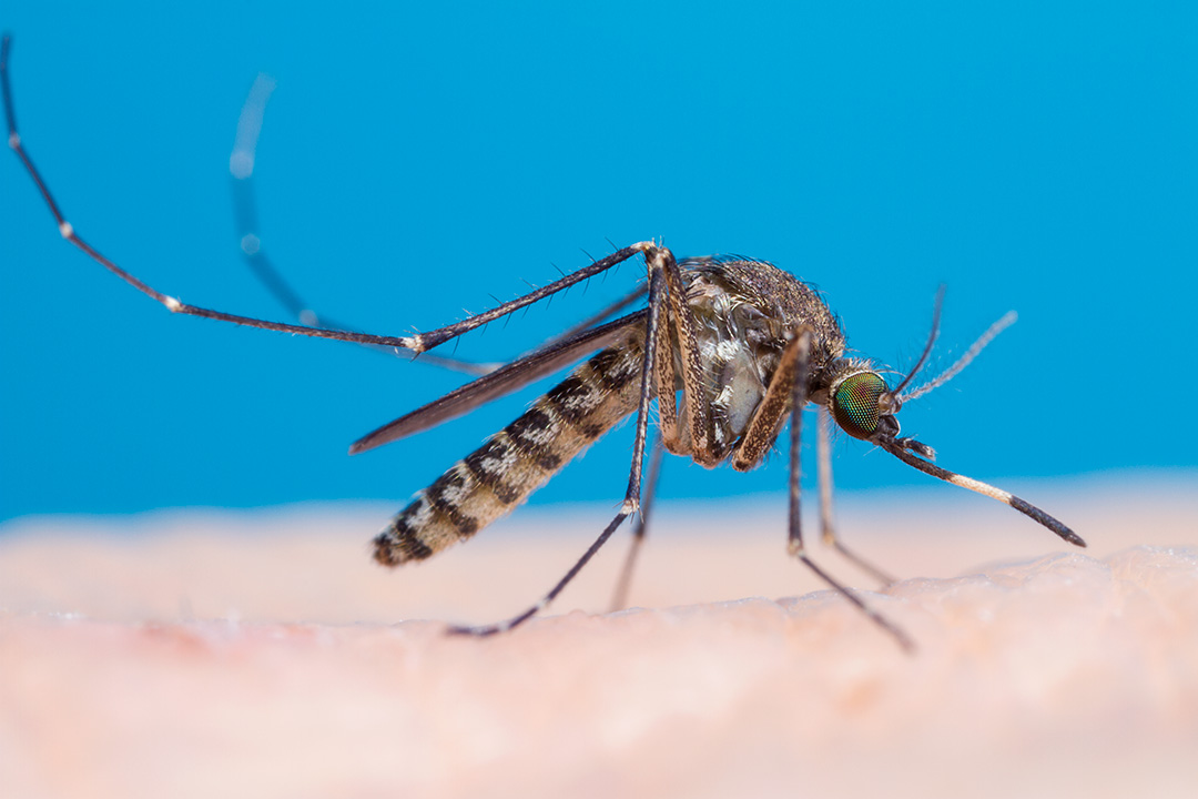
                <p class="qld__display-sm">Culex annulirostris</p>
<figure>
  <img
    loading="lazy"
    src="https://www.choreport.health.qld.gov.au/__data/assets/image/0013/140512/Culex_annulirostris_female2.jpg"
    alt="Close up photo of Culex annulirostris on human skin"
    width="1080"
    height="720"
    class="qld__responsive-media-img "
  />
  <figcaption>
    Supplied by Stephen Doggett, Department of Medical Entomology, NSW Health
    Pathology.
  </figcaption>
</figure>
Decorative images
These are just for looks and don't tell you anything important. You don't have to write ‘Alt text’ for these pictures because they’re just for decoration (Government Digital Service, 2023).
An example would be decorative images used within banners.
Image size and type
It is important to use images with appropriate resolution and file types in content. Balancing resolution and file size is crucial to page loading times. It is recommended to optimise and compress images for better user experience. Designing for mobile devices first and ensuring readability on both mobile and desktop screens is best practice.
Image dimensions
The specific dimensions of images depend on where they will be used. The following are some examples and recommended sizes for images used within the design system.
Banner background images
Banner background images should be 1600 wide and 520 pixels high when using the contained banner style otherwise banners should be 1920px wide and 520 pixels high.

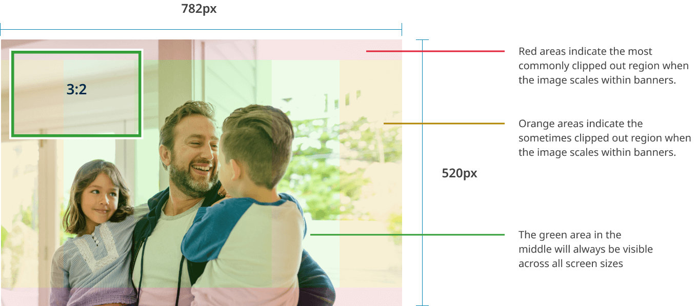
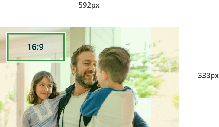
Banner images
Banner images (also referred to as hero) have a 3:2 ratio on desktop and sized at 782 x 520 pixels, and scale to a 16:9 ratio on mobile at 592 x 333 pixels.
Desktop example
Mobile example
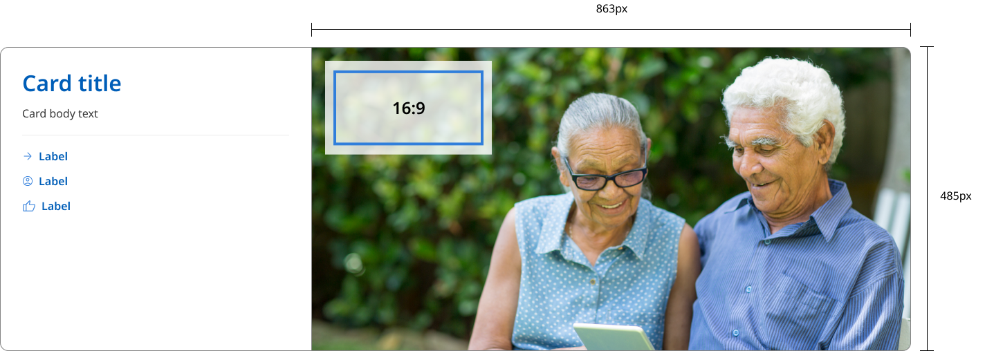
Card images
Card images should be produced with an aspect ratio of 16:9. The optimum dimensions for card images is dependent on the style chosen and the largest size they may appear. For feature cards where an image can appear on the right or left, the recommended dimensions are 863px wide and 486px high. For standard cards the recommended dimensions are 672px wide and 378px high.
Feature card example
Standard card example

Images in content
Images in content (informative images), sizes and aspect ratio can vary based on the type of image you are using. It is recommended to use standard aspect ratios. The maximum size an image can be displayed within a content area on a landing page is 1312px wide. The maximum image size on a content page is 960px wide.
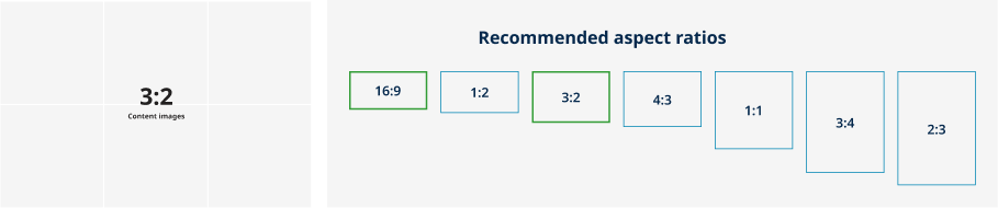
Aspect ratios
An aspect ratio is the proportion of an element’s width to its height. Aspect ratios are written as width:height.
For the majority of photos an aspect ratio of 3:2 is recommended. However, 16:9 may be more useful if you want to create visual consistency with multimedia with your layouts.
To maintain consistency in your layout, it's best to be consistent with whatever aspect ratio you choose for your elements.
The following aspect ratios are recommended for use across your UI:
- 16:9
- 1:2
- 3:2
- 4:3
- 1:1
- 3:4
- 2:3..
File formats
There are many file types for images so it may be best to seek specialist advice to optimise your images, however the following guidelines from the Mozilla Developer Network (MDN), a reputable source for web standards and practices offer some general guidelines (Mozilla Developer Network, n.d.).
- JPEG: use JPEG for photographs or images with many colours. It offers good compression but loses some data and quality
- PNG: PNG is best for images that require transparency or have text, sharp lines, and solid colours. It has lossless compression, meaning the image quality remains intact, but the file sizes tend to be larger
- WebP: Google’s WebP format is gaining popularity as it provides better compression than JPEG and PNG while maintaining high quality. However, it might not be supported in all browsers
- SVG: for vector graphics such as logos and icons, use SVG. It’s a scalable format and usually has a small file size
This is just a summary but for detailed information check out MDN's Image file type and format guide
File size
Aim to keep image files between 150-250kb to ensure optimal performance. Content management systems may not accept very large images, around 1mb in size, which can hinder the system's performance. To optimise images, utilise image compression tools to maintain quality while reducing file size, some suggestions are:
Resolution
For standard displays, a resolution of 72dpi (dots per inch) is commonly recommended. For high-resolution displays, such as Retina screens, you should use images with higher resolutions (e.g., 144dpi).
Styling images on your site
Responsive images
Use the .qld__responsive-media-img class to make an image fill the available space while not exceeding the actual image dimensions.

<img class="qld__responsive-media-img" src="./?a=153387" alt="">
Images within text
Use the .qld__right-aligned-img class to make an image fill the available space while not exceeding the actual image dimensions.
Lorem ipsum dolor sit amet, consectetur adipiscing elit. Aliquam molestie libero quis arcu sodales, non dapibus enim porta. Donec vitae commodo odio. Morbi viverra augue leo, et tincidunt arcu dignissim sed. Integer sagittis ac neque vitae dictum. Vestibulum eu quam enim. Suspendisse in elit tristique, dictum felis in, rhoncus ipsum. Donec mollis mi lectus, in fermentum metus dapibus at. Aliquam quis tristique justo. In egestas dapibus eros. Phasellus velit odio, consequat vel blandit a, ultricies vel lacus. In eu arcu nibh. Aenean lacus dolor, ornare ut ante ac, hendrerit efficitur elit. Donec congue sit amet tellus nec rutrum. Maecenas eu quam erat.
                <figure class="qld__right-aligned-img">
  <img
    loading="lazy"
    src="https://www.choreport.health.qld.gov.au/__data/assets/image/0013/140512/Culex_annulirostris_female2.jpg"
    alt="Close up photo of Culex annulirostris on human skin"
    width="1080"
    height="720"
    class="qld__responsive-media-img"
  />
  <figcaption>
    Supplied by Stephen Doggett, Department of Medical Entomology, NSW Health
    Pathology.
  </figcaption>
</figure>
<p>Lorem ipsum dolor sit amet, consectetur adipiscing elit. Aliquam molestie libero quis arcu sodales, non dapibus enim porta. Donec vitae commodo odio. Morbi viverra augue leo, et tincidunt arcu dignissim sed. Integer sagittis ac neque vitae dictum. Vestibulum eu quam enim. Suspendisse in elit tristique, dictum felis in, rhoncus ipsum. Donec mollis mi lectus, in fermentum metus dapibus at. Aliquam quis tristique justo. In egestas dapibus eros. Phasellus velit odio, consequat vel blandit a, ultricies vel lacus. In eu arcu nibh. Aenean lacus dolor, ornare ut ante ac, hendrerit efficitur elit. Donec congue sit amet tellus nec rutrum. Maecenas eu quam erat.
<p>
Usage guidelines
When to use
Adding images can sometimes help users better understand instructions. However, images should only be visual aids — written content must contain all the information the user needs to complete the service (GOV.UK, 2023).
Images are best used when they:
- help users visually understand the product or concept
- are relevant to the task at hand
- relate to the actual goals of the page
- scale or crop without losing their meaning
- support ‘familiar’ branding (e.g. user can identify that the site is a trusted government website).
When not to use
Images should be avoided when they:
- are used purely for decoration
- are used in place of text headings (e.g. navigation headings, content headings)
- are used to just fill space
- fill all the real estate above the fold (users spend 80% of their time above the fold)
- force excessive scrolling (low literacy users find tracking hard with unnecessary scrolling)
- don’t add content or feel ‘real’
- are showcased over the site purpose
- obscure any text
- slow page redraw/download times
- are there for design sake only and don't improve communication.
How to use images
- Visual weight should be based on goal importance
- Where a person can be identified, a signed Photo Consent Form must be obtained
- When using photographs of an employee please ensure the employee looks neat and tidy and the staff ID card isn't visible
- Although most photographs should use the 3:2 aspect ratio if your image represents something physical, such as a letter, document or credit card you should use the aspect ratio of that item
- Should be reflective of the diversity of Australia’s peoples and cultures
- Always choose images that are relevant to the content
- Ensure your images are from a credible source and are appropriately credited if necessary
- Make sure your images or illustrations follow a consistent style
- If outside, ensure sun safety measures are applied (hats, sunscreen, shade, etc).
- No visible brand logos on clothes (e.g. Nike) can appear in the photography
- Ensure your photography is stored securely and critical meta data is recorded
- If photographs are used in website branding, agencies must use images photographed in Queensland
- Avoid zigzag images patterns and align decorative images down the page. This supports efficient scanning since users prefer to ignore decorative images
- The first images in the list set the tone and make users decide whether to ignore the rest. Pay particular attention to the information value of the images used first
- Use the correct dimensions for images used. Images smaller than the recommended dimensions may appear blurry or pixelated when they stretch to fill containers.
- Don't enlarge smaller images.
- Optimise all images used. If the file size is bigger the page will take longer to load. Aim for 250kb maximum. We recommend a maximum width of 1600pixels.
- Include image alt tags for all informative images used.
- Include captions where required. Captions should not repeat alt text.
Accessible image requirements
When it comes to accessibility, the Web Content Accessibility Guidelines (WCAG) 2.1 provide several guidelines related to images:
Our default image styles have already been designed to meet accessibility requirements however keep these considerations in mind if you're modifying the Design System or creating a custom component.
Fundamentals
The following are recommendations from the Australian Government style manual:
- include images on a page only if they meet a real user need
- understand the purpose of the image to write alt text
- use real text rather than images of text whenever technically possible. (Logos can be an exception.)
- make sure that colour isn't the only visual means of conveying information in graphs and diagrams. Text labels and patterns can supplement the use of colour. Make sure the contrast is sufficient for all users.
WCAG guideline
1.1.1 Non-text Content (Level A)
All images should have alternative text that serves the equivalent purpose or presents the same information as the image itself.
1.4.5 Images of Text
If the technologies being used can achieve the visual presentation, text is used to convey information rather than images of text except for certain situations.
1.4.3 Contrast (Minimum)
Images that convey information must have a contrast ratio of at least 4.5:1, especially if it includes text.
1.4.11 Non-Text Contrast
The visual presentation of user interface components, graphical objects, and states have a contrast ratio of at least 3:1 against adjacent colours.
2.4.4 Link Purpose (In Context)
If an image is used as a link, the alternative text for the image must describe the purpose of the link.
By following these guidelines, you ensure that your website is accessible to all users, including those with visual impairments or other disabilities.
References
Mozilla Developer Network (2023) '<img>: The Image Embed element - HTML: HyperText Markup Language | MDN', Mozilla Developer Network, accessed 12 June 2023.
UK Government (2023) 'Images', GOV.UK Design System,, accessed 12 June 2023.
Australian Government (2022) 'Alt text, captions and titles for images', Australian Government Style Manual, accessed 12 June 2023.
Australian Government (2022) 'Images', Australian Government Style Manual, accessed 12 June 2023.
Salazar, K (2023) 'Zigzag Image–Text Layouts Make Scanning Less Efficient', Nielsen Norman Group, accessed 12 June 2023.
W3C (2018) Web Content Accessibility Guidelines (WCAG) 2.1, World Wide Web Consortium, accessed 10 April 2023.
Digital Transformation Agency (2018) Responsive images, Gold Design System (Formerly DTA), accessed 10 April 2023.
Web.dev Team (n.d.) 'Images', web.dev, accessed 12 June 2023.