Overview
Found on the left hand side of the screen, vertical navigation displays a list of global navigation links that can include primary, secondary navigation levels.
Using vertical navigation removes the visual design constraints that limit the number of categories that can exist in top level navigation.
They're an excellent design choice for accommodating a large number of options or for revealing many lower-level site pages at a glance. This form of navigation is beneficial for complex applications, admin apps and desktop apps.
Vertical navigation supports more efficient scanning than horizontal navigation and translates naturally to mobile, however it does take up more visual space and very long vertical menus may result in content that appears below the fold.
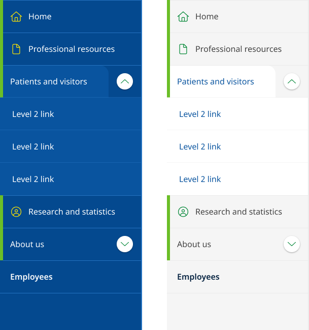
Dark and light example
<!-- Ver Navigation colours
    Default light:  <div class="qld__left-nav">
    Dark:   <div class="qld__left-nav qld__main-nav--dark">
    -->

       <div class="qld__left-nav ">
        <!-- Left Navigation Container -->
        <nav aria-label="left navigation" id="left-nav" class="qld__left-nav__content">
            <ul class="qld__link-list">
                <!-- Home Link -->
                <li>
                    <a class="qld__left-nav__item-link" href="javascript:void(0)">
                        <!-- SVG icon for the link -->
                        <span class="qld__main-nav__item-icon">
                            <svg aria-hidden="true" focusable="false" xmlns="http://www.w3.org/2000/svg" class="qld__icon qld__icon--md">
                               <use href="./?a=151118#home">
                            </svg>
                        </span>
                        <span class="qld__left-nav__item-text" data-name="">Home</span>
                    </a>
                </li>

                <!-- About Section (Menu item with dropdown) -->
                <li>
                    <a class="qld__left-nav__item-link" href="javascript:void(0)">
                        <span class="qld__left-nav__item-text" data-name="About">About</span>
                    </a>
                    <!-- About Submenu -->
                    <button class="qld__left-nav__item-toggle qld__accordion--closed" aria-controls="internal-nav-118539" aria-expanded="false" aria-selected="false" aria-label="Toggle navigation, About"></button>
                    <ul id="internal-nav-example1" class="qld__link-list qld__accordion--closed qld__accordion__body">
                        <li>
                            <a class="qld__left-nav__item-link" href="javascript:void(0)">
                                <span class="qld__left-nav__item-text">Digital services policy and standard</span>
                            </a>
                        </li>
                        <li>
                            <a class="qld__left-nav__item-link" href="javascript:void(0)">
                                <span class="qld__left-nav__item-text">Principles and Introduction</span>
                            </a>
                        </li>
                    </ul>
                </li>

                <!-- Settings Section (Menu item with icons) -->
                <li>
                    <a class="qld__left-nav__item-link" href="javascript:void(0)">
                        <span class="qld__left-nav__item-text" data-name="Settings">Settings</span>
                    </a>
                    <a class="qld__main-nav__item-link" href="javascript:void(0)">
                        <!-- SVG icon for the link -->
                        <span class="qld__main-nav__item-icon">
                            <svg aria-hidden="true" focusable="false" xmlns="http://www.w3.org/2000/svg" class="qld__icon qld__icon--md">
                                 <use href="./?a=151118#settings">
                            </svg>
                        </span>
                    </a>
                </li>

                <!-- Settings Section Standard menu item -->
                <li>
                    <a class="qld__left-nav__item-link" href="javascript:void(0)">
                        <span class="qld__left-nav__item-text" data-name="About us">About us</span>
                    </a>
                    <a class="qld__main-nav__item-link" href="javascript:void(0)">
                        <!-- SVG icon for the link -->
                        <span class="qld__main-nav__item-icon">
                            <svg aria-hidden="true" focusable="false" xmlns="http://www.w3.org/2000/svg" class="qld__icon qld__icon--md">
                                <use href="./?a=151118#settings">
                            </svg>
                        </span>
                    </a>
                </li>

            </ul>
        </nav>
    </div>
</div>
Usage guidelines
When to use
- Information-heavy websites with a large number of primary level 1 categories: Vertical navigation is helpful for websites with large amounts of content, as it enables users to navigate through categories or sections more efficiently (Laubheimer, 2021).
- Hierarchical navigation: Vertical navigation is suitable for websites or applications with a hierarchical navigation structure where items in the navigation should be accessed in sequential order.
- Web Applications: If your digital product has a native application version, you will want your web app to be consistent with it. Vertical navigation is widely used both in macOS and Windows applications as primary means of navigation, as the top area is usually reserved for the menu bar (Mockplus, n.d.). Using vertical navigation for web applications can mean that your interface is more familiar to users (Laubheimer, 2021).
- For sites that where navigation is likely to grow: Adding additional categories to the vertical navigation doesn’t require a major process of redesigning the navigation UI; the only major decision is how the new items should be blended into the existing category structure (Laubheimer, 2021).
- File or content management products: For file or content management products where users can customise their navigation and need support for a tree/folder structure.
When not to use
- Standard government websites: Generally, not recommend for standard websites. Studies have shown users are more familiar with horizontal navigation patterns. Horizontal navigation also encourages a more considered approach to the structure and labelling of the navigation which can result in better user experiences.
- Simple navigation structures: If your website or application has a simple and flat navigation structure, horizontal navigation may be more appropriate. This style of navigation is not recommended for for small, medium, and large websites that don’t have a hierarchical structure and want to promote imagery, content or advertising.
- Minimalist designs or campaign websites: Websites with a minimalist design or limited content may not benefit from vertical navigation, as it can consume valuable screen space and create unnecessary visual clutter. Websites that focus on visual content, such as photography or video, may benefit more from horizontal navigation, as it allows for larger visuals and a more immersive experience without the distraction of a vertical menu.
- For sites with a deep IA structure: This style of navigation shouldn't be used for sites that have a deep IA structure consisting of many level 2 and 3 links which are more appropriately surfaced through the use of mega-menu.
- For very wide screens: Websites or applications primarily designed for wide screens should consider using horizontal navigation to take advantage of the available screen real estate. Vertical navigation may leave excessive empty space on wide screens and may not align well with other page elements.
- When familiarity and conventions are important: Horizontal navigation is a more common and familiar design pattern. If your users are generally accustomed to seeing and interacting with horizontal menus on other sites in your network, consider it may be advantageous to maintain consistency across all sites designs.
How to use
Do
- Show each choice only once: Duplicating options makes users wonder whether the 2 occurrences are the same or different.
- Consider the Primacy effect: Items at the beginning of a list are more easily remembered.
- In long menus, place less-important ones at the bottom: Due to the usability problems caused by the page fold, a very long vertical menu risks having items that aren't visible without scrolling (Laubheimer, 2021).
- Keep words short and direct: For example, the base form of verbs ("shop") is usually better than gerunds ("shopping").
- Incorporate Icons carefully: Icons can help when there are a lot of links to call attention to important tasks or categories.
- Use descriptive, recognisable link labels: Don’t label links with jargon or unfamiliar terms.
Don't
- Use vague or misleading labels: Don't use labels that are vague or misleading (e.g. "Services" instead of "Web Design Services").
- Use obscure symbols or icons: Avoid using symbols or icons that may be confusing to users. Stick to simple, easily recognizable icons if you must use them.
- Use inconsistent navigation throughout the site: Make sure the layout and design of your primary navigation is consistent throughout the site. Don't make users have to re-learn how to navigate your site every time they visit a new page.
- Don't hide the navigation behind a hamburger menu on desktop: Because vertical navigation takes up more space some sites tend to hide it behind a hamburger menu, this provides a worse experience for a user than if it's visible. Hidden navigation is less visible or partially visible navigation. When navigation is hidden, users are less likely to use navigation. If people use hidden navigation, they do so later in the task than if it were visible (Kalbach, 2014).
- Don't hide the navigation items behind icons: Since vertical navigation takes up more space than horizontal navigation, designers often attempt to minimise its corresponding area. However, this impacts usability and accessibility of the site navigation. Also make sure that when using icons you include labels as well as this reduces ambiguity and increases the target size (Laubheimer, 2021).
Anatomy
Below is an annotated anatomy of the vertical navigation layouts.
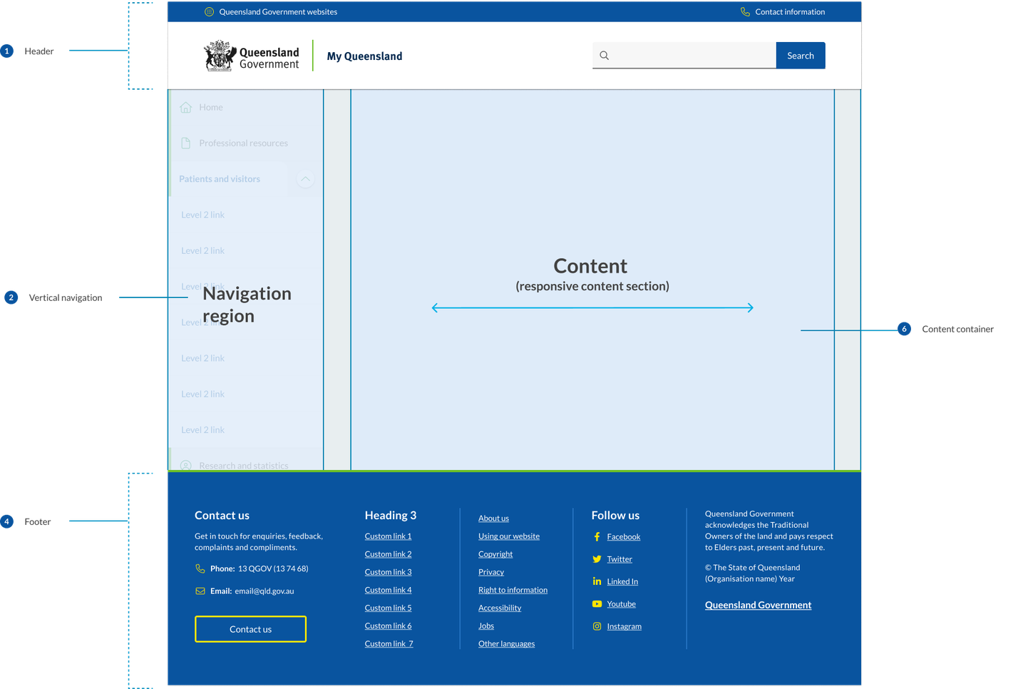

- Header
The header design matches the default pattern from the Design System. The primary change is that the centred alignment is removed at the xl breakpoint and content is justified to the left and right off the screen with 48px margins. - The navigation region
This region is comprised of navigational components and elements listed vertically on the left of the screen. The navigation region maintains a consistent width of 280px and only appears on screen sizes 992px wide and above. The design of the vertical navigation is designed to match mobile menu and its components are used in mobile tablet menu. - Content
The content region is used for displaying content the primary page content. It has a max-width of 1312px which is the same as the default horizontal navigation layouts. The footer
In vertical navigation layouts the footer component is justified to the left and right of the screen xl breakpoint with 48px margins.
Research and rationale
The design of the vertical navigation is based on best practice established by Material design, IBM carbon. For the design of this component, we conducted a comparative review of 9 different Design Systems that included this vertical navigation, as well as research from Nielsen and Norman Group on best practices and layout. Our goal was to create a vertical navigation pattern that was visually consistent with our horizontal and mobile navigation patterns and built on as much established best practice as possible.
Colour
Research indicated that we should ensure that the navigation was visually salient using different background colours and borders to make navigation and content stand out from the other page elements (Laubheimer, 2021). We ensured that we used the same colours from our horizontal component which uses shades of background colours to distinguish the primary navigation from the page content.
The vertical navigation is also available in 2 colours to match what is available in the horizontal menu design.
Iconography
Although icons should not replay menu labels, they can assist users to scan and locate information more efficiently. Due to the availability of space in vertical navigation menus we designed the component to allow for them to be incorporated into the level 1 navigation items.
Mobile navigation
One of the commonalities between all the vertical navigation patterns we reviewed was the consistency between vertical navigation designs and mobile navigation. Based on this we chose to use our mobile navigation as the basis for the design of our vertical navigation component. This meant that there would be more visual consistency between sites using horizontal navigation and those using vertical navigation.
The vertical navigation menu builds on the research conducted for the design of the mobile navigation pattern and actually uses the same components as the tablet mobile navigation.
Layout
During our comparative review we discovered that each navigation category should have no more than one level of sub-menu items and that the average size of the navigation containers was 280px which we chose to adopt as the standard for our design.
Consistency
With our approach to the design of the vertical navigation we've tried to ensure that there is as little visual friction between this layout and the default horizontal layout. Breakpoints remain the same and only minor adjustments were made to the xl and lg grid patterns. We also designed the vertical in such a way that the existing headers and footers could remained the same with the only difference being that at the xl breakpoint they're now justified to the left and right of the screen.
Classes and design tokens
| Name | Description |
|---|---|
| Wrapper for vertical navigation. |
| <nav> container for navigation items. |
| Styling for link list items. |
| Styling menu item icons. |
| Styling for menu item labels. |
| Styling for open level 1 categories that include sub-navigation. |
| Default styling for navigation toggle <buttons>. |
| Styling for navigation toggle <buttons> after being open. |
| Current page style. |
| Modifies the navigation to use the dark theme. |
Accessible vertical navigation requirements
Keep these considerations in mind if you're modifying the Design System or creating a custom component.
WCAG Guidelines
1.1.1: Non-text Content
If any icons are used in the primary navigation, ensure that they have alternative text that describes the image for users with screen readers (W3C, 2018).
1.3 Adaptable
All items in the left panel are in a nested <ul> structure, which provides additional information to assistive technologies (Carbon Design System, n.d.).
The Vertical navigation component is in a <nav> section with aria-label="left navigation".
Each ‘sub-menu’ is implemented as a <button> with aria-expanded.
2.1.1: Keyboard
Ensure that users can navigate the primary navigation using the keyboard alone, as some users may not be able to use a mouse (W3C, 2018). Implement proper keyboard navigation for menus, including support for arrow keys to move between menu items, the Enter or Space key to activate links or expand submenus, and the Esc key to close submenus or the entire menu.
2.4.1 Bypass blocks
Include a mechanism to bypass navigation for those.
2.4.4 Link Purpose
Use descriptive labels for each link in the primary navigation, as this makes it easier for users with screen readers to understand what the link is for (W3C, 2018).
2.4.5 Multiple ways
More than one way is available to locate a Web page within a set of Web pages except where the Web Page is the result of, or a step in, a process.
2.4.6 Headings and labels
Use clear and consistent headings to organise the links in the primary navigation and mega-menu, as this makes it easier for users with screen readers to navigate the menu (W3C, 2018).
2.4.7 Focus Visible
Provide visible focus indicators for interactive elements, so keyboard users can easily identify which element is currently focused. (W3C, 2018).
3.2.4 Consistent Identification
Maintain a consistent design, appearance, and placement for the back-to-top button across all pages of the website (W3C, 2018).
3.2 Predictable
Maintain consistent navigation structure and appearance across all pages of the website to help users understand the interface and anticipate where they'll find navigation items.
4.1.2 Name, Role, Value
Use appropriate ARIA roles and attributes to describe menu components and their states. This helps assistive technologies understand the structure and functionality of the menu.
Other best practice guidance
- Offer multiple ways to access content, such as providing a search functionality and a sitemap
- If the primary navigation includes dropdown menus or other interactive elements, ensure they're accessible using both keyboard and screen reader interactions
- Make sure the navigation has appropriate colour contrast, meeting at least the AA level of WCAG 2.1 (4.5:1 for normal text and 3:1 for large text)
- Use clear and simple language for navigation labels, avoiding jargon or unfamiliar terms
- Provide an accessible close mechanism for menus, such as a "Close" button or an option to click outside the menu to close it, ensuring that users can easily dismiss the menu when needed
- Activated links receive an
aria-current="page"attribute
References
W3C (2018) Web Content Accessibility Guidelines (WCAG) 2.1, World Wide Web Consortium, accessed 10 April 2023.
Mockplus (n.d.) Vertical Navigation Menu, Mockplus Blog, accessed 19 April 2023.
Laubheimer, P. (2021) Left-Side Vertical Navigation on Desktop: Scalable, Responsive, and Easy to Scan, NNGroup, accessed 19 April 2023.
Material Design (n.d.) Understanding Layout, Material Design , accessed 19 April 2023.
Kalbach, James (2014) Hamburger Menus and Hidden Navigation, Nielsen Norman Group, accessed 19 April 2023.
Carbon Design System (n.d.) UI Shell Left Panel, Carbon Design System, accessed 19 April 2023.