
Overview
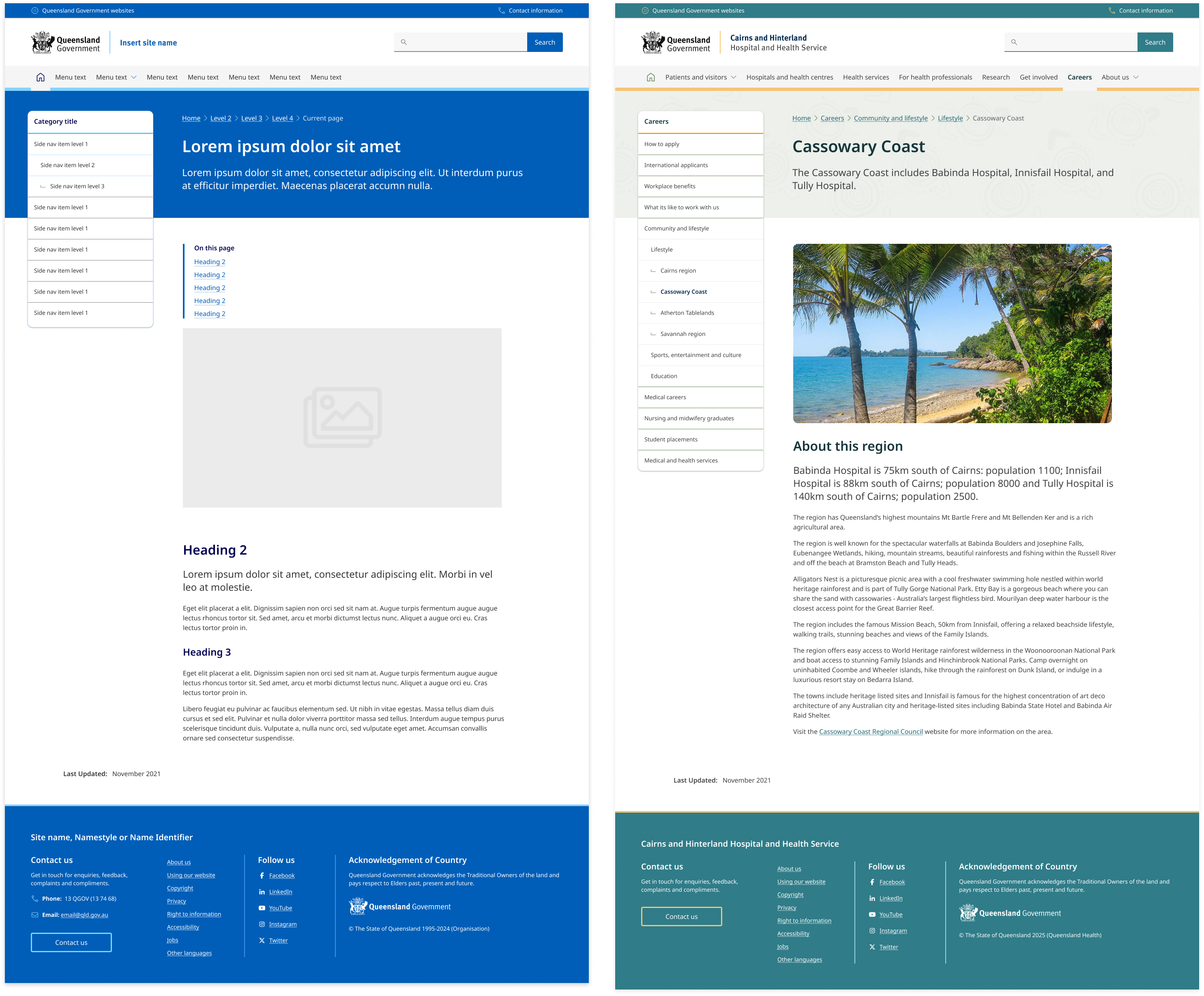
The side navigation is a vertical list of links that is usually placed next to the body content of a website. It serves as a helpful tool for users to quickly find other pages that relate to the same topic or section.
The side navigation generally supports up to 3 levels of nesting, and each level is accompanied by a relevant heading to provide context.
On mobile devices and smaller viewports, the side navigation is designed to use the accordion component. This allows it to collapse down into a compact, expandable element that's easy to use on smaller screens.
Example
                <!-- Column containing side navigation -->
<div class="col-xs-12 col-lg-6 col-xl-5">
  <!-- Side navigation section -->
  <aside class="qld__side-nav qld__accordion">
    <!-- Button to toggle side navigation -->
    <button class="qld__side-nav__toggle qld__accordion__title qld__accordion--closed" aria-controls="nav-default" aria-expanded="false" aria-selected="false">In this section</button>
    <!-- Side navigation content -->
    <nav id="nav-default" aria-label="section" class="qld__side-nav__content qld__accordion--closed qld__accordion__body">
      <!-- Navigation title -->
      <h2 class="qld__sidenav__title">
        <a class="qld__sidenav__link" href="#">Lodging your tax return</a>
      </h2>
      <!-- Navigation links -->
      <ul class="qld__link-list">
        <li><a class="qld__sidenav__link" href="#">Lodge online</a>
          <ul class="qld__link-list">
            <li><a class="qld__sidenav__link" href="#">Pre-filling your online tax return</a></li>
          </ul>
        </li>
        <li class="active" aria-current="page"><span>Do you need to lodge a tax return?</span></li>
        <li><a class="qld__sidenav__link" href="#">What's new for individuals</a></li>
        <li><a class="qld__sidenav__link" href="#">Why you may receive a tax bill</a></li>
        <li><a class="qld__sidenav__link" href="#">In detail</a>
          <ul class="qld__link-list">
            <li><a class="qld__sidenav__link" href="#">Record keeping</a>
              <ul class="qld__link-list">
                <li><a class="qld__sidenav__link" href="#"><svg class="qld__icon" aria-hidden="true" xmlns="http://www.w3.org/2000/svg"><use href="https://www.designsystem.qld.gov.au/?a=169317:dist/mysource_files/img/QLD-icons.svg#tick"></use></svg>Keeping your tax records</a></li>
                <li><a class="qld__sidenav__link" href="#"><svg class="qld__icon" aria-hidden="true" xmlns="http://www.w3.org/2000/svg"><use href="https://www.designsystem.qld.gov.au/?a=169317:dist/mysource_files/img/QLD-icons.svg#tick"></use></svg>Incorrect amounts</a></li>
              </ul>
            </li>
            <li><a class="qld__sidenav__link" href="#">Tax receipt</a></li>
            <li><a class="qld__sidenav__link" href="#">Pre-fill availability</a></li>
          </ul>
        </li>
      </ul>
    </nav>
  </aside>
</div>
Usage guidelines
When to use
- Use this component when you have a large amount of related content that needs to be organised and easily accessible to users
- When you want to display navigational hierarchy with one to three levels
- Use this component when you want to provide users with a secondary navigation option that's separate from the main content area of the page
- Content pages that are part of multi-level navigation: Pages that require multiple levels of navigation, such as those with subcategories can benefit from a side navigation component that allows users to drill down
When not to use
- On small sites: Don't use this component if you only have a small number of navigation items, as it may be unnecessarily complex for users. If the site has fewer than 5 pages, consider organising the page without a navigational hierarchy
- Existing navigation: Multiple navigation options, consider if adding side navigation benefits the user. Try to simplify your navigation system where possible
- On home and landing pages: The content on a home or landing page may not necessarily require a secondary navigation option, as users may be able to find what they need through scrolling, searching, or clicking on clear calls to action. Furthermore the purpose of a home or landing page is often to provide a clear and concise overview of the content and services offered by the website. Including a side navigation component with a large number of links may overwhelm users and distract from the main purpose of the page
How to use
- Only expand active subsections to help emphasise which section the user is in and to reduce visual complexity
- Keep the navigation link text short. They can be shorter versions of pages titles
Find the right balance
If the side navigation is too long, users may miss items at the bottom. If there are too many levels, users may miss items that require too many clicks. Do usability testing to find the right balance between breadth and depth. The goal for a menu, as the Nielsen Norman Group states, is for people to “rely on recognition rather than recall,” so menus need to be short enough to scan, but long enough to be clear (Whitenton, 2013).
Limit the number of Levels
The number of levels within a navigation is ultimately determined by the site hierarchy. Ideally, the fewer levels people need to click through, the quicker and least confusing it should be for them to access what they want. Nielson and Normans group’s research suggests that “the deeper a hierarchy becomes, the more likely visitors are to become disoriented.” (Whitenton, 2013).
Research and rationale
The side navigation was based on research and designs from the Digital Transformation Agency’s (DTA) side navigation component. The DTAs design was found to be consistent with existing best practices and only minor adjustments were made to include design accent colours which was done to allow more brand elements to be incorporated throughout the sites design.
Unique Visual Design for Each Level
People should be able to quickly scan the navigation and understand which links are primary, secondary, and tertiary navigation items. The placement and grouping of the links in our side navigation supports this through typography styles such as indentations and marks which are used to establish hierarchy between the list items (Lin, 2017).
Use Location Indicators
Like with breadcrumbs, location indicators on the navigation help people orient themselves on the site, especially if they're deeper within the website. This clear visual indicator can indicate which section someone is in. In our component, active pages are indicated by having a bold heading colour and interactivity such as hover states are removed.
Three levels
Following the research conducted by the DTA our side navigation supports 3 levels of hierarchy. The reason we only support 3 levels is because beyond 3 levels, visual solutions quickly become too complex or drastically reduce the available line length for links.
The DTA reviewed multiple government and private sector websites and found that the upper extent of complex navigation solutions tended to be around 5 levels.
To accommodate this and avoid overly complex user interfaces the navigation is often split into groups.
The best examples of navigation for a user where:
- One level in a main menu
- Landing page containing a list of second level links
- Three levels in a side navigation, including:
- Active state in main menu
- Title in side navigation for second level
- Breadcrumbs
Styles for the collapsed element
The DTA discovered through usability testing that the collapsed navigation on mobile was often overlooked by users because it was too subtle. A revision was made to make the collapsed navigation similar to the accordion and tertiary button styles in order to be more identifiable as a possible action. We chose to continue with the solution.
Future state
We're currently investigating future state design for this component that incorporates elevation, collapsible sections and more considered integration with banners on content pages.
Classes
| Name | Description |
|---|---|
| Wrapper for vertical navigation. |
| Style of button used to toggle the mobile accordion version of the side navigation. |
| Governs the style of the content of contained within the <Nav> element. |
| Style for the primary level 1 category heading of the side navigation. |
| Styling for side navigation link list. |
| Style for navigation link items. |
| Current page style. |
Accessible side navigation requirements
Keep these considerations in mind if you're modifying the Design System or creating a custom component.
WCAG guidelines
1.3 Adaptable
All items in the side navigation are in a nested <ul> structure, which provides additional information to assistive technologies (Carbon Design System, n.d.).
The Vertical navigation component is in a <nav> section with aria-label="side navigation" .
Further more the side navigation should be housed in an <aside> element. By using the <aside> element to mark up a side menu, you're providing a semantic structure to the content, which helps assistive technology such as screen readers to correctly identify and interpret the menu. The <aside> element is designed to be used for content that is related to the main content of the page, but not essential to understanding it which makes it perfect for a side menu.
2.1.1: Keyboard
Implement proper keyboard navigation for menus, including the Enter key to activate links, the Enter or Space key to press buttons and expand submenus.
2.4.1: Bypass blocks
Include a mechanism to bypass side navigation for those using a keyboard or screen readers.
2.4.7: Focus Visible
Provide visible focus indicators for interactive elements, so keyboard users can easily identify which element is currently focused.
3.2: Predictable
Maintain consistent navigation structure and appearance across all pages of the website to help users understand the interface and anticipate where they'll find navigation items.
2.4.4: Link Purpose
Use descriptive labels for each link in the primary navigation, as this makes it easier for users with screen readers to understand what the link is for.
2.4.5: Multiple ways
More than one way is available to locate a Web page within a set of Web pages except where the Web Page is the result of, or a step in, a process.
2.4.6: Headings and labels
Use clear and consistent headings to organise the links in the side navigation and mega menu, as this makes it easier for users with screen readers to navigate the menu.
Other best practice guidance
- Offer multiple ways to access content, such as providing a search functionality and a sitemap
- Use clear and simple language for navigation labels, avoiding jargon or unfamiliar terms
- Activated links should receive an
aria-current="page"attribute
References
Digital Transformation Agency (2018) Side Nav, Gold Design System (Formerly DTA), accessed 10 April 2023.
Lin S (2017) The Rules for Modern Navigation, UX Booth, accessed 23 April 2023.
Whitenton K (2013) Flat vs. Deep Website Hierarchy, Nielsen Norman Group, accessed 23 April 2023.
W3C (2018) Web Content Accessibility Guidelines (WCAG) 2.1, World Wide Web Consortium, accessed 10 April 2023.
Carbon Design System (n.d.) UI Shell Left Panel, Carbon Design System, accessed 19 April 2023.