
Overview
Our hyperlink style was developed after researching the needs and challenges facing users with varying levels of cognitive, literacy and visual ability. Our goal was to create an inclusive solution that improves the user experience for all users.
Our underline style
The underline is designed to always sit below the descender line, which is the lowest point of characters like j, y, and g. For text set at 1rem, this distance is approximately 5px from the baseline. To maintain consistent spacing across all font sizes, we converted this value to 0.3em, which scales appropriately with different text sizes.
On hover the underline increases in weight rather than just changing colour which enables colour blind users to see the transition and the colour for both the default underline style and the hover style, it has been designed to meet required contrast ratios.
To reduce distracting impact that underlines in hyperlinks the line thickness for the rest state reduced and colour is lightened. This ensures the visual strength of the underline isn't the same as the rest of the text.
                <!-- H1 heading hyperlink -->
<h1>
    <a href="javascript:void(0)">H1 heading hyperlink</a>
</h1>

<!-- H2 heading hyperlink -->
<h2>
    <a href="javascript:void(0)">H2 heading hyperlink</a>
</h2>

<!-- H3 heading hyperlink -->
<h3>
    <a href="javascript:void(0)">H3 heading hyperlink</a>
</h3>

<!-- H4 heading hyperlink -->
<h4>
    <a href="javascript:void(0)">H4 heading hyperlink</a>
</h4>

<!-- H5 heading hyperlink -->
<h5>
    <a href="javascript:void(0)">H5 heading hyperlink</a>
</h5>

<!-- H6 heading hyperlink -->
<h6>
    <a href="javascript:void(0)">H6 heading hyperlink</a>
</h6>

<!-- Body text hyperlink -->
<p>Here is some <a href="javascript:void(0)">body text with a hyperlink</a> included.</p>
Guidelines for use
As a general rule underlines are required for all links and interactive text unless it's clear that it's a hyperlink (ie buttons, nav etc).”
When to use
- Traditionally, underlined text is associated with hyperlinks on the web. Users often expect links to be underlined, so not using underlines may make links less noticeable
Since there’s no hover state on mobile, underlines can be especially important for making links visible
When not to use
- In navigation menus or buttons: These elements are usually understood to be interactive, so underlines are often unnecessary on the rest state for these items
To avoid visual clutter: If there are many links close together, not using underlines can make the text less cluttered
Anatomy
Below is a breakdown of the 3 main components of our underline anatomy which are placement, colour and thickness.
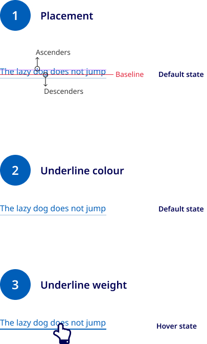
- Placement
Our underlines are placed 1px below the descenders of words. To ensure this scales proportionally to the text size we aim to define the offset value. This is set a sit wide variable that can be adjusted if different fonts are used.
- Colour
The following 4 colours are defined by the user to control the colour of underlines across different background colours. These colours define the default colour of the underline on the rest state. On hover the underline colour changes to the link text colour.
Light underline#3F7AB4
Light visited#8B63B0
Dark underline#B5CCE2
Dark visited#F2CDFF
- Underline weight
On hover the underline stays in same position, but the thickness increases and colour changes to the link text colour. The underline weight is defined by 2 variables. The rest state is 0.5px and the hover weight is 2px. Not all devices support half px values so on lower resolution devices the underline will display as 1px weight by default.
Research and rationale
To ensure that this design has a rock-solid foundation, the design process followed a problem-oriented rather than a solution-oriented approach. We approached this component design with the desire to have a solid and broad understanding of the requirements and challenges facing users of Queensland Government websites with varying levels of cognitive, literacy and visual ability. The end goal was to create an inclusive solution that improves the user experience for all users.
Researching the needs and challenges facing users with cognitive and visual difficulties followed Human Centred Design and Design Thinking principles. With this approach we were able to better understand the challenges experienced by different user groups, and could also uncover the root causes to these challenges. By understanding the root causes of each challenge we were able to confidently tailor a solution that addresses each challenge. These designs also meet WCAG AA compliance.
Underline to close to text
The underline is too close/overlaps text and visually looks like part of the word. It's harder to skim or read through blocks of content with underlines.
About this problem
Using “text-decoration: underline” the underline is very close to the baseline of text and overlaps letters with descenders, changing the overall shape of the word. For people who have difficulties with reading, this can make reading text which is underlined harder, and may result in misreading words and misunderstanding text.
How has this been addressed
The underline is moved 1px below text descenders to not obstruct any characters of a hyperlinked word. This is achieved by using the border-bottom and padding-bottom properties.
It's also recommended to follow the content writing style guides and avoid using too many hyperlinks within body copy.
Considering the needs of vision impaired users
About this problem
The solution must use familiar UI patterns and be accessible for users who are vision impaired (low vision, colour blind) or users who have low contrast screens/using a device in the sun. If the underline is to be removed the solution must meet 1.4.1: Use of Color (A).
How has this been addressed
The underline hasn't been removed from hyperlinks. The underline also meets accessibility requirements and has a minimum contrast of 4:5.1 to the background colour. On hover the underline increases in weight rather than changing colour which enables colour blind users to see the transition.
Rules were also created for how to present hyperlinks to ensure that expected, familiar and consistent UI patterns are used and WCAG requirements met.
Underlines make content or page layouts look busy
About this problem
Aesthetically when viewing a block of paragraph text, underlined hyperlinks create unbroken solid horizontal lines throughout the content, which can distract from reading the content.
How has this been addressed
The line thickness and colour of the underline is reduced so that visually the strength of the underline isn't the same as the rest of the text.
Progressive enhancement
Progressive enhancement in this design applies to the weight of the underline at a hyperlink's default state. Pixels in CSS are an abstract unit of measure and vary depending on the resolution of devices. On high resolution devices, a single CSS pixel may be displayed across 2 pixels. A fractional pixel will round up to the nearest whole number. This means that higher resolution devices can display thinner lines.
On lower resolution devices the underline will display as 1px weight. Higher resolution devices will display the underline at 0.5px, using a half width allowed us to continue to comply with 1.4.1 Use of Color (A) and 1.4.3 Contrast (Minimum) (AA) and present a more aesthetic and clean design.
Classes and design tokens
Design tokens
| Name | Description |
|---|---|
| The thickness of underlines on the rest state (0.5px). |
Copy | The thickness of underlines on the hover state (2px). |
Copy | The offer of underlines from the text (0.3em). |
| Colour of underlines for hyperlinks on light backgrounds during the rest state. |
$QLD-color-light-hover-underlineCopy | Colour of underlines for hyperlinks on light backgrounds during the hover state. |
$QLD-color-light-hover-visited-underline | Colour of underlines for visited hyperlinks on light backgrounds during the rest state. |
$QLD-color-dark-underline | Colour of underlines for hyperlinks on dark backgrounds during the rest state. |
$QLD-color-dark-hover-underline | Colour of underlines for hyperlinks on dark backgrounds during the hover state. |
$QLD-color-dark-hover-visited-underline | Colour of underlines for visited hyperlinks on dark backgrounds during the rest state. |
$QLD-color-system__underline--light | A default dark underline used on light alert colour backgrounds. |
$QLD-color-system__underline--dark | A default light underline used on dark alert colour backgrounds. |
Accessible underline requirements
Keep these considerations in mind if you're modifying the Design System or creating a custom component.
WCAG guidelines
Here are the WCAG 2.1 guidelines that apply to the AA level and are relevant to the design of underlines in hyperlinks.
1.4. Use of colour
Ensure that colour isn't the only visual means of conveying information. Underlines should be used to distinguish links from surrounding text so that colour isn't the sole indicator.
1.4.3 Contrast
The colour of the hyperlink text and its underline must have a contrast ratio of at least 4.5:1 with the surrounding text and background.
2.4.4 Link purpose
The purpose of each link should be clear from the link text alone. Underlines can be used to indicate that text has a function beyond plain text.
2.4.7 Focus visible
Ensure that the keyboard focus indicator is visible when hyperlinks are clicked and that the underline style matches the hover state.
1.4.8 Readable text (Level AAA)
Although this is Level AAA, considering it as a best practice is important. Be sure that underlines don't touch or overlap the text, which can make it harder to read.