
What's new
Details component
We’ve introduced a new Details component that lets users show and hide extra information on demand.
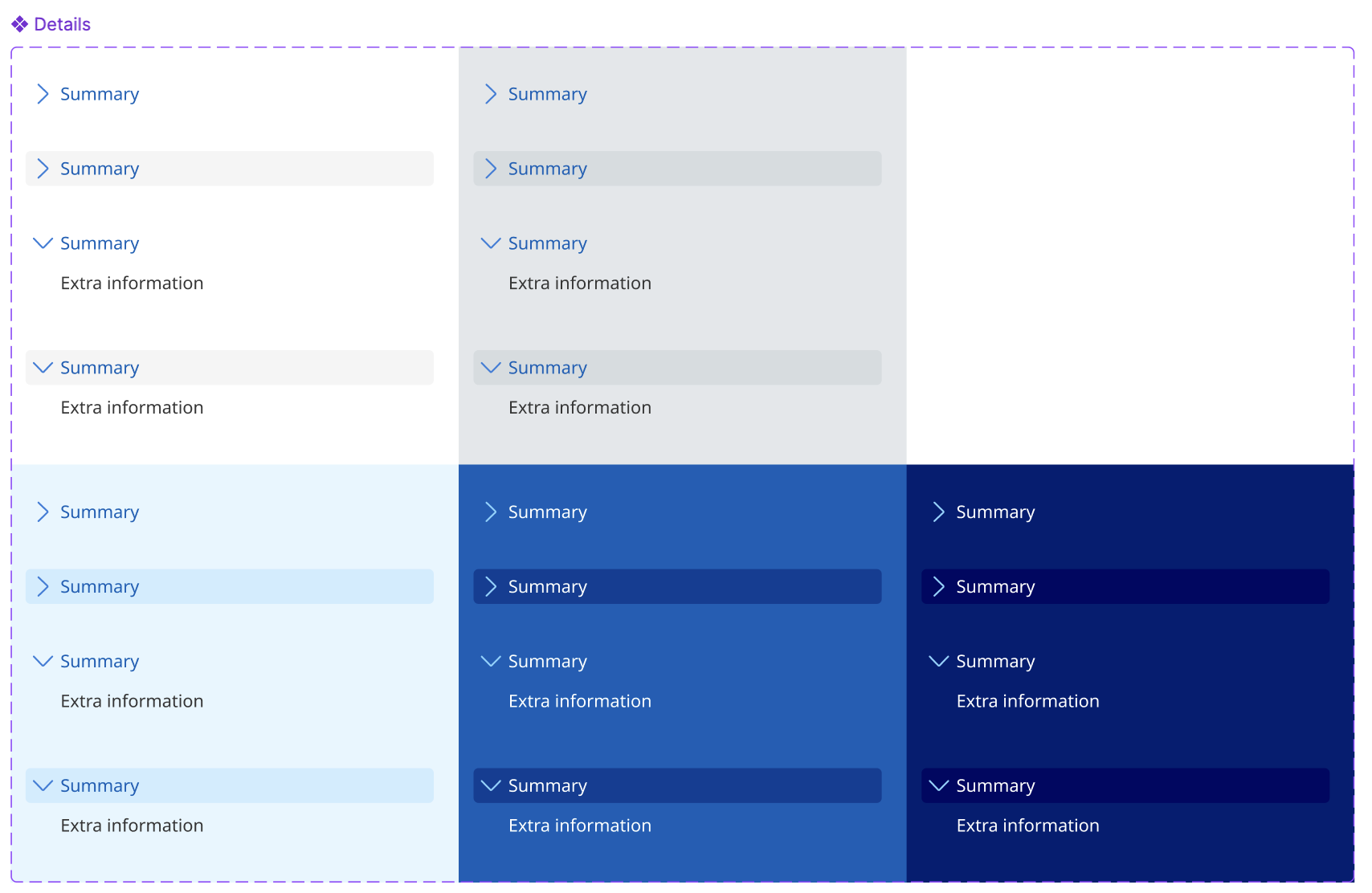
You can use the Details component
- for supplementary content that is only relevant to some users of the page
- for static inline help text, definitions or explanatory notes that would otherwise disrupt the reading flow
- when only one item needs to be disclosed, not a group of items.
The Details component is also available within form components such as Text input, Radio, Checkbox and Select - ideal for giving extra context right where users make a choice.
Read the full usage guidance for more information on when and how to use the Details component.
The Details component is also available in all QGDS code libraries.
Skip link component
We’ve introduced a new Skip link component to help keyboard and screen reader users bypass sections of repetitive content and quickly get to the main content of the page.
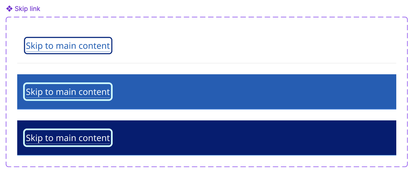
All Queensland Government websites should include a skip link that reads “Skip to main content”. It is visually hidden until it receives focus.
We'll notify you as soon as this Skip link update is available in QGDS code libraries. In the meantime, you can review the full usage guidance to see how it works.
What's changed
Back to top
We’ve deprecated the Back to top component and transitioned it to a pattern. As an inline element, it doesn’t require unique styles and simply uses the Direction link component. Pattern guidance is available to help consistent placement and usage across QGDS implementations.
Button, text input and search input
To resolve inconsistencies across the UI Kit and code, we’ve updated the height for button, text input and search input components to 52px.
We also took the opportunity to deprecate the separate Button leading icon and Button trailing icon components. You can now toggle leading and trailing icons on/off directly within the Button component.
Other UI Kit file usability improvements
Since the last minor version release (5.1.0) we’ve also published numerous patch fixes to the QGDS UI Kit file/library to ensure alignment to code or to improve usability for designers.
File upload - Label and hint text can now be independently visible. Refined the icon background for error states to better align with the error background, consistent across light and dark palettes.
CTA - Improved the way link text and icons respond on smaller screens, especially with longer labels that need to wrap across lines. Added a ‘Label’ component property to make it easier to update text.
Text link - Fixed focus outline alignment and width (now 3px). Added a Focus + Hover state.
Mobile nav btns - Fixed right padding of content in some variants to be 12px.
Footer base - Fixed content ordering so ‘contact us' button is below phone/email. Fixed deprecated icon component to point to latest icon component. Fixed some broken toggle properties.
Card - No-action, Multi-action and Single-action - Updated dark-alt variant to use dark-border-alt colour (not dark-border).
Global alert - Added exemplar content to further demonstrate correct usage, e.g. link text should be understandable without context.
v5.1.3
- Pagination buttons light and dark - Added auto-layout so that numbers are scalable beyond 2 digits. Fixed focus border to match standard 3px stroke.
- Basic Banner and Advanced Banner - Fixed content area widths to align with grid columns. Adjusted content to fill full-width at MD breakpoint for ‘no-image’ and ‘background texture’ variants. Fixed some image heights so they maintain 16:9 aspect ratio at SM and MD viewports.
- Banner-content / sm-xs - Fixed an issue with block style heading not overlapping image correctly. Corrected block style font size to be 28px instead of 32px.
v5.1.2
- Linked components - Icon and Illustration linked library components added to the UI Kit were updated to fix conflicts when components with nested icon/illustration instances are used in other files. This update may cause colour customisations to revert to QGDS colours, so please review when receiving this update.
- Single line code snippet - Fixed icon and colour.
- Footer base - Fixed light palette border colour below social links to be light/border/border-alt.
- Social links - Fixed light palette icon colour to be light/action/secondary.
- Tabs - Label and text - Updated icon to a more applicable example, fixed the title colour variable. Fixed Tabs btns to use neutral white background across all palettes. Fixed border colours in the sm variants of the Section Tabs.
- Link column list - Fixed gap from 12px to 8px to align with CTA and other large link elements.
- File status and File upload - Updated strokes to sit inside and be included in auto-layout which more closely matches the CSS box model, removed some unnecessary hidden layers, adjusted buttons to maintain standardised height and width.
v5.1.1
- Callout - Refactored component to simplify and be more aligned with code. Deprecated unnecessary base components.
- Radio - Fixed missing properties, duplicate layers and incorrect states.
- Updated underline styles across various components to match actual specifications.
- Text styles - Fixed font weight values for Heading 2 / XXXL, XXL and XL from Bold to Semi Bold.