
Design
Banner anatomy
Banner colours
All banners can use the 5 primary background colours set within the Queensland Government Colour system. This includes a white, light, light alternate, dark and dark alternative options. In addition to the 5 colours light and dark background textures can also be applied.
Feature headings (block style)
Feature headings are an optional style that can be used in the advanced banners. These headings use a contained block design that distinguishes the heading 1 style from other pages. It useful for specialised pages that need to stand out. It's also useful for page tiles that include a subheading.
Background patterns
Background patterns can be used in banners as a way of incorporating decorative elements and website branding. Background patterns are based on a tiled background image. This tiled image needs to be designed so that it can repeat seamlessly both horizontally and vertically.
Background patterns should be based on one of the four primary background colours of the websites colour palette. Background patterns use the same image for all screen sizes including mobile.
The benefit of using background patterns is that the images used for these can be much smaller than other image types used for banners which can help increase the performance of the page.
Care must be taken when designing background images and patterns to ensure they don't impact colour contrast for text.
Background images
Background images are recommended to be designed at 1600px 520px. This size best covers the majority of desktop screen sizes. On mobile displays the background image changes to a smaller branding strip (592x200px). This is because background images generally don't need the same screen real estate as other images.
When designing background images for desktop it's important to factor in colour contrast and image placement. Imagery should only appear on the far right and a considered approach should be taken for any patterns or designs placed in regions where text will appear.
Banner hero image options
There are 3 styles of images that can be used in advanced banners, grid aligned, right aligned and fixed ratio.
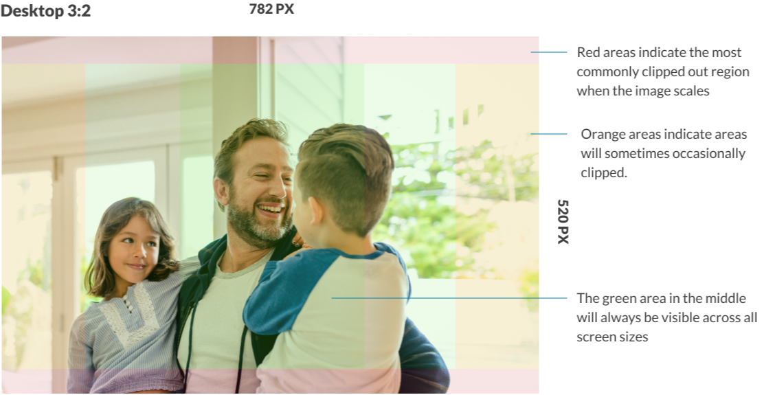
Specifications for hero images
Grid aligned and right aligned images should be designed at a size of 782px x 520px and care should be taken to ensure that the focal point is in the centre of the image as the outer sections will occasionally be clipped as the banner changes shape of different screen sizes. The Guidelines below indicate roughly where image clipping may occur.
Image sizes for fixed ratio style banners utilise the same dimensions as all other banners above. They key difference is that no area of the image will be cropped as the screen changes size. Instead, the image will shrink to fit the area. This means that the images won't always be same height of the banner and padding will appear above and below the image. When utilising graphical options, it's best to take this into consideration when crafting the image. Making use of transparency is a good way to create a more seamless design.
Combining image styles
Background images and patterns can be combined with hero images to create more complex designs. These styles default simpler patterns on mobile. The example below shows a background image combined with a fixed ratio image.
Research and rationale
The design of our banners was inspired by the NSW Design System banners (Digital NSW, n.d.) and Mozilla’s Protocols split pattern (Mozilla Protocol, n.d.). The designs have gone through multiple refinements as we've sort to craft a solution that allows designers to communicate the hierarchy of a sites structure, incorporate unique branding, imagery and maintaining these elements responsively over multiple screen sizes.
Our banner component allows more prominent pages such as home, landing and feature pages to use more advance banners that have a greater number of customisation options allowing them to appear distinct and important to the user. In contrast lower level pages in an IA can use simpler banner styles that take up less screen space and don't distract from the content of the page.
We chose to incorporate multiple colour options to give designers the ability to use colour to create visual hierarchy in their designs, we wanted designers to be able to use colour to help distinguish different pages on the site.
There are multiple hero-image and background-image options to allow for multiple graphic design approaches. We received feedback from stakeholders that finding images to fit banner designs often proves difficult especially when there is limited budget for photography or design. Our intention is that there are multiple options available for imagery and graphics will work with a variety of sizes and styles, this way users are not forced to source imagery.
Much of the testing we've done has been into the way images and content respond across different displays. The design of our banner component ensures that imagery responds so that the images focal point is always visible.