
Design
Anatomy
The anatomy of file breadcrumb consists of several elements:
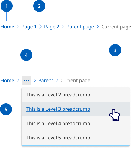
- Page link: Each segment within a breadcrumb is styled as a link, and directs users to the parent level page.
- Separator: Visual separator to distinguish between links.
- Current page title: Indicates the current page being viewed and is not styled as a link.
- Overflow menu: When space becomes limited due to viewport or long page titles, an overflow menu is used to reduce the number of breadcrumbs. The first and last page links are always shown, but remaining breadcrumbs are condensed into an overflow menu as required to fit the space.
- Overflow menu container: Contains the breadcrumb links that are been collapsed within the overflow menu when space is limited.
Research and rationale
Our breadcrumb design was based on the research and designs from DTA Design System that use a location based breadcrumb style which shows users where their current page stands in the hierarchy of a website.
The final item in our breadcrumb list isn’t a link. Another way to approach breadcrumbs is making the last item a link with the aria-current="page" attribute. Screen readers will announce to the user that they're on the current page.
Where our design differs from the DTA’s design is on mobile and table devices. On resolutions below 992 the breadcrumb shows a link to the immediate parent only. This is called single-level breadcrumb or back button breadcrumb and is an effective and intuitive design pattern for mobile. The choice was made to reduce complexity and vertical height in mobile designs (Laubheimer P, 2018).
Overflow behaviour
To reduce the proliferation of websites, we often have large websites with deep content. This can result in long breadcrumbs that break over multiple lines, taking up vertical space and adding cognitive load.
After considering various options, we found that an overflow menu provides the best user experience to solve this issue. An overflow menu manages space effectively and keeps the interface clean and easy to navigate.
Our approach ensures that all navigation paths are accessible without overwhelming users with lengthy or heavily truncated breadcrumb trails.
We chose the overflow menu because it is a familiar pattern in modern interfaces (used by IBM Carbon Design System, Atlassian Design System, Microsoft Fluent 2, Material Design), making it intuitive, accessible, and user-friendly.