
Overview
Overview
Call to action (CTA) link is a text-based link that is designed to prompt users to take a specific action, such as signing up for a newsletter.
CTA links are visually distinct instructions to users designed to provoke an immediate response using verbs such as 'call now' or 'find out more'.
Our CTA links are different to buttons which are typically larger and more visually prominent. While both CTA links and buttons are used to encourage users to take a specific action, the main difference between the two is the visual design.
CTA links are typically used for less important actions, such as linking to other important pages within a website while buttons are used for more important actions, such as submitting a form.
It's worth noting that the line between CTA links and buttons can be blurry, and the specific design and implementation of CTAs can vary depending on the website or application.
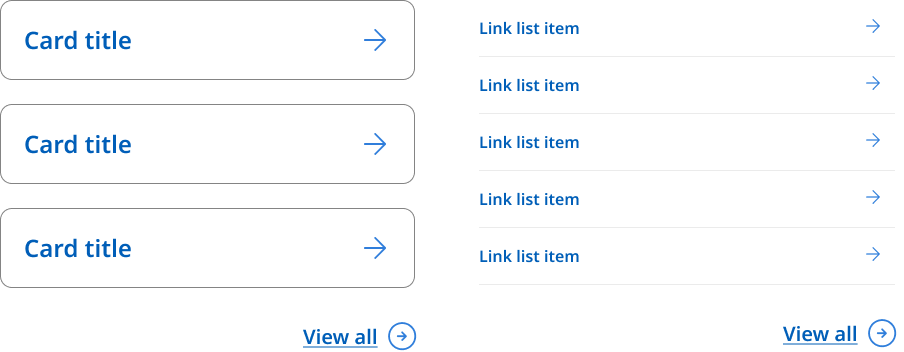
In our Design System we have 2 styles, a default and view all.
Default
A simple and clear link to direct users to a preferred action.
View all
When a CTA link appears at the end of link columns or drop down menus it uses a modified icon style for the arrow. This is so that it appears visually distinct and differentiated from other links and is not part of the proceeding list.
View all example
                <!--
  Default:   <a href="#" class="qld__cta-link">Sign up</a>
  View all:  <a href="#" class="qld__cta-link qld__cta-link--view-all">View all</a>
-->

<ul class="qld__link-list qld__margin-t-li--lg">
    <li><a href="javascript:void(0);" class="qld__cta-link">Sign up</a></li>
    <li><a href="javascript:void(0);" class="qld__cta-link qld__cta-link--view-all">View all</a></li>
</ul>
Usage guidelines
CTA links are more subtle than buttons and are often used for secondary or tertiary actions on a page.
It’s important to note, that a CTA link doesn’t need to use descriptive text like other hyperlinks.
When to use it
- Use a CTA when the action is less important than a primary action that already exists on a page.
- When the link is embedded in text.
When not to use it
- When there’s no specific action: A CTA link should lead the user to do a specific task, such as ‘Sign Up’ or ‘View all’. If the link isn't actionable, such as giving the user a link to reading more information or to an external website, it's better to style it as a regular hyperlink.
- A CTA link may not be necessary if the user can do the action through other means, such as a form, a button or a link in primary navigation. In this case, adding a CTA link may clutter the page and confuse the user.