
Design
Card anatomy
All cards follow a similar anatomy and structure and are available in 4 colours.
Colour
Unlike other components where the colour is determined by their content containers a cards colour is controlled independently from the background. Cards can use any of the 5 primary background colours as their base colour. The outer border colour however will respond to the background.
-
Default (no class)
This card has no colour modifying class applied.
-
Light
This card has the class qld__card--light applied.
-
Alt
This card has the class qld__card--alt applied.
-
Dark
This card has the class qld__card--dark applied.
-
Dark alt
This card has the class qld__card--dark-alt applied.
                <ul class="qld__card-list qld__card-list--matchheight">
    <li class="col-xs-12 col-md-6 col-lg-4 qld__card-list--matchheight qld__card-list--col">
        <!-- Default color card -->
        <div class="qld__card qld__card__action">
            <!-- Card Inner -->
            <div class="qld__card__inner">
                <!-- Card Content -->
                <div class="qld__card__content">
                    <div class="qld__card__content-inner">
                        <!-- Card Ttile -->
                        <h3 class="qld__card__title">
                            <a class="qld__card--clickable__link" href="javascript:void(0)">Default (no class)</a>
                        </h3>
                        <!-- Card Description -->
                        <p class="qld__card__description">
                            This card has no colour modifying class applied.
                        </p>
                    </div>
                </div>
            </div>
        </div>
    </li>
    <li class="col-xs-12 col-md-6 col-lg-4 qld__card-list--matchheight qld__card-list--col">
         <!-- Light color card -->
        <div class="qld__card qld__card--light qld__card__action">
            <!-- Card Inner -->
            <div class="qld__card__inner">
                <!-- Card Content -->
                <div class="qld__card__content">
                    <div class="qld__card__content-inner">
                        <!-- Card Ttile -->
                        <h3 class="qld__card__title">
                            <a class="qld__card--clickable__link" href="javascript:void(0)">Light</a>
                        </h3>
                        <!-- Card Description -->
                        <p class="qld__card__description">
                            This card has the class <strong>qld__card--light</strong> applied.
                        </p>
                    </div>
                </div>
            </div>
        </div>
    </li>
    <li class="col-xs-12 col-md-6 col-lg-4 qld__card-list--matchheight qld__card-list--col">
        <!-- Alt color card -->
        <div class="qld__card qld__card--alt qld__card__action">
            <!-- Card Inner -->
            <div class="qld__card__inner">
                <!-- Card Content -->
                <div class="qld__card__content">
                    <div class="qld__card__content-inner">
                        <!-- Card Ttile -->
                        <h3 class="qld__card__title">
                            <a class="qld__card--clickable__link" href="javascript:void(0)">Alt</a>
                        </h3>
                        <!-- Card Description -->
                        <p class="qld__card__description">
                            This card has the class <strong>qld__card--alt</strong> applied.
                        </p>
                    </div>
                </div>
            </div>
        </div>
    </li>
    <li class="col-xs-12 col-md-6 col-lg-4 qld__card-list--matchheight qld__card-list--col">
        <!-- Dark color card -->
        <div class="qld__card qld__card--dark qld__card__action">
            <!-- Card Inner -->
            <div class="qld__card__inner">
                <!-- Card Content -->
                <div class="qld__card__content">
                    <div class="qld__card__content-inner">
                        <!-- Card Ttile -->
                        <h3 class="qld__card__title">
                            <a class="qld__card--clickable__link" href="javascript:void(0)">Dark</a>
                        </h3>
                        <!-- Card Description -->
                        <p class="qld__card__description">
                            This card has the class <strong>qld__card--dark</strong> applied.
                        </p>
                    </div>
                </div>
            </div>
        </div>
    </li>
    <li class="col-xs-12 col-md-6 col-lg-4 qld__card-list--matchheight qld__card-list--col">
        <!-- Dark-alt color card -->
        <div class="qld__card qld__card--dark-alt qld__card__action">
            <!-- Card Inner -->
            <div class="qld__card__inner">
                <!-- Card Content -->
                <div class="qld__card__content">
                    <div class="qld__card__content-inner">
                        <!-- Card Ttile -->
                        <h3 class="qld__card__title">
                            <a class="qld__card--clickable__link" href="javascript:void(0)">Dark alt</a>
                        </h3>
                        <!-- Card Description -->
                        <p class="qld__card__description">
                            This card has the class <strong>qld__card--dark-alt</strong> applied.
                        </p>
                    </div>
                </div>
            </div>
    </li>
</ul>
Card structure
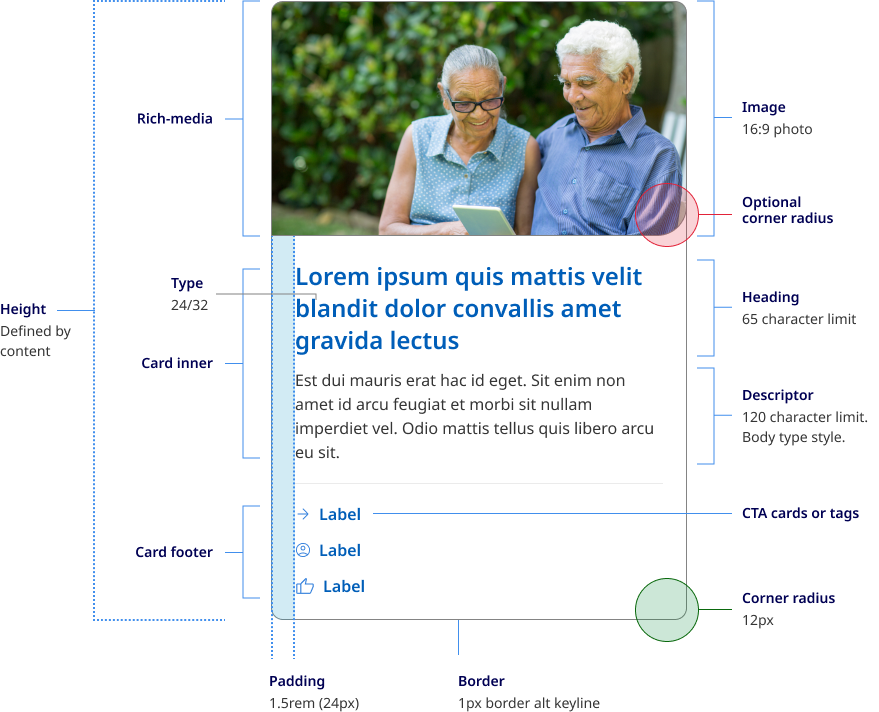
A card is container for a few short, related pieces of information. It roughly resembles a playing card in size and shape, and is intended as a linked, short representation of a conceptual unit (Nielsen Norman Group, 2016). All cards share anatomy that is comprised of 3 main sections, rich-media, card Inner and card footer.
The rich media section houses card images, icons or video thumbnails. Cards images use fixed image ratio of 16:9 and the Qld responsive image class.
The section houses the card title, description and in news cards a date.
The card footer is used to guide users to the call to action or to tags that may support the article content.
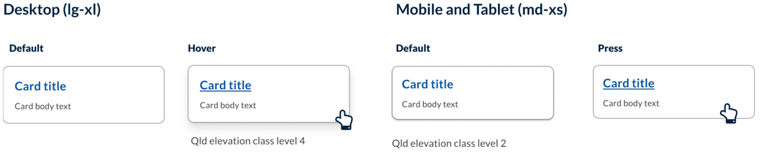
Card elevation
On desktop, cards have a shadow on hover. This is reversed on mobile. The subtle shadow on mobile helps to indicate that the card is an interactive component.
Icons and images
Using visual elements (such as images or icons) in cards allows for different content to stand out and provide additional context. It helps users visualise different pieces of information and quickly distinguish between content to find information easily (Digital NSW n.d.).
In our Design System you can choose to use custom iconography in the rich-media section.
Any visual elements should:
- re-enforce the content to the user
- be easily identified
- not be used for decorative purposes only.
Research and rationale
The design of our components started with DTA as a foundation, functionality and features were added after an extensive review of other Design Systems and best practice research. Our visual designs were heavily influenced by Victoria’s ripple Design System (State Government of Victoria, 2022) and Google’s Material Design (Material Deign, n.d.) and Nielson Norman UI-Component Definition (Laubheimer, 2016).
Some of the key areas we investigated when designing our cards was the use of curved edges, behaviour of single action vs multiple action cards, hover states and elevation styles, integrating action buttons and designing cards for articles and new page layouts.
Curved edges
We've used curved edges in our card design to help create a softer, more approachable look for cards. The curved edge creates a stronger visual distinction between cards and other design elements on a page, making it easier for users to identify and interact with cards.
Furthermore, Plasq designer, Keith Lang in his article on rounded corners offers a quote from Professor Jürg Nänni an authority on visual cognition who states
A rectangle with sharp edges takes indeed a little bit more cognitive visible effort than for example an ellipse of the same size. Our “fovea-eye” is even faster in recording a circle. Edges involve additional neuronal image tools. The process is therefore slowed down.”
Professor Nänni is saying that rounded corners have been found to take less cognitive load to see than it does to see sharp-cornered ones and are more computationally efficient for the human brain.
You may also notice that image cards have an intern curved edge on the bottom right corner. This was an intentional design choice to help visually connect the image with the description. It also creates a very subtle visual design similar to that of a speech bubble whilst giving our Design System cards their own unique flare.
Multi-action behaviour
Best practice and research conducted by the DTA indicated that when a card had a single link the whole region of the card must be clickable and however what we encountered was need from our users to have cards that included multiple clickable regions for links like news articles that included clickable tags or facility cards that had multiple navigational options (Digital Transformation Agency, 2018).
Our solution was to a create a new variety of cards which we tabled multi-action. The behaviour of these cards included having different hover, focus states and keyboard navigation. Unlike single action cards, only the actions within the card have a hover state and the entire card no longer has an elevation on hover.
Card actions, tags and buttons
Material Design guidelines by Google recommend limiting the number of actions in a card to no more than four or five (Material Design, n.d.). And Microsoft fluent suggest a best practice, include 1-3 actions (Microsoft, 2021). This is based on the principle that "less is more" when it comes to user interface design, and that too many options can lead to decision paralysis and user frustration.
Similarly, the Human Interface Guidelines recommend limiting the number of actions in a card to a small, manageable set that is essential to the user's task. They suggest grouping related actions together and presenting them in a clear and organised way to help users quickly find and access the functionality they need (Apple Inc., n.d.).
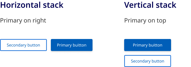
For these reasons we have based our card action designs around 3 modified CTA style links that can include an icon and are placed in a list within the footer of the card. These are known as supplemental actions or secondary actions. Research from both our comparative review and material design also suggested that the best placement for these was on the bottom left of the card this placement supported by both material design and the original DTA card structure. As an alternative to the card actions, users can also include clickable or clickable tags in the footer area. These were included to support the best practice approach to the design of new article cards which we established in our comparative review of card designs.
If a user wants to include buttons in their card it's important that these are also placed in the footer. If a secondary and primary action button are included the best practice research as well as our comparative review suggests that in small windows, the primary action button should be placed at the bottom right while the secondary action appears on the left.
However if the action is destructive, rather than reducing friction and making it easy for the user to execute the action, destructive actions should introduce friction to make the user pause before continuing, and alternative approaches should be sort for these situations such as requiring the the user to confirm the action or take an extra step such as writing the word DELETE to ensure they really want to take a destructive action (Carlson B, n.d).
Arrow links
One of the new styles we added to our cards was what are called Arrow links. In our Design System we have developed a consistent approach to the use of arrows and chevrons. In all cases where an arrow is used this indicates a link that takes you from page to page. Because this is a common function of a card and was also a common pattern found on cards in our comparative review, we added a trailing arrow icon to our default action cards as a new option for users.
Elevation
Our card elevation patterns and style take direction from material design but use our Design System elevation styles. Material design suggests having 2 distinct forms of elevation for mobile and desktop.
On desktop, cards by default have no resting elevation rather using an outline to indicate the card component. These cards only have an elevation on hover. On mobile, cards have a small default elevation which helps reintroduce visual depth as a signifier of click-ability (Laubheimer P 2016).