
Design research and rationale
Grounded in cross-industry design system precedent
The QGDS Details component is based on the GOV.UK Design System Details component, which has been tested with real government service users and is built on the same native <details> and <summary> HTML elements. Gov.UK's research established that the pattern is well understood by users when the summary label is clear and descriptive.
Beyond Gov.UK, the component draws on progressive disclosure patterns from three major commercial design systems, each of which independently validated the same core pattern across different product contexts:
- GitHub Primer established progressive disclosure as a first-class interaction pattern with clear guiding principles, including pairing disclosure controls with descriptive text and avoiding interactions that disorient the user's initial point of focus. The Primer Details component is a styled wrapper that enhances the native
<details>element with a button-driven summary trigger, demonstrating how the native pattern can be extended for production use in a design system at scale. - AWS Cloudscape Expandable Section demonstrates the pattern's suitability in complex, information-dense enterprise interfaces where progressive disclosure reduces cognitive load without sacrificing access to detail.
- Salesforce Lightning Design System Summary Detail shows a comparable disclosure pattern applied inside dense data contexts, validating the trigger-and-panel model as intuitive to a broad range of users.
The convergence of this pattern across government, developer tooling, cloud infrastructure, and CRM contexts gives confidence that the Details component addresses a genuine, widely understood user need.
Distinct from the Accordion component
The Details component and Accordion serve different purposes and should not be used interchangeably. The Accordion is designed for groups of related content sections and includes "Open all" / "Close all" controls for groups of two or more panels. The Details component is for a single standalone disclosure, for example, a definition, a description, or a help note adjacent to a form field.
Using a single Accordion panel where a Details component is appropriate adds unnecessary visual weight and interactive complexity to a page.
Chevron icon
Chevrons are used rather than plus/minus icons or triangles, consistent with the Accordion component. Plus and minus carry additive and subtractive connotations in form contexts, which creates ambiguity when used as a disclosure toggle (Laubheimer and Budiu 2020). The chevron is also consistent with other QGDS interactive controls that reveal additional content or options, including the Select component and the Accordion. This consistency across components creates a unified visual language where a chevron signals "more is available."

While the Details component shares the chevron icon with the Accordion, it differs in both position and default direction.
The Accordion places the chevron at the far right of a full-width bordered trigger row. That container makes the interactive area self-evident, so the icon can sit at a distance from the label. The Details component has no equivalent container, without a border or background to define an interactive region, a right-aligned chevron loses its visual relationship to the label, especially at wider viewports.
Placing the chevron to the left of the summary label keeps the icon-plus-label unit visually cohesive and reads as a single interactive control. This positioning also aligns the icon with the leading edge of QGDS validation message text, reinforcing the component's visual relationship to adjacent form elements when used in an input group.
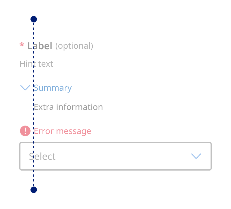
The chevron points to the right in the collapsed state and rotates downward when the panel opens (the inverse of the Accordion). This matches the convention used by Gov.UK, GitHub Primer, AWS Cloudscape, and Salesforce Lightning in their disclosure components, and better suits a left-positioned icon: a right-facing chevron points toward the label and the content it controls, while a downward-facing chevron in the left position risks being read as pointing to the content below rather than indicating the collapsed state.
States
The interactive states of the Details component: default, hover, focus, and expanded, were designed to be consistent with other QGDS components that follow a trigger/disclosure model, including buttons, tabs, and accordions. Users who are familiar with how these components behave can transfer that understanding to the Details component without relearning.
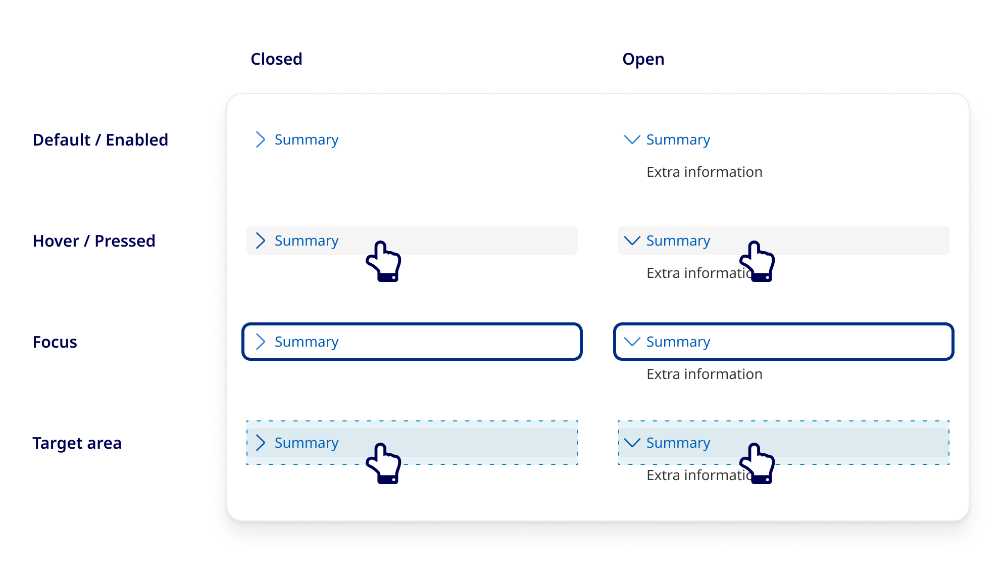
While using the link style underline was considered in earlier iterations of the Details component, research from GOV.UK found evidence the behaviour of a Details component could be misconstrued when styled like a link, so we opted to use a background colour for visual state changes instead. During usability testing, we found no adverse affects of removing the underline link style and relying solely on the icon and colour (for sighted users) as interactive cues.
Each state uses the same visual tokens (colour, border, focus ring) as its functional equivalents in other components. This approach reduces the design system's surface area for visual decision-making and ensures components behave predictably as a system rather than as isolated widgets.
Placement within a form
When the Details component is used inside a form, for example, to provide additional context for a specific field, the position of the component within the input group was considered carefully. The question was whether it made more sense to place the Details component before or after the associated input control.
The decision to place Details after the hint text and before the input control reflects how users typically read a form field: label first, then any clarifying hint text, then any additional information they need before committing an answer, then the input itself. Placing Details after hint text but before the input means users encounter supplementary information at the moment in the reading sequence when they are most likely to need it, before they begin entering data, not after.
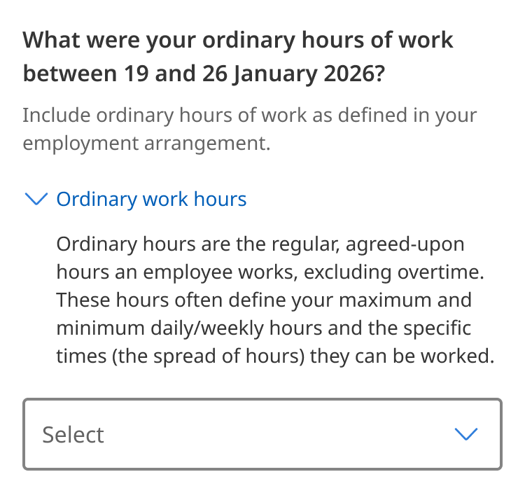
This ordering is also validated by accessibility requirements. WCAG 1.3.2 Meaningful Sequence (A) requires that when the order of content affects its meaning, that order is reflected in the DOM and not produced artificially through CSS or JavaScript. Placing the Details component in its logical visual position in the DOM, rather than reordering it programmatically for screen reader users, ensures that both sighted and non-sighted users encounter the same information in the same sequence (W3C 2023).