
Overview
The Details component lets users show and hide extra information on demand.
Help with marital status
- A de facto relationship involves two people, of the same or opposite sex, who are not legally married, not related, and live together as a couple.
- If in a de facto relationship without a registered marriage, choose ‘Never married’.
- For individuals under 15, select ‘Never married’.
- If divorced or widowed, and remarried, select ‘Married’.
- If divorced and not remarried, select ‘Divorced’, even if in a de facto relationship.
- ‘Separated but not divorced’ means separation from a registered marriage.
- ‘Married’ includes registered marriages and traditional Aboriginal and Torres Strait Islander marriages.
                <!-- Queensland Government Design System: Details component -->

<details id="details-component-1" class="qld__details qld__details--md">
    <summary class="qld__details__summary">
        <span class="qld__details__summary-text">
            <svg class="qld__icon qld__details__icon" aria-hidden="true" xmlns="http://www.w3.org/2000/svg">
                <use
                    href="https://www.designsystem.qld.gov.au/__data/assets/git_bridge/0027/169317/dist/mysource_files/img/QLD-icons.svg#chevron-right"
                ></use>
            </svg>
            Help with marital status
        </span>
    </summary>

    <!-- Content revealed when the details component is expanded -->
    <div class="qld__details__content">
        <ul>
            <li>
                A de facto relationship involves two people, of the same or
                opposite sex, who are not legally married, not related, and
                live together as a couple.
            </li>
            <li>
                If in a de facto relationship without a registered marriage,
                choose ‘Never married’.
            </li>
            <li>
                For individuals under 15, select ‘Never married’.
            </li>
            <li>
                If divorced or widowed, and remarried, select ‘Married’.
            </li>
            <li>
                If divorced and not remarried, select ‘Divorced’, even if in
                a de facto relationship.
            </li>
            <li>
                ‘Separated but not divorced’ means separation from a
                registered marriage.
            </li>
            <li>
                ‘Married’ includes registered marriages and traditional
                Aboriginal and Torres Strait Islander marriages.
            </li>
        </ul>
    </div>
</details>
Usage guidelines
When to use it
- If content is supplementary and only relevant to a subset of users on the page.
- If static inline help text, definitions, or explanatory notes would disrupt the reading flow.
- If only a single item needs to be disclosed (not a related group of sections).
- If you want to give users agency over whether they see additional context, without removing it from the page entirely.
When not to use it
- If most users are likely to need the content; display it in full instead, as hiding critical information increases cognitive effort (Loranger 2014).
- If you have multiple related sections to show and hide, use the Accordion group component instead, which is designed for grouped disclosure.
- If the content is a primary action or step in a task (do not hide required information behind a disclosure toggle).
- If the content is so short it can be included inline without disrupting the page (a single sentence does not warrant a disclosure widget).
- If you need to disclose content as part of a form (consider whether a well-written label or hint text is more appropriate).
How to use
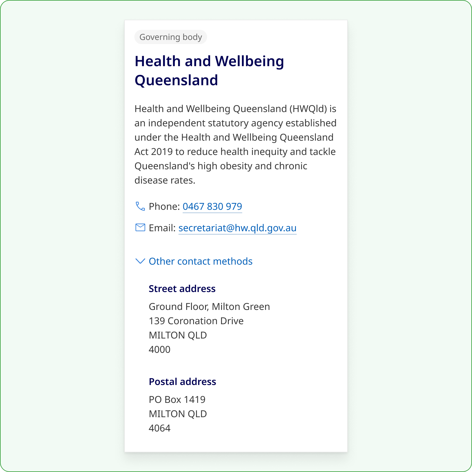
Do
Use Details to display additional information that is less frequently needed so users can decide what to see.
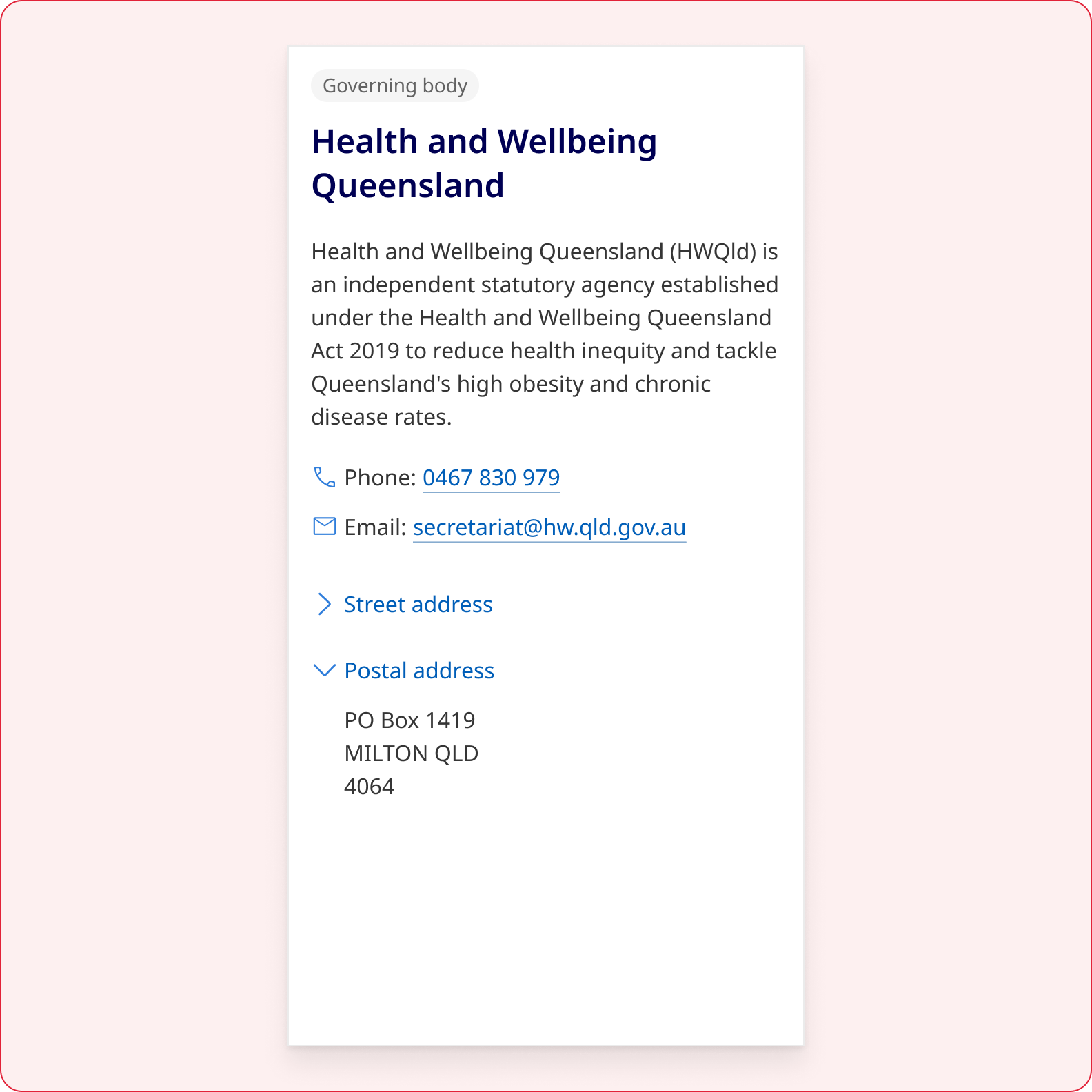
Don't
Don't use multiple Details components to group related information into stacked sections. Instead use Accordion.
Write clear labels
The <summary> label is the only visible text when the component is collapsed, so it carries the full responsibility of helping users decide whether to open the panel.
- Describe the content directly, for example, "Eligibility criteria" rather than "Find out if you are eligible".
- Use nouns rather than gerunds where possible.
- Stay under 10 words unless a longer phrase is genuinely needed for clarity.
- Avoid verbs like, 'Show' and 'See' as they describe the action of the component and become inaccurate once opened, producing contradictions for both sighted users and screen readers.
- Avoid filler words like, 'More' to reduce repetitiveness and improve the ability to quickly scan content.
- Avoid ending in a full stop.
Write succinct content
- The content inside the panel should be self-contained: it must make sense on its own without requiring the user to read surrounding page content first.
- Keep panel content concise, if it runs longer than a few short paragraphs, consider whether the information belongs on a separate page or within the main body of the page.
Choose a colour palette for the context
The Details component adapts to all five QGDS section colour palettes. Always match the component palette to the surface it sits on, do not place a Default variant on a Dark alternate section, for example, as this breaks the visual consistency of the section.
Adjust the size for content sections
Choose size based on surrounding elements and appropriate information hierarchy.
| Size | Font size | Forms | Content | Use |
|---|---|---|---|---|
| Small (SM) Default | 0.875rem / 14px | Suitable for most content contexts and all form contexts | ||
| Medium (MD) | 1rem / 16px | Use when the component sits alongside body text at base size | ||
| Large (LG) | 1.25rem / 20px | Use when a more prominent disclosure trigger is needed | ||
| Extra Large (XL) | 1.5rem / 24px | Use sparingly for high-prominence disclosure in editorial or landing pages |
Details versus Accordion
Although both Details and Accordion are similar in nature, there is a difference between the components.
| Details | Accordion | |
|---|---|---|
| Visual example | 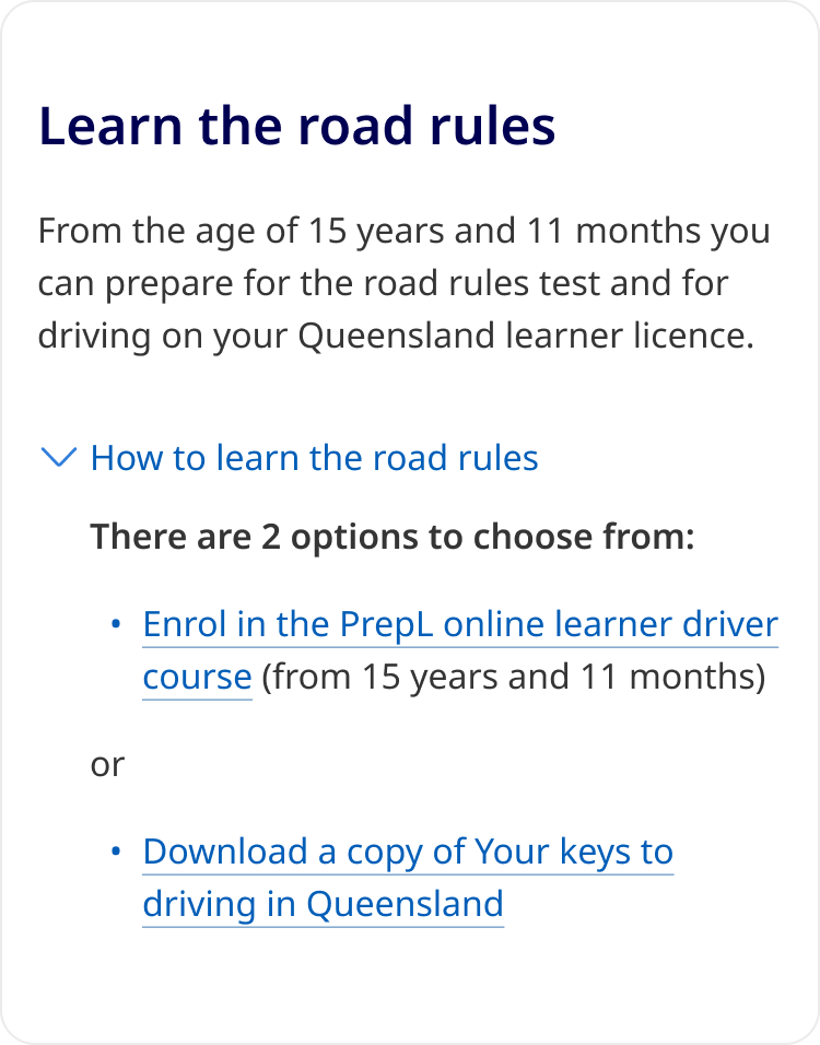
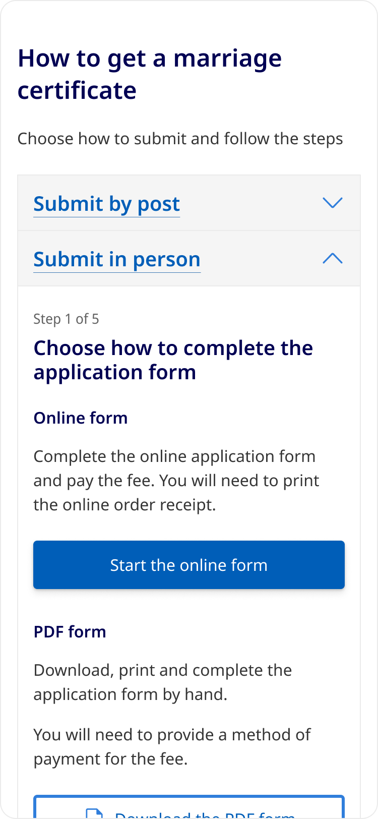
| 
|
| Structure | An interactive label that can be toggled to show or hide content. |
A vertical stack of contained headings that can be toggled to show or hide content. A stack of 3 or more can include an optional Open/Close all button to toggle all sections at once. |
| Use case | For additional content that is optional or less frequently needed. Often used in forms, descriptions and definitions. | For displaying a set of related information. Often used to chunk sections of content that are only relevant to some users. |
| Presentation | Subdued to reveal content within a continuous flow (part of the content). | Prominent and visually segmented with headings for each section. |
| Relationships | Extending content beyond the initial presentation (like a form input). | Suitable for grouped information. |
| Icon placement | Left | Right |
| Icon treatment |
chevron-right (collapsed) chevron-down (expanded) |
chevron-down (collapsed) chevron-up (expanded) |