
Design
Input field anatomy
The anatomy of input fields in our design system consists of several elements:

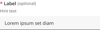
- Labels: Labels are headings that identify the purpose or context of the input field. For example, a label might say "First Name" to indicate that the user should enter their first name in the text field. Standard label alignment is left-aligned with the field underneath. Labels are mandatory on all fields with some exceptions such as search fields used in the header.
- Hint/Helper text: Helper text conveys additional guidance about the input field, such as how it will be used. It should only take up a single line and be persistently visible.
- Required field indicators: To indicate that a field is required, display an asterisk (*) next to the label text and mention at the start of the form that asterisks indicate required fields.
- Optional field indicators: Optional field indicators indicate that a field is optional. Clearly indicate optional fields by displaying the word ‘optional’ in parentheses next to the label text.
- Placeholder text: Hints at what goes into a field. Placeholder text is optional. It should always be avoided unless communicating complex formatting requirements.
- Trailing icons: Trailing icons are optional, they're often used to convey additional field functionality or options. This space should also be reserved to fit icons that some browsers might insert into the input (for example to show or generate a password) (UK.GOV n.d).
- Validation messages
- Error messages: When text input isn't accepted, an error message can display instructions on how to fix it. Error messages are displayed above the input line.
- Success messages: When text input is accepted, a message can display to the inform the user. This is useful in situations like password generation where you can let the user know their password has met syntax requirements.
Visual style
Within our Design System we have 2 styles of input fields, outlined and filled.
Outlined text fields

Outlined text fields have more visual emphasis than filled text fields, making them stand out when surrounded by other content or components.
Filled text fields
Filled text fields have less visual emphasis than outlined text fields. They work best where there are many text fields that are placed together to reduce the visual weight of complex forms.
Input field sizes
Use the width of a text input field to suggest the length of information it should contain. It provides a visual guide for users. For instance, a postcode input field should be narrower than an email field.
By default, the width of text inputs is fluid and will fit the full width of the container they're placed into. If you want to make the input smaller, you can either use a fixed width input, or use the width override classes to create a smaller, fluid width input.
Fluid width
There are 4 fluid widths for text-boxes.
                <!--
  Full:  <input class="qld__text-input--block">
  3/4:   <input class="au-text-input qld__field-width--3-quarters">
  Hlaf:  <input class="au-text-input qld__field-width--half">
  1/4:   <input class="au-text-input au-text-input--width-lg">

-->
    <!-- Full -->
    <div class="qld__form-group">
        <label for="text-field-id-1" class="qld__label">
            <abbr title="required">*</abbr>
            Text-field label
        </label>
        <span class="qld__hint-text" id="text-field-hint-1">Hint text</span>
        <input type="text" id="text-field-id-1"
            class="qld__text-input qld__text-input--block" aria-required="true"
            aria-describedby="text-field-hint-1">
    </div>
    <!-- 3 Quarters -->
    <div class="qld__form-group">
        <label for="text-field-id-2" class="qld__label">
            <abbr title="required">*</abbr>
            Text-field label
        </label>
        <span class="qld__hint-text" id="text-field-hint-2">Hint text</span>
        <input type="text" id="text-field-id-1"
            class="qld__text-input qld__text-input--block qld__field-width--3-quarters" aria-required="true"
            aria-describedby="text-field-hint-2">
    </div>
    <!--Half -->
    <div class="qld__form-group">
        <label for="text-field-id-3" class="qld__label">
            <abbr title="required">*</abbr>
            Text-field label
        </label>
        <span class="qld__hint-text" id="text-field-hint-3">Hint text</span>
        <input type="text" id="text-field-id-3"
            class="qld__text-input qld__text-input--block qld__field-width--half" aria-required="true"
            aria-describedby="text-field-hint-3">
    </div>
    <!-- 1 Quarter -->
    <div class="qld__form-group">
        <label for="text-field-id-4" class="qld__label">
            <abbr title="required">*</abbr>
            Text-field label
        </label>
        <span class="qld__hint-text" id="text-field-hint-4">Hint text</span>
        <input type="text" id="text-field-id-4"
            class="qld__text-input qld__text-input--block qld__field-width--1-quarter" aria-required="true"
            aria-describedby="text-field-hint-4">
    </div>
Fixed width
There are 6 preset widths for text-boxes based on character numbers. Use fixed width inputs for content that has a specific, known length. Postcode inputs should be postcode-sized, telephone number inputs should be telephone number-sized.
Width is determined by the widest character which in most cases is capital ‘W’.
                <!--
20 Characters:  <input class="qld__text-input--block qld__field-width--20char">
10 Characters:  <input class="au-text-input qld__field-width--10char">
5 Characters:   <input class="au-text-input qld__field-width--5charf">
4 Characters:   <input class="au-text-input qld__field-width--4char">
3 Characters:   <input class="au-text-input qld__field-width--3char">
2 Characters:   <input class="au-text-input qld__field-width--2char">
-->
    <!-- 20 Characters -->
    <div class="qld__form-group">
        <label for="text-field-id-1" class="qld__label">
            <abbr title="required">*</abbr>
            Text-field label
        </label>
        <span class="qld__hint-text" id="text-field-hint-1">Hint text</span>
        <input type="text" id="text-field-id-1"
            class="qld__text-input qld__text-input--block qld__field-width--20char" aria-required="true"
            aria-describedby="text-field-hint-1">
    </div>
    <!-- 10 Characters -->
    <div class="qld__form-group">
        <label for="text-field-id-2" class="qld__label">
            <abbr title="required">*</abbr>
            Text-field label
        </label>
        <span class="qld__hint-text" id="text-field-hint-2">Hint text</span>
        <input type="text" id="text-field-id-1"
            class="qld__text-input qld__text-input--block qld__field-width--10char" aria-required="true"
            aria-describedby="text-field-hint-2">
    </div>
     <!-- 5 Characters -->
    <div class="qld__form-group">
        <label for="text-field-id-3" class="qld__label">
            <abbr title="required">*</abbr>
            Text-field label
        </label>
        <span class="qld__hint-text" id="text-field-hint-3">Hint text</span>
        <input type="text" id="text-field-id-3"
            class="qld__text-input qld__text-input--block qld__field-width--5char" aria-required="true"
            aria-describedby="text-field-hint-3">
    </div>
    <!-- 4 Characters -->
    <div class="qld__form-group">
        <label for="text-field-id-4" class="qld__label">
            <abbr title="required">*</abbr>
            Text-field label
        </label>
        <span class="qld__hint-text" id="text-field-hint-4">Hint text</span>
        <input type="text" id="text-field-id-4"
            class="qld__text-input qld__text-input--block qld__field-width--4char" aria-required="true"
            aria-describedby="text-field-hint-4">
    </div>
     <!-- 3 Characters -->
       <div class="qld__form-group">
        <label for="text-field-id-5" class="qld__label">
            <abbr title="required">*</abbr>
            Text-field label
        </label>
        <span class="qld__hint-text" id="text-field-hint-4">Hint text</span>
        <input type="text" id="text-field-id-5"
            class="qld__text-input qld__text-input--block qld__field-width--3char" aria-required="true"
            aria-describedby="text-field-hint-5">
    </div>
    <!-- 2 Characters -->
       <div class="qld__form-group">
        <label for="text-field-id-6" class="qld__label">
            <abbr title="required">*</abbr>
            Text-field label
        </label>
        <span class="qld__hint-text" id="text-field-hint-6">Hint text</span>
        <input type="text" id="text-field-id-6"
            class="qld__text-input qld__text-input--block qld__field-width--2char" aria-required="true"
            aria-describedby="text-field-hint-6">
    </div>
Research and rationale
Like most of our components input fields started off using the DTA designs as a base. As our Design System progressed, we saw a need to include additional styles with less visual weight as well as to investigate this pattern as a whole to understand why other Designs Systems had diverged from the original DTA patterns.
To inform our design choices we collated best practice research from a number of sources such as the Nielsen and Normans group articles, industry leaders, guidelines from Google's Material Design and the UK.GOV’s Design System and the IBM carbon Design System and experts such as author of Form design patterns book Adam Silver whose work focuses on highly accessible form patterns and the original sited research used by the DTA.
We also conducted a comparative review of forms patterns, looking at widths, heights, layout and features used by:
Borders
Based on research and advice from a third party accessibility audit of our components we chose to continue to use thick borders for our input boxes as seen in the DTA, borders must use the secondary-alt border colour which is crafted to meet a 3:1 minimum colour contrast ratio, W3C guidelines. Graphical objects that are very thin are harder to perceive, therefore have a higher contrast requirement of 4.5:1. Graphical objects that are thicker or are solid shapes have a lower requirement of 3:1. 1px is considered thin and 3px is considered thick. Because our forms are using 2px borders we opted to ensure our contrast ration actually closer to 4.5.
Outlined and filled styles
Some of the feedback we received on the current form component was that the thick and dark border styles often looked out of place with the rest of the page or when a form element was in an isolated location. We noticed that most other Design Systems reduced the border thickness to-compensate for this. As we didn't want to compromise the accessibility of our forms, we looked to our comparative analysis of forms patterns to see if there was an alternative approach to resolve this problem.
Our solution came from IBM Carbon, Microsoft Fluent and Google’s Material Design all of which employ a secondary form style called ‘Filled’. This style uses only a solid border at the base of the form and then different background colour shade for the fill. Within our Design System having only the 2px solid border at the base can soften the overall visual weight of the form field as well as give the form design a more modern aesthetic.
Both types of text fields use a container to provide a clear affordance for interaction, making the fields discoverable in layouts.
Size
During our review of Design Systems, we determined that the average size for a form field was between 32px and 48px high. This aligns with Apples Apple's Human Interface Guidelines and Google's Material Design Guidelines that recommend touch points should be at least 44px, Adam Silver also reinforces this with his recommendations that 44px height or more is good to ensure they're easy to tap (Silver, 2019).
In our Design System we chose to follow the NSW input components which used a height of 48px as this worked nicely with our underlying grid pattern and allowed for generous white spacing.
Colour
They often still work on light alternative and dark alternative backgrounds but care should be taken to check and ensure there are not contrast issues. It is recommended where possible to use only light or dark backgrounds for long forms for best performance.
Behaviour
One of the elements that was missing from the DTA’s form components that we discovered in our comparative review was the inclusion of a hover state for form elements. We chose to include this as an additional indicator to users that the form field is a clickable element, this was also consistent with Google Material Design’s (n.d) approach to text field behavior. In our component the hover state changes the border to colour to use the ‘Primary action colour’ which we have established with our Design System as an indicator of an interactive element.
When testing form behaviour, we also discovered that it made sense to use a consistent focus state for both the filled and outlined style of forms. The focus state which includes a 3px outline that surrounds the form element and a white background colour ensures optimum contrast for the user when they're inputting text. Making this state standout also aligns with Material Design guidance on focus states, suggesting that they should be highly emphasised and signified by an overlay, colour change.
Creating consistency wherever possible is part of our design principles and keeping focus states the same across all input fields aligns with this. Our belief is that it will help users recognise they're interacting with a form element no matter what its starting visual appearance is. This will be useful if a designer has used outlined and filled styles for different forms across the same website.
Hint messages
According to Material Design (n.d) best practice for hint messages is that they should only take up a single line and be persistently visible or visible only on focus. Our comparative review suggested hint text was commonly placed above and below the input field. During out testing though we discovered that browser auto-complete suggests would often cover the field if placed below. For this reason, we opted to follow the existing DTA convention of placing it between the label and input field, this is also what is recommend by the UK Government Design system (n.d) and Adam Silvers article on form design layouts (Silver, 2019).
Labels
Research informing guidelines for forms (Bargas-Avila et al. 2009) points to the best positioning for labels is to be above the text field as this results in a number of advantages:
- label length doesn't affect form field placement
- faster completion rates
- reduces the number of fixations (easier to scan).
The only adjustments we made from the original DTA source however was to increase the font-weight of these labels, enabling them to stand out better on the page which was in line with best practice of other Design Systems.
Required fields and optional fields
Research informing guidelines for forms (Bargas-Avila et al. 2009) and our own comparative review of common practices indicated that a red asterix was the best choice indicator to mark required fields. Using colour to highlight required fields was shown to lead to faster completion rates Pauwels et al. (2009).
The placement of the asterix in our Design System is at the beginning of the label, as it can draw attention to the field and make it easier to locate required fields when scanning multiple fields with labels of varying length.
For optional fields we chose to follow IBM Carbon (2023) convention of writing the word optional after the label.
Validation messages
Error and validation messages are positioned above the text field. This is because placing error messages under fields is problematic. Adrian Roselli (2017) author several books on web design offers the following simple arguments in his article on message positioning for why:
- auto-complete features in browsers obscure them
- on-screen keyboards can obscure them
- depending on how you programmatically associate this text with form fields, it may be an anti-pattern to announce afterward in screen readers.
We've also chosen to adopt Nielsen and Norman group's recommendations (Krause, 2019) that colour is used to help validations states stand out and that a transparent background shade of the same colour be added to the error field to make it salient on a page that includes many fields.
Validation Iconography
In our comparative review we found that icons were commonly included with error and validation messages. We chose to follow this convention and include icons in a validation messages. The incorporation of icons was also supported by Nielsen and Norman Group’s article on website form usability which states that Errors should be signaled through a variety of cues, not solely through colour and WCAG Level A requirements which state colour isn't used as the only means of conveying information. The article how to report errors (Krause, 2019) states that together with colour, using icons to the left of your error message will draw attention to the error and help users that are colour blind.
Planned improvements and research
There are a number of proposed features based on common functionality we noted in our comparative review that we intend to review as improvements to this component.
These include:
- use of tool tips in forms to replace placeholder text or provide additional context
- prefix and suffixes to help users enter things like currencies and measurements
- use of the Character Countdown component to inform users of how many characters they have left while typing in text fields
- autocomplete styling
- trailing icons such as show and hide options for password fields.