
Design
Desktop anatomy
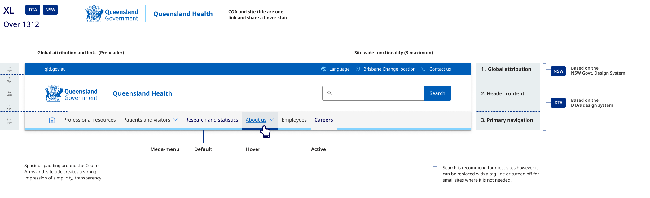
The desktop header pattern is broken into 3 sections:
- the global attribution pre-header which includes site-wide functionality
- the header content area where branding, site name, search, and tertiary navigation links are located
- the primary navigation bar.
Mobile and tablet anatomy
- The primary navigation component contains branding with search and the main menu, where site-wide functionality is contained.
- The header content area contains only the site name, written in Meta FF. The example on the right shows how the mobile header easily adapts to longer site names.
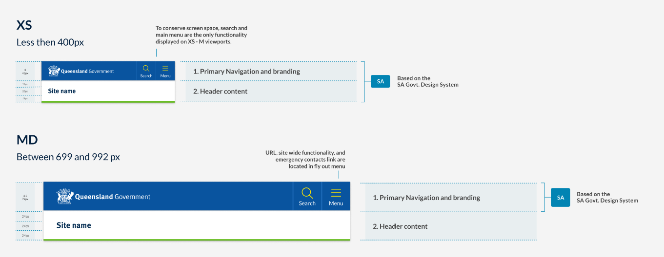
Differences between tablet and mobile
The header pattern for medium to large viewports is also based on the South Australian Design system and the smaller viewport pattern. As this pattern adopts a mobile first approach, those same benefits can be leveraged for this pattern as well. The primary difference is that the tablet pattern is slightly larger to make for a more balanced design when there is more screen space available.
Research and rationale
General overview
In developing the Queensland Health Design System header, we conducted an audit of the existing CUE header pattern to identify shortcomings as well as a brand audit of over 60 sites. We examined the compatibility of current assets and guidelines within Queensland Government and the viability of the DTA header we were using as a basis for our competent.
The current CUE pattern faced challenges in flexibility and consistency, including unnecessary height on desktop layouts, confusion caused by separate links for the Coat of Arms and site name, and inconsistencies in logo sizes and site name positioning. In our brand audit, we also found that many sites deviated from the recommended CUE pattern and struggled to apply corporate branding consistently.
To optimise a header solution that would work for multiple sites we realised it would need to:
- easily accommodate long site titles such as department names
- work for many different types of sites with a variety of logos and branding
- be mobile first, accessible and responsive
- enable cross site and global navigation and offer methods to navigate back to parent sites
- have a unified approach for applying corporate identity maintaining consistency across all government digital services
- build on the existing CUE pattern which was still heavily used.
The DTA and CUE patterns didn't offer solutions to resolve this so we explored other Design Systems and existing Queensland Government examples outside of the current CUE.
We analysed many other government Design Systems such as New South Wales, South Australia, and the UK as well as multiple sites in Queensland Government to identify the approaches they had taken and to see if we could adopt any of their patterns.
Our final solution was heavily inspired by the South Australian Design System for both our mobile and desktop layouts, this is because SA has a very similar logo to the Queensland Government and their patterns were already highly accessible and accommodated for long site names well on both mobile and desktop.
In addition to this, we also chose to include a global attribution (pre-header) component in our pattern which came from our review of NSW design header pattern. Incorporating a pre-header into our design allowed us to create a clear space for navigation back to the qld.gov.au from department websites and offered us room to feature key site utilities which in the existing CUE were previously featured alongside the search bar adding clutter and unnecessary high to the layout.
The final pattern offers increased flexibility on desktop devices as opposed to existing CUE patterns and the Initial DTA design. It easily accommodates longer names and includes a variety of layout options for the header content area that relate specifically to the different categories of brands detailed in our brand architecture.
Tablet and Mobile Pattern
The header patterns for both medium to large viewports (tablet pattern) and smaller viewports (mobile pattern) are based on the South Australian Design System. These patterns adopt a mobile-first approach, allowing the same benefits to be leveraged across different devices. Compared to the DTA's mobile header pattern, the South Australian Design System offered the following advantages:
- it takes up less vertical height, a premium on smaller viewports
- it easily accommodates longer site names
- it features a simple yet versatile design that can be easily adapted to any site within the brand architecture.
On mobile, site-wide functionality such as location and language are located in the hamburger menu, preserving screen space and prioritising the content area. This approach ensures a consistent and adaptable design for various screen sizes and devices.
Design of the attribution bar (preheader)
The pre-header component is placed the main header, in our Design System we used it to display secondary information and additional navigation options. The design of our pre-header is inspired by NSW Government, however there were a number of other factors we considered when designing our component.
Should be used for only secondary information: In our Design System the intention is that the pre-header is used to display secondary information like contact details, social media icons, or a secondary navigation menu. The placement of these things should be in the top right hand corner of the site. This prominent placement makes them always visible, and, in general, easier to notice and users look in that area for tools, especially for items such as Log in, Search, and My Account (Farrel S, 2015) .
Key links should be accompanied with Icons that include text labels: Studies have shown that while people enjoy seeing icons, they often struggle to comprehend and remember them. Additionally, websites tend to use icons inconsistently. Hover-text explanations (tool tips) that appear when the mouse hovers over an icon don't work on touch screens. To ensure good accessibility, understanding, and translation, it's recommended to use words, or a combination of words and icons (Harley A, 2014).
Minimalistic design: Our intention was to keep the pre-header simple and clean, with minimal visual elements. Since it's not the main focal point of the header we wanted to not overshadow the content in primary header.
Contrast with the main header: We chose to used differences in background colour to ensure there's enough visual distinction between the pre-header and the main header.
Responsive: Just like the main header, our pre-header adapts well to various screen sizes and devices. On mobile displays the however the site utilities and global navigation are combined into the hamburger menu.
Hamburger menu
Placement
The placement of our hamburger menu icon is on the top right. Placement of a hamburger menu item is a debated topic; we chose to place ours on the top right for the following reasons.
Familiarity: Many popular mobile applications, like Facebook and Instagram, place their menu icons in the top-right corner, so users may already be accustomed to looking for the icon in this location.
Thumb reachability: Approximate 70-90% of people in the world are right handed (Goldman, n014.). Placing the menu icon in the top-right corner can make it easier for users to reach with their thumbs.
Follows an existing tested pattern: This positing is consistent with the South Australian Design System which our header pattern has been heavily inspired by.
Separation from branding: Placing the hamburger menu icon in the top-right corner helps separate it from the site branding elements, which are typically found in the top-left corner. This separation can improve visual hierarchy and make it easier for users to find the menu icon.
Including the word menu
Researchers have found that the hamburger menu is used more when it is labelled Menu and has a border around it to make it look more like a button (Pernice and Budiu, 2016). This was also something that was part of the or original DTA hamburger menu design.
Search placement
For research and rationale on our search button placement and design on mobile and desktop see input fields search.
Navigation
The design rationale and requirements for primary navigation is covered within primary navigation section.