
Overview
Overview
A container for navigation links intended to be used as the primary means of getting around the website or application. It typically accommodates the top level of the information architecture.
The header displays across the top of all our sites and is crucial to:
- communicate to users what the page is about
- orient the user to where they are on the Queensland Health network
- communicate the sites relationship to the Queensland Government (see brand architecture)
- assisting in navigation.
It typically includes the site name or logo, Queensland Government attribution (Coat of Arms), the primary navigation menu, and other important components, such as search boxes, contact information, global navigation, calls-to-action and site-wide functionality.
Within our Design System there are 3 header variations for:
- horizontal navigation desktop pages
- vertical navigation desktop pages
- mobile and tablet viewports.
Open example in a new tab (recommended)


                <!-- Main header container with banner role -->
<header class="qld__header horizontal-example" role="banner">

    <!-- Navigation bar for skip links -->
    <nav class="qld__skip-link" aria-label="skip links" tabindex="-1">
        <a class="qld__skip-link__link" href="#content">Skip to main content</a>
        <a class="qld__skip-link__link" href="#main-nav">Skip to main navigation</a>
    </nav>

    <!-- Pre-header section with logo and links -->
    <div class="qld__header__pre-header qld__header__pre-header--dark">
        <div class="container-fluid">

            <!-- Government link and logo used for mobile display -->
            <a href="https://www.qld.gov.au">
                <span class="qld__header__pre-header-url">qld.gov.au</span>
                <img class="qld__header__pre-header-brand-image" alt="Queensland Government" src="./?a=160271">
            </a>

            <!-- CTA wrapper for right aligned links in the preheader -->
            <div class="qld__header__cta-wrapper">
                <a class="qld__header__cta-link" href="javascript:void(0)">
                    <span class="qld__header__cta-link-icon">
                        <span class="qld__header__cta-link-icon">
                         <svg class="qld__icon" aria-hidden="true" xmlns="http://www.w3.org/2000/svg"><use href="./?a=169317:dist/mysource_files/img/QLD-icons.svg#phone"></use></svg>
                    </span>
                    </span>
                    <span class="qld__header__cta-link-text">Contact us</span>
                </a>
            </div>

            <!-- Main navigation controls (Search and Menu buttons on mobile and tablet screens) -->
            <div class="qld__header__main-nav-controls">
                <!-- Search button -->
                <button aria-controls="qld-header-search"
                    class="qld__header__toggle-main-nav qld__main-nav__toggle-search qld__main-nav__toggle-search--open"
                    aria-expanded="false">
                    <!-- Search and close icons -->
                    <svg aria-hidden="true" focusable="false" xmlns="http://www.w3.org/2000/svg"
                        class="qld__icon qld__main-nav__toggle-search-icon">
                        <use href="./?a=169317:dist/mysource_files/img/QLD-icons.svg#search"></use>
                    </svg>
                    <svg aria-hidden="true" focusable="false" xmlns="http://www.w3.org/2000/svg"
                        class="qld__icon qld__main-nav__toggle-search-close-icon">
                        <use href="./?a=169317:dist/mysource_files/img/QLD-icons.svg#close"></use>
                    </svg>
                    <!-- Search button label -->
                    <span class="qld__main-nav__toggle-text">Search</span>
                </button>

                <!-- Menu button -->
                <button aria-controls="main-nav" class="qld__header__toggle-main-nav qld__main-nav__toggle--open">
                    <!-- Menu icon -->
                    <svg aria-hidden="true" focusable="false" xmlns="http://www.w3.org/2000/svg"
                        class="qld__icon">
                        <use href="./?a=169317:dist/mysource_files/img/QLD-icons.svg#menu"></use>
                    </svg>
                    <!-- Menu button label -->
                    <span class="qld__main-nav__toggle-text">Menu</span>
                </button>
            </div>
        </div>
    </div>


    <!-- Main header section -->
    <div class="qld__header__main">
        <div class="container-fluid">

            <!-- Header brand section -->
            <div class="qld__header__brand">

                <a href="https://www.choreport.health.qld.gov.au">
                    <!-- QLD Government logo -->
                    <div class="qld__header__brand-image">
                    <img src="./?a=160263" alt="A logo representing the Queensland Government">
                    </div>
                    <!-- Site name and description -->
                    <div class="qld__header__site-name">
                        <span class="qld__header__heading">Header</span>
                        <span class="qld__header__subline">Subheading</span>
                    </div>
                </a>

            </div>

            <!-- Search form section -->
            <div class="qld__header__search" id="qld-header-search">
                <div class="qld__main-nav__focus-trap-top"></div>

                <div class="qld__search-form--wrapper">
                    <form role="search" aria-label="sitewide" class="qld__search-form" id="search-input-global-header" action="#">
                        <label for="search-input-global-header-query"
                            class="qld__label qld__display-lg qld__search-form__label">Search this website</label>
                        <div class="qld__search-form__inner">
                            <input type="search" id="search-input-global-header-query" name="query"
                                class="qld__text-input data-hj-allow" autocomplete="off">
                            <input type="text" id="name" name="name" autocomplete="off" tabindex="-1"
                                class="qld__text-input--validation">
                            <div class="qld__search-form__btn">
                                <button class="qld__btn qld__btn--search" type="submit" aria-label="Search">
                                    <span class="qld__btn__icon"></span>
                                    <span class="qld__btn__text">Search</span>
                                </button>
                            </div>
                        </div>
                    </form>
                </div>
                <div class="qld__main-nav__focus-trap-bottom"></div>
            </div>
        </div>
    </div>

</header>


<!-- Main navigation bar -->
<nav class="qld__main-nav qld__main-nav--mega" id="mainmenu">
    <div class="container-fluid">
        <!-- Main navigation content wrapper -->
        <div class="qld__main-nav__content" id="main-nav">
            <!-- Navigation menu wrapper -->
            <div class="qld__main-nav__menu">
                <!-- Inner navigation menu wrapper -->
                <div class="qld__main-nav__menu-inner">
                    <!-- Focus trap for accessibility purposes (keyboard navigation) -->
                    <div class="qld__main-nav__focus-trap-top"></div>
                    <!-- Navigation header which contains menu title and close button -->
                    <div class="qld__main-nav__header">
                        <h2 class="qld__main-nav__menu-heading" tabindex="-1">Menu</h2>
                        <!-- Close button for the menu -->
                        <button aria-controls="main-nav" class="qld__main-nav__toggle qld__main-nav__toggle--close">
                            <!-- SVG icon for the close button -->
                            <svg aria-hidden="true" focusable="false" xmlns="http://www.w3.org/2000/svg"
                                class="qld__icon qld__icon--md">
                                <use
                                     href="./?a=169317:dist/mysource_files/img/QLD-icons.svg#close">
                                </use>
                            </svg>
                            <span class="qld__main-nav__toggle-text">Close</span>
                        </button>
                    </div>
                    <!-- Navigation link list -->
                    <ul class="qld__link-list qld__link-list--flex">
                        <!-- Here is a navigation item example -->
                        <li class="qld__main-nav__item ">
                            <div class="qld__main-nav__item-title">
                                <a class="qld__main-nav__item-home qld__main-nav__item-link"  aria-label="Home" href="#">
                                    <!-- SVG icon for the link -->
                                    <span class="qld__main-nav__item-icon">
                                        <svg aria-hidden="true" focusable="false" xmlns="http://www.w3.org/2000/svg"
                                            class="qld__icon qld__icon--md">
                                            <use
                                            href="./?a=169317:dist/mysource_files/img/QLD-icons.svg#home">
                                            </use>
                                        </svg>
                                    </span>
                                    <span class="qld__main-nav__item-text" data-name="">Home</span>
                                </a>
                            </div>
                        </li>
                        <li class="qld__main-nav__item">
                            <div class="qld__main-nav__item-title">
                                <a class="qld__main-nav__item-link" href="#">Category page 1</a>
                            </div>
                        </li>
                        <li class="qld__main-nav__item">
                            <div class="qld__main-nav__item-title">
                                <a class="qld__main-nav__item-link" href="#">Category page 2</a>
                            </div>
                        </li>
                    </ul>
                    <!-- ... More elements like call-to-action or additional navigations could go here ... -->
                    <!-- Focus trap for accessibility purposes (keyboard navigation) -->
                    <div class="qld__main-nav__focus-trap-bottom"></div>
                </div>
            </div>
            <!-- Overlay element, which usually displayed when menu is open -->
            <div class="qld__main-nav__overlay" aria-controls="main-nav"></div>
        </div>
    </div>
</nav>
Header patterns
Horizontal navigation
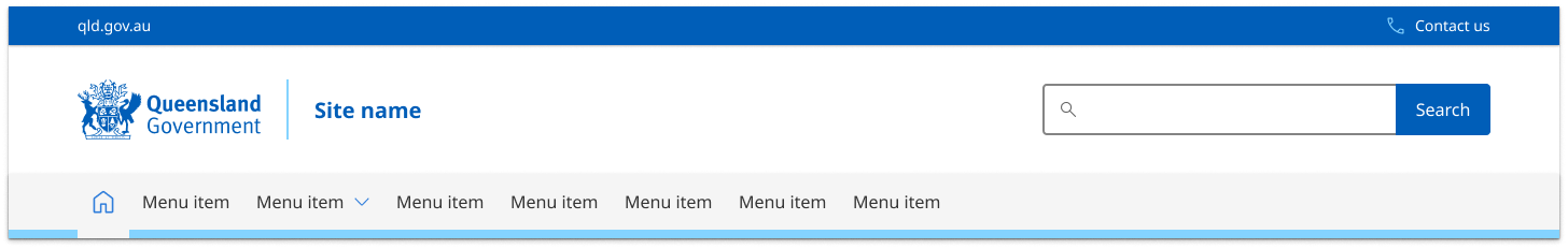
This style of header is the default for most sites. It's comprised of three parts:
- the global attribution bar (Pre-Header) which includes site-wide functionality and global navigation
- the header content area where branding, site name, search or taglines are located
- the primary navigation bar.
Vertical navigation

The header pattern for vertical navigation websites is similar to our default pattern. The only difference is it's justified to the left and right of the screen rather than centred. This is only visible on the xl screen sizes. The header pattern for all other screen sizes remains the same.
The style of this header is comprised of only two parts:
- the global attribution bar (Pre-Header) which includes site-wide functionality and global navigation
- the header content area where branding, site name, search or taglines are located.
Primary navigation is separate on vertical navigation style pages.
Mobile and tablet
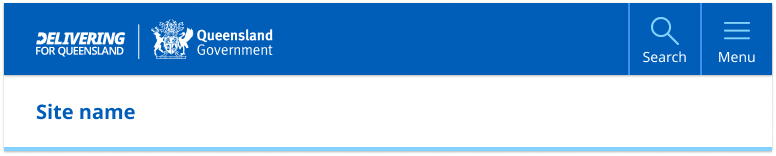
Both vertical and horizontal navigation style pages default to the standard mobile and tablet header pattern.
The mobile and tablet pattern is broken into two sections:
- the primary navigation component which contains site branding, search and the main menu
- the header content which contains only the the site name or on certain sites a tag-line.
The mobile and tablet patterns are identical in layout but the size of the tablet components are slightly larger to make a more balanced design when there's more screen space available.
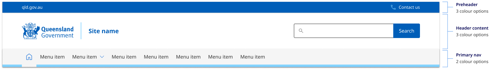
Header colour options
The header pattern has been designed to be versatile enough to cater for multiple types of brands with varying design and corporate ID requirements. There are currently three colour options for the content area, three for the primary attribution bar and two for the primary navigation. These options provide the best balance of customisation without adding too much complexity.
Colour choice implications
When choosing colours for the header pattern it's crucial to understand how your choices affect both the desktop and mobile layouts. The pre-header colour determines the mobile and tablet header colour. For this reason, it's recommended that your header content area and pre-header use different background colours see figma for more details.
Usage guidelines
The Design System header is a mandatory component and should be used on all pages of your site. However what header pattern and the layout options you should use is based on two factors:
- what form of navigation your site is using
- what brand category your site is.
Horizontal navigation
The most common header pattern used on most sites is the one designed to work with horizontal navigation. This is where the sites primary navigation sits within the header horizontal under the site title.
Vertical Navigation
If you have a vertical navigation site, you need to use the vertical navigation style header which has been designed specifically to compliment sites that use left hand side vertical navigation. It's also often a good choice for web apps and portals.
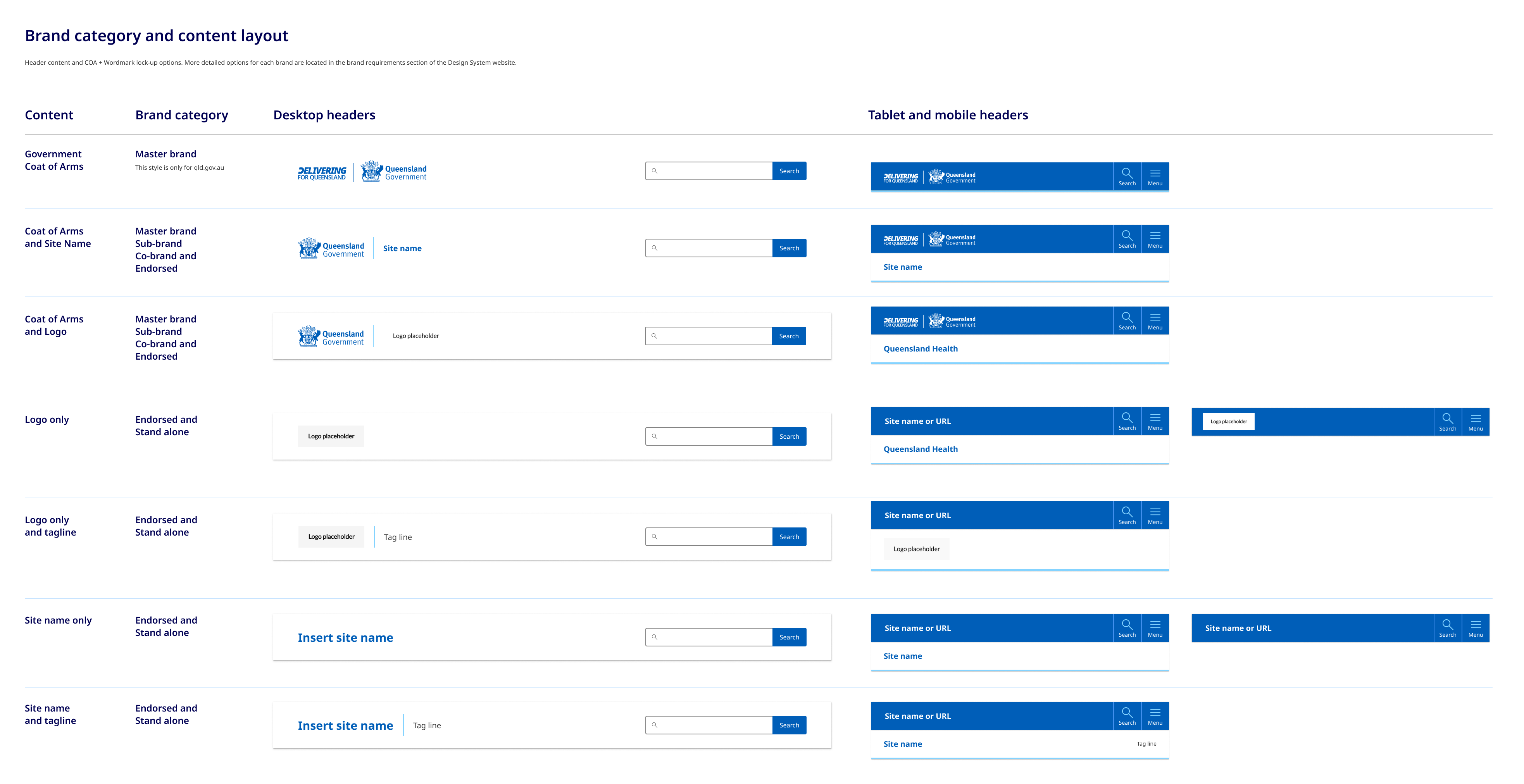
Brand category and content layout
How the government crest is positioned and what options you have in terms of incorporate tag lines and site logos is determined by what category of branding your site falls under. To work out what category your site is and what layout you should be using for your header see the brand architecture section.
There are a variety of layout options for the header content area that relate specifically to the different categories of brands detailed in our brand architecture. Below is a brief example of the layout options available, you can see more detailed visual guidelines in our figma file.
How to use headers
Do
- Your site title should be short and to the point, ideally no more than 70 characters. This makes it easy to read and remember
- Ideally any logos used should be the same size and shape of the Queensland Government Crest
Don't
- Use long taglines: Avoid taglines that are too long or difficult to read. This can be overwhelming for visitors and may detract from the impact of your message
- Don't over complicate the links in the master attribution bar, avoid too many features or options, try to limit it to 3 key actions