
Design
Anatomy
Desktop anatomy
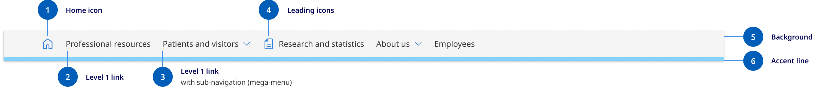
- Home icon: Home icon replaces text to simplify the primary navigation, by reducing the number of perceived options, and reducing cognitive load on the user.
- Level 1 link: This is the default level 1 link style. It typically represents the top level of the information architecture.
- Level 1 with sub-navigation (closed): When a level 1 link has sub-navigation turned on, it's coupled with a drop-down icon. The entire link becomes a toggle for the drop-down menu and the link to the level 1 page is moved into the mega menu.
- Leading Icons: Level 1 links can be coupled with Icons when appropriate. Icons help when there are a lot of links to call attention to important tasks or categories and should be used sparingly. It's generally not recommended to include them in the horizontal navigation pattern.
- Background: The primary navigation uses a darker shade background colour to differentiate it from the header content area.
- Accent: The accent colour allows designers to incorporate a brand colour into the header. This colour changes to the default action colours on hover.
Mobile anatomy
Our mobile navigation has the ability to display 2 levels of navigation. It's a combination of the base DTA design coupled with the SA pattern. The primary adjustments from the DTA were the inclusion of a tablet size, added sub-navigation functionality, icon support and inclusion of site-wide CTAs.
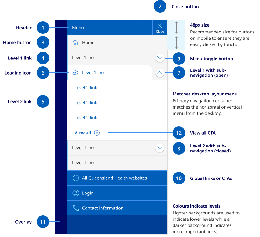
- Mobile menu header: This is a fixed area that contains the close button, it also contains the title ‘Menu’ to further communicate the purpose of the component.
- Close button: The close button is fixed to the top and appears in the same position as the original hamburger menu button.
- Home button: The home button should always be placed with an icon and the first list item. Because there is adequate space the home button uses both text and the icon unlike the desktop menu which only uses the icon.
- Level 1 links: These are the top level pages of a sites IA. Level 1 links can be coupled with an icon when necessary or an optional dropdown menu. These are styled to match the appearance of the desktop menu.
- Level 2 links: Level 2 links are the child pages of the primary navigation. These can be a curated list. On desktop these can be coupled with a description however this is removed for the mobile and tablet designs.
- Leading icons: Level 1 links can be coupled with Icons when appropriate. Icons help when there are a lot of links to call attention to important tasks or categories and should be used sparingly.
- Level 1 with sub-navigation (close): When a level 1 link has sub-navigation turned on, it's coupled with a drop-down button. All sub-navigation items are closed by default on open.
- Level 1 with sub-navigation (open): When a level 1 link is opened, the design changes to have a tabbed appearance, this helps to create relationship between the level 1 parent and its child links. The colour of the text is also changed to the link colour to indicate that it is still a clickable link option.
- Toggle button: This is a unique button that has been designed to float over the primary navigation link and appear as a separate clickable region.
- Global links and CTAs: Any site-wide links that were located in the pre-header are moved into the mobile navigation. These links maintain the same colour and design as they had in the pre-header bar.
- Background overlay: When the mobile navigation menu opens the background is darkened to help the user focus attention on the navigation links.
Mega menu anatomy
Mega menus use a three column layout. Because the mega-menu acts in a similar way to cards its internal contents do not align to the page grid. However it still uses consistence spacing and vertical rhythm patterns. The mega menu has three rows containing link lists.
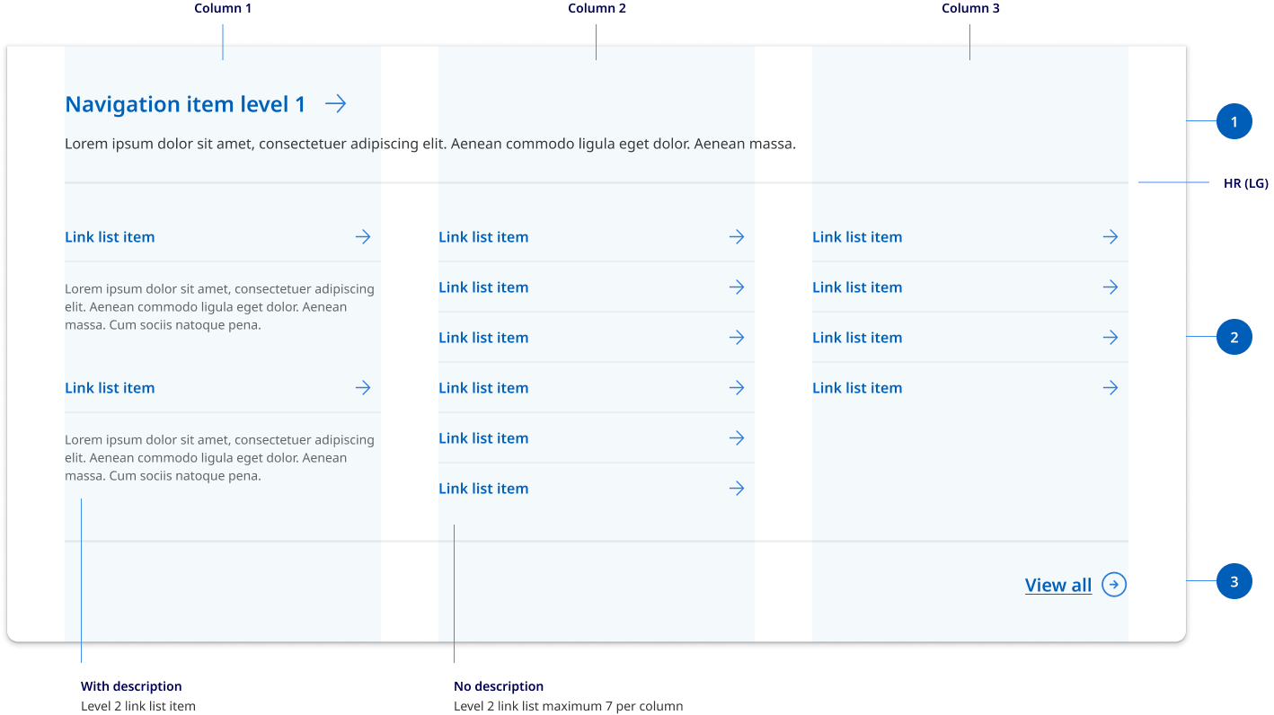
- Row 1: Row one spans the whole width and contains the mandatory link to the primary category page as well and an optional descriptions.
- Row 2: Row two houses a curated list of level 2 link list options. These are spaced across three columns. You can choose to display only the level 2 links titles or level 2 links with their page descriptions. The mega-menu uses the existing link list component to display to levels of links.
- Row 3: Row three is used if there are too many level 2 links to included in the mega menu. It includes CTA view all link that helps to indicate to the user that there are more subpages that exist in the site other then what is displayed in the menu.
Research and rationale
The design for the horizontal navigation was based on Digital Transformation Agency’s original layout. We expanded this design to be able to accommodate mega menu’s and iconography.
Mega menus were added because for large websites, mega menus can assist users' journey by letting users preview lower-level content (Nielsen, 2017).
Iconography was added because:
- icons are fast to recognise at a glance (if well designed) — particularly true for standard icons that people have seen and used before (Harley A, 2014)
- there is no need to translate icons for international users, provided that the icons are mindful of cultural differences (for example, mailboxes look very different in various countries whereas envelopes look the same, therefore an envelope is a more international icon for an email program than a mailbox) (Harley A, 2014).
Best practice
Menu only hidden on tablet
Best practice guidance suggests that primary navigation should be prominent and never hidden on desktop screens (Nielsen, 2017). For this reason our primary navigation will only be hidden behind a hamburger menu once it reaches the tablet breakpoint.

Tell users ‘where’ the currently visible screen is located within the menu options
'Where am I?' is one of the fundamental questions users need to answer to successfully navigate. Users rely on visual cues from menus to answer this critical question (Nielsen, 2017). To assist with this, we've followed the existing Digital Transformation Agency’s solution which removes the border below the current page.

Menu links are designed to be easily clicked
Links that are too small or too close together are a huge source of frustration for mobile users, and also make large-screen designs unnecessarily difficult to use (Nielsen, 2017). We've designed our menu so that each link is easy to interact with, has generous padding and large hit targets.
Our mobile icon should include a label
In mobile (small) device layouts, the main navigation uses a ‘Hamburger’ icon which represents the menu. This follows a common convention in mobile interface design and is taken directly from the Digital Transformation Agency's implementation (Digital Transformation Agency, 2018).
Despite this convention, not all users know that a hamburger means "navigation" or "menu" so we've added accompanying text ‘Menu’ to avoid assumed understanding of the icon.
Mega menu research
We reviewed 14 different mega menu patterns from a number of different Design Systems as well as collated best practice research from leading experts.
Some of the key findings from this research was:
- Mega menus were most often two-dimensional panels divided into groups of navigation options
- Mega menu patterns often change depending on the content and were often curated only showing important links and not necessarily every link under a primary navigation item
- Icons were often incorporated to help when there are a lot of links
- Indentation, heading colours and font weights often change with child links
- Chevrons were most commonly used for opening and closing menus
- Everything was visible at once there was never any scrolling
- People tend to scan vertically. A menu is not narrative text. It's scanned, not read. And scanning tends to proceed down a list in a vertical manner. (That's also why left-justifying navigation menus makes them easier to scan.)
- Not every primary navigation item needed a mega menu
- Best practice was to use an on click event and only hide the menu when the user clicks and that you should close a mega menu because the user’s cursor moves to a different part of the screen.
We tried to factor all of these considerations into our mega menu design. For our final concept we were influenced by NSW and by the work that had been done on the beta version of the MyGov website.
Our final design uses a 3 column layout that supports a curated lists of level 2 pages listed vertically from left to right. It has a similar design to our cards for consistency and appears as a panel that animates out from our primary navigation. It's made visible via a click event and primary menu items that include a mega menu are indicated by a chevron icon.
It's designed to be modular and can accommodate added link descriptions, initially we did develop patterns however we decided these patterns required further user testing as we were concerned about overcomplicating the design.
The key challenges we faced with our mega menu design was ensuring that the user could still travel to the primary level 1 landing page and that if not all links under that category were displayed, they understood there were more links available. We resolved this issue by splitting our mega menu into 3 distinct rows, the row one spans the whole width and contains the link to the primary category page as well and an optional description. The second row houses a curated list of level 2 link list options. The third row was optional and is used if there are too many level 2 links to include in the mega menu. It includes CTA view all link that helps to indicate to the user that there are more subpages that exist in the site other than what's displayed in the menu.
Mobile navigation research
Our sub-menu style uses the drop-down approach which is a common sub-navigation design pattern.
Dropdown menus have a low interaction cost, good usability and is consistent with our desktop mega-menu experience.
Our solution was influenced by the existing DTA left hand navigation styles and South Australia’s mobile menu design which enabled the users to click either a category links or drop-down toggle.
Our solution ensures users can choose to travel to a category page or open sub-navigation this was accomplished by creating a new style of accordion open and close button specifically for mobile navigation. This new button floats on top of the primary navigation link using elevation to distinguish it as a separate clickable action item.
To maintain visual consistency, we chose to base our design on the the existing DTA side navigation pattern which already included multi level links and a tab style aesthetic was incorporated to further help users identify child links with their associated category category links.
Drop-down menus vs sequential menus design
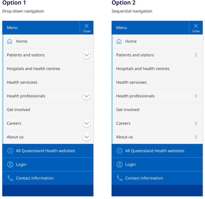
Accordions (drop-down) and sequential menus are popular options for implementing mobile sub-navigation. No best practice was found on which option performs better and both patterns have positive and negative attributes. A comparative analysis led to an even split across other government agencies and Design Systems. Because of these reasons we're conducting user testing to determine what the best option will be for the QH Design System.
Overall both menu systems worked but the dropdown menu did have higher levels of direct success, however it should be noted that many users opted to navigate without using either pattern.
Because there was no clear prominence of sequential menus over drop-downs we opted to go with drop-down menus over sequential menus for 2 reasons.
- Dropdown menus a safer option in terms of usability
Research from Nielsen Norman Group states
‘users with low spatial ability (as measured by a spatial-ability test), however, seem to be less efficient with these menus than users with high spatial abilities. And unfortunately, on mobile devices, due to the increased probability of interruption, we are more likely to become disoriented and behave like users with poor spatial abilities.
Sequential menus cause users to accidentally make mistakes, especially on Android phones (or in a browser) — often people are tempted to use the phone’s physical Back button or the browser’s Back button, and accidentally end up closing the menu and navigating to a different page instead of moving back to the higher-level menu.’
- Drop down menus create consistency without vertical navigation experience
In our design of lefthand side vertical navigation templates it was most common practice to use drop-down navigation. One of the benefits of vertical navigation is that the desktop and mobile navigation can use the pattern and components. For consistency it makes sense to use a drop-down navigation rather than a sequential pattern for our sub-menus on mobile.
Examples of this can be seen in sites such as: