
Design
Anatomy
Below is an annotated anatomy of the vertical navigation layouts.
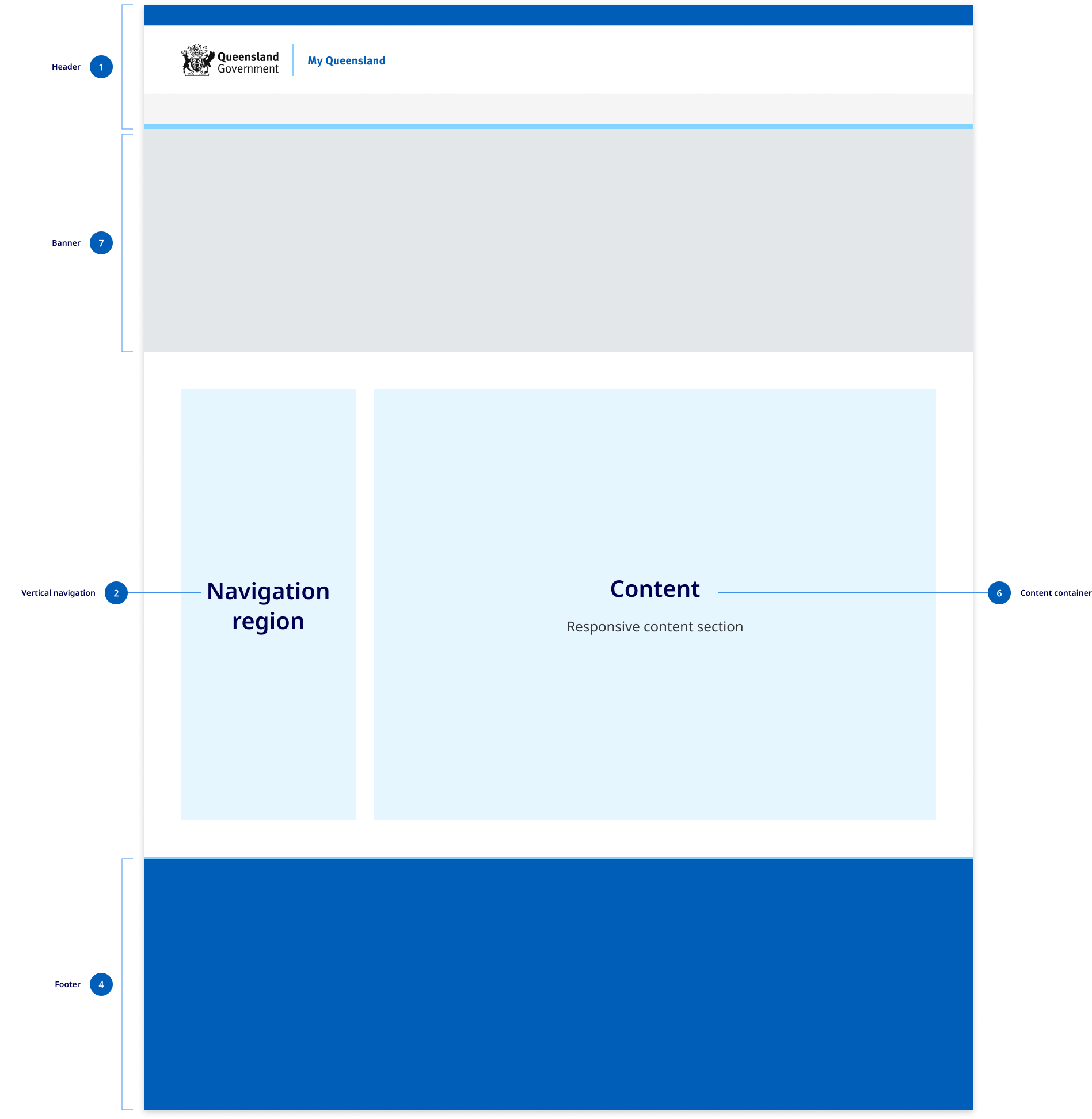

- Header
The header design matches the default pattern from the Design System. The primary change is that the centred alignment is removed at the xl breakpoint and content is justified to the left and right off the screen with 48px margins. - The navigation region
This region is comprised of navigational components and elements listed vertically on the left of the screen. The navigation region maintains a consistent width of 280px and only appears on screen sizes 992px wide and above. The design of the vertical navigation is designed to match mobile menu and its components are used in mobile tablet menu. - Content
The content region is used for displaying content the primary page content. It has a max-width of 1312px which is the same as the default horizontal navigation layouts. The footer
In vertical navigation layouts the footer component is justified to the left and right of the screen xl breakpoint with 48px margins.
Research and rationale
The design of the vertical navigation is based on best practice established by Material design, IBM carbon. For the design of this component, we conducted a comparative review of 9 different Design Systems that included this vertical navigation, as well as research from Nielsen and Norman Group on best practices and layout. Our goal was to create a vertical navigation pattern that was visually consistent with our horizontal and mobile navigation patterns and built on as much established best practice as possible.
Colour
Research indicated that we should ensure that the navigation was visually salient using different background colours and borders to make navigation and content stand out from the other page elements (Laubheimer, 2021). We ensured that we used the same colours from our horizontal component which uses shades of background colours to distinguish the primary navigation from the page content.
The vertical navigation is also available in 2 colours to match what is available in the horizontal menu design.
Iconography
Although icons should not replay menu labels, they can assist users to scan and locate information more efficiently. Due to the availability of space in vertical navigation menus we designed the component to allow for them to be incorporated into the level 1 navigation items.
Mobile navigation
One of the commonalities between all the vertical navigation patterns we reviewed was the consistency between vertical navigation designs and mobile navigation. Based on this we chose to use our mobile navigation as the basis for the design of our vertical navigation component. This meant that there would be more visual consistency between sites using horizontal navigation and those using vertical navigation.
The vertical navigation menu builds on the research conducted for the design of the mobile navigation pattern and actually uses the same components as the tablet mobile navigation.
Layout
During our comparative review we discovered that each navigation category should have no more than one level of sub-menu items and that the average size of the navigation containers was 280px which we chose to adopt as the standard for our design.
Consistency
With our approach to the design of the vertical navigation we've tried to ensure that there is as little visual friction between this layout and the default horizontal layout. Breakpoints remain the same and only minor adjustments were made to the xl and lg grid patterns. We also designed the vertical in such a way that the existing headers and footers could remained the same with the only difference being that at the xl breakpoint they're now justified to the left and right of the screen.