
Overview
Overview
Found on the left hand side of the screen, vertical navigation displays a list of global navigation links that can include primary, secondary navigation levels.
Using vertical navigation removes the visual design constraints that limit the number of categories that can exist in top level navigation.
They're an excellent design choice for accommodating a large number of options or for revealing many lower-level site pages at a glance. This form of navigation is beneficial for complex applications, admin apps and desktop apps.
Vertical navigation supports more efficient scanning than horizontal navigation and translates naturally to mobile, however it does take up more visual space and very long vertical menus may result in content that appears below the fold.
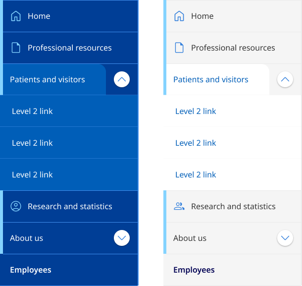
Dark and light example
                <!-- Ver Navigation colours
    Default light:  <div class="qld__left-nav">
    Dark:   <div class="qld__left-nav qld__main-nav--dark">
    -->

       <div class="qld__left-nav ">
        <!-- Left Navigation Container -->
        <nav aria-label="left navigation" id="left-nav" class="qld__left-nav__content">
            <ul class="qld__link-list">
                <!-- Home Link -->
                <li>
                    <a class="qld__left-nav__item-link" href="javascript:void(0)">
                        <!-- SVG icon for the link -->
                        <span class="qld__main-nav__item-icon">
                            <svg aria-hidden="true" focusable="false" xmlns="http://www.w3.org/2000/svg" class="qld__icon qld__icon--md">
                               <use href="./?a=151118#home">
                            </svg>
                        </span>
                        <span class="qld__left-nav__item-text" data-name="">Home</span>
                    </a>
                </li>

                <!-- About Section (Menu item with dropdown) -->
                <li>
                    <a class="qld__left-nav__item-link" href="javascript:void(0)">
                        <span class="qld__left-nav__item-text" data-name="About">About</span>
                    </a>
                    <!-- About Submenu -->
                    <button class="qld__left-nav__item-toggle qld__accordion--closed" aria-controls="internal-nav-118539" aria-expanded="false" aria-selected="false" aria-label="Toggle navigation, About"></button>
                    <ul id="internal-nav-example1" class="qld__link-list qld__accordion--closed qld__accordion__body">
                        <li>
                            <a class="qld__left-nav__item-link" href="javascript:void(0)">
                                <span class="qld__left-nav__item-text">Digital services policy and standard</span>
                            </a>
                        </li>
                        <li>
                            <a class="qld__left-nav__item-link" href="javascript:void(0)">
                                <span class="qld__left-nav__item-text">Principles and Introduction</span>
                            </a>
                        </li>
                    </ul>
                </li>

                <!-- Settings Section (Menu item with icons) -->
                <li>
                    <a class="qld__left-nav__item-link" href="javascript:void(0)">
                        <span class="qld__left-nav__item-text" data-name="Settings">Settings</span>
                    </a>
                    <a class="qld__main-nav__item-link" href="javascript:void(0)">
                        <!-- SVG icon for the link -->
                        <span class="qld__main-nav__item-icon">
                            <svg aria-hidden="true" focusable="false" xmlns="http://www.w3.org/2000/svg" class="qld__icon qld__icon--md">
                                 <use href="./?a=151118#settings">
                            </svg>
                        </span>
                    </a>
                </li>

                <!-- Settings Section Standard menu item -->
                <li>
                    <a class="qld__left-nav__item-link" href="javascript:void(0)">
                        <span class="qld__left-nav__item-text" data-name="About us">About us</span>
                    </a>
                    <a class="qld__main-nav__item-link" href="javascript:void(0)">
                        <!-- SVG icon for the link -->
                        <span class="qld__main-nav__item-icon">
                            <svg aria-hidden="true" focusable="false" xmlns="http://www.w3.org/2000/svg" class="qld__icon qld__icon--md">
                                <use href="./?a=151118#settings">
                            </svg>
                        </span>
                    </a>
                </li>

            </ul>
        </nav>
    </div>
</div>
Usage guidelines
When to use
- Information-heavy websites with a large number of primary level 1 categories: Vertical navigation is helpful for websites with large amounts of content, as it enables users to navigate through categories or sections more efficiently (Laubheimer, 2021).
- Hierarchical navigation: Vertical navigation is suitable for websites or applications with a hierarchical navigation structure where items in the navigation should be accessed in sequential order.
- Web Applications: If your digital product has a native application version, you will want your web app to be consistent with it. Vertical navigation is widely used both in macOS and Windows applications as primary means of navigation, as the top area is usually reserved for the menu bar (Mockplus, n.d.). Using vertical navigation for web applications can mean that your interface is more familiar to users (Laubheimer, 2021).
- For sites that where navigation is likely to grow: Adding additional categories to the vertical navigation doesn’t require a major process of redesigning the navigation UI; the only major decision is how the new items should be blended into the existing category structure (Laubheimer, 2021).
- File or content management products: For file or content management products where users can customise their navigation and need support for a tree/folder structure.
When not to use
- Standard government websites: Generally, not recommend for standard websites. Studies have shown users are more familiar with horizontal navigation patterns. Horizontal navigation also encourages a more considered approach to the structure and labelling of the navigation which can result in better user experiences.
- Simple navigation structures: If your website or application has a simple and flat navigation structure, horizontal navigation may be more appropriate. This style of navigation is not recommended for for small, medium, and large websites that don’t have a hierarchical structure and want to promote imagery, content or advertising.
- Minimalist designs or campaign websites: Websites with a minimalist design or limited content may not benefit from vertical navigation, as it can consume valuable screen space and create unnecessary visual clutter. Websites that focus on visual content, such as photography or video, may benefit more from horizontal navigation, as it allows for larger visuals and a more immersive experience without the distraction of a vertical menu.
- For sites with a deep IA structure: This style of navigation shouldn't be used for sites that have a deep IA structure consisting of many level 2 and 3 links which are more appropriately surfaced through the use of mega-menu.
- For very wide screens: Websites or applications primarily designed for wide screens should consider using horizontal navigation to take advantage of the available screen real estate. Vertical navigation may leave excessive empty space on wide screens and may not align well with other page elements.
- When familiarity and conventions are important: Horizontal navigation is a more common and familiar design pattern. If your users are generally accustomed to seeing and interacting with horizontal menus on other sites in your network, consider it may be advantageous to maintain consistency across all sites designs.
How to use
Do
- Show each choice only once: Duplicating options makes users wonder whether the 2 occurrences are the same or different.
- Consider the Primacy effect: Items at the beginning of a list are more easily remembered.
- In long menus, place less-important ones at the bottom: Due to the usability problems caused by the page fold, a very long vertical menu risks having items that aren't visible without scrolling (Laubheimer, 2021).
- Keep words short and direct: For example, the base form of verbs ("shop") is usually better than gerunds ("shopping").
- Incorporate Icons carefully: Icons can help when there are a lot of links to call attention to important tasks or categories.
- Use descriptive, recognisable link labels: Don’t label links with jargon or unfamiliar terms.
Don't
- Use vague or misleading labels: Don't use labels that are vague or misleading (e.g. "Services" instead of "Web Design Services").
- Use obscure symbols or icons: Avoid using symbols or icons that may be confusing to users. Stick to simple, easily recognizable icons if you must use them.
- Use inconsistent navigation throughout the site: Make sure the layout and design of your primary navigation is consistent throughout the site. Don't make users have to re-learn how to navigate your site every time they visit a new page.
- Don't hide the navigation behind a hamburger menu on desktop: Because vertical navigation takes up more space some sites tend to hide it behind a hamburger menu, this provides a worse experience for a user than if it's visible. Hidden navigation is less visible or partially visible navigation. When navigation is hidden, users are less likely to use navigation. If people use hidden navigation, they do so later in the task than if it were visible (Kalbach, 2014).
- Don't hide the navigation items behind icons: Since vertical navigation takes up more space than horizontal navigation, designers often attempt to minimise its corresponding area. However, this impacts usability and accessibility of the site navigation. Also make sure that when using icons you include labels as well as this reduces ambiguity and increases the target size (Laubheimer, 2021).