Design
Design rational
Why we have promotional panels
Focusing user actions
Promo panels are strategically placed to catch the user's eye and direct their focus to specific content or actions. The foundation of conversion centred design is focus, having having one clear goal on your page will make visitors more likely to act (Gardner, n.d.).
Enhancing user engagement
By showcasing relevant and timely content, promo panels encourage users to explore more of the website or take specific actions (Gardner, n.d.).
Emphasising content
Promo panels assist in emphasising important information that might otherwise be overlooked if presented in a standard content block (Gardner, n.d.).
Reducing the chance of banner blindness
Promo panels were designed provide users with a way to highlight content in a way that is consistent with a design that aligned to the look and feel of overall site. This is important because if promo panels appear too distinct they may look like advertisements banners. Designers think that by making content look really distinct from the rest of the site that it will increase its salience however this often has the opposite effect (Nielsen, 1997) as users will often ignore content they consider to be an advertisement, this behaviour is called banner blindness, you can read more about banner blindness in this Nielson Norman Group article.
Providing a pattern to anchor images left or right without scaling issues
At large screen sizes images that are anchored to the right or left of a page can become distorted or cropped poorly as they scale horizontally. This a common issues that makes choosing images for websites challenging. The promo panel addresses by having a fixed max-width of 1600px, once the panel reaches this width it will prevent images from scaling and being cropped too dramatically.
Layout and overlap effect
The promo panel is designed to highlight feature content and create a distinct visual break on the page.
The promo panel is designed to highlight feature content, creating a distinct visual break on the page. This component interacts uniquely with other content sections, ensuring that it stands out within the overall layout. The use of contrasting background colours, elevation, and overlapping margins further enhances its visibility, making it an effective tool for drawing attention to key information.
The slight overlap and background shadows create the impression that the promo panel floats above other sections on the page. By placing the promo panel at a higher elevation than other elements, the design directs the user's focus to its content. This approach is inspired by the principles of Material Design, which emphasises the use of elevation to convey hierarchy and importance. In Material Design, elevation is used to indicate the relative importance of elements on a page, with higher elevation levels suggesting greater prominence.
For more details on how elevation is used to create this effect, you can refer to the Material Design guidelines on elevation.
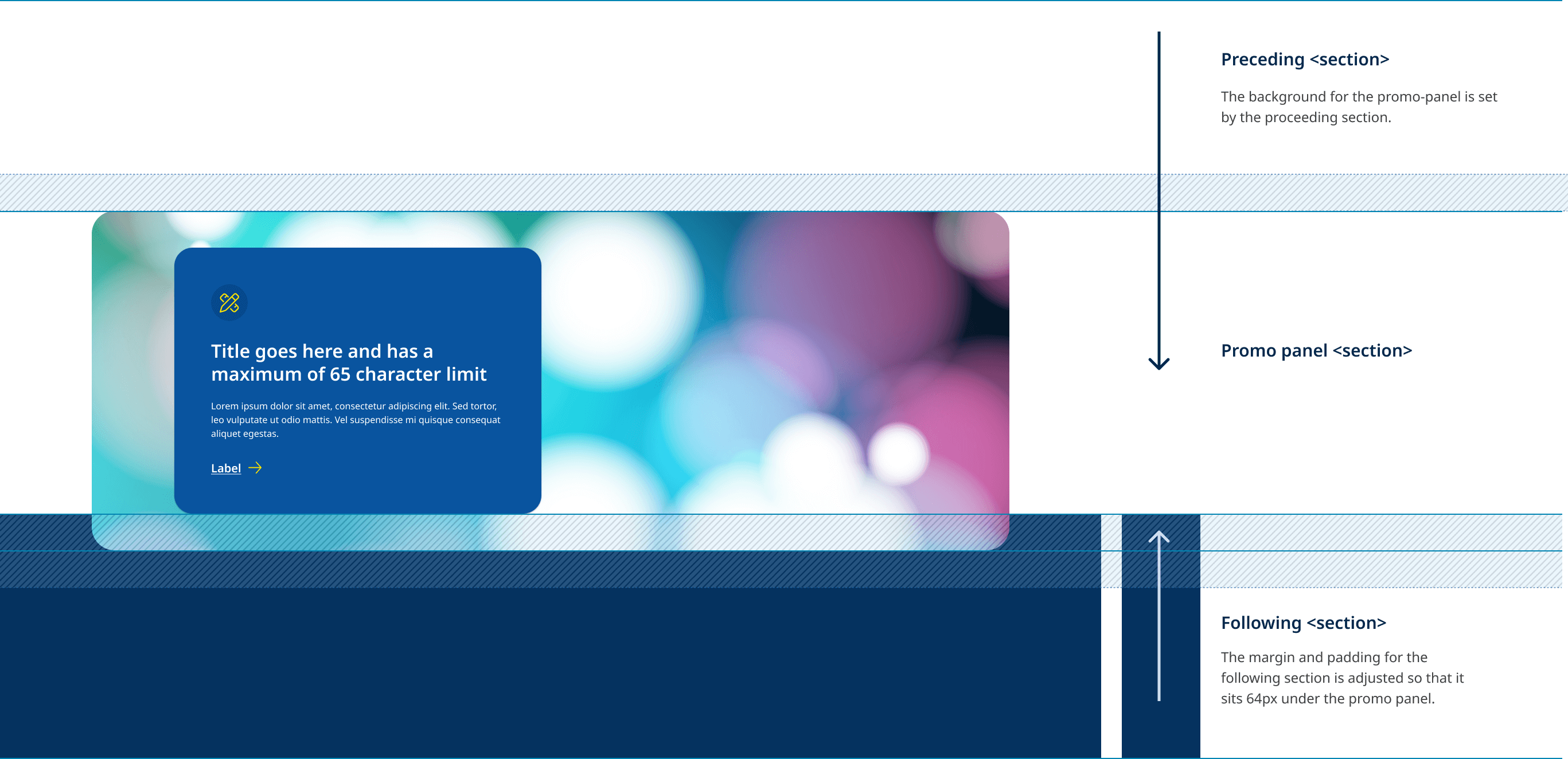
When using the promo panel it is important to understand how the component interacts with sections that preceded and follow it. The diagram below illustrates the how the background colour for the promo panel is inherited from the section before it, while the padding and margin of the following section are are adjust the create the overlap effect.
Overlap example
View live example of overlap and elevation behaviour.