
Overview
Overview
A promotional panel is used to highlight specific content like announcements, new features, or promotional content. Acting as a visual break on a page, it draws attention with visual emphasis and imagery, and often includes a call to action, such as a link or button.
Types of promo panels
There are four types of promo panels in our design system:
- Indented text panel
- Indented image panel
- Contained image panel and
- Full image panel.
All types support placing content on the left or right and are available in default, light, light-alt, dark and dark-alt colours.
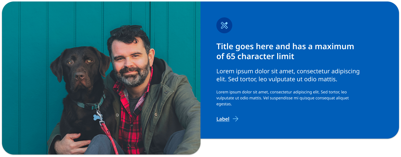
Indented text panel (larger image)
This type of promotional panel is best used when a hero image needs to be larger and have greater focus. An example would be a promotional panel where the image is used to showcase advertising campaign imagery.
View indented text example with code
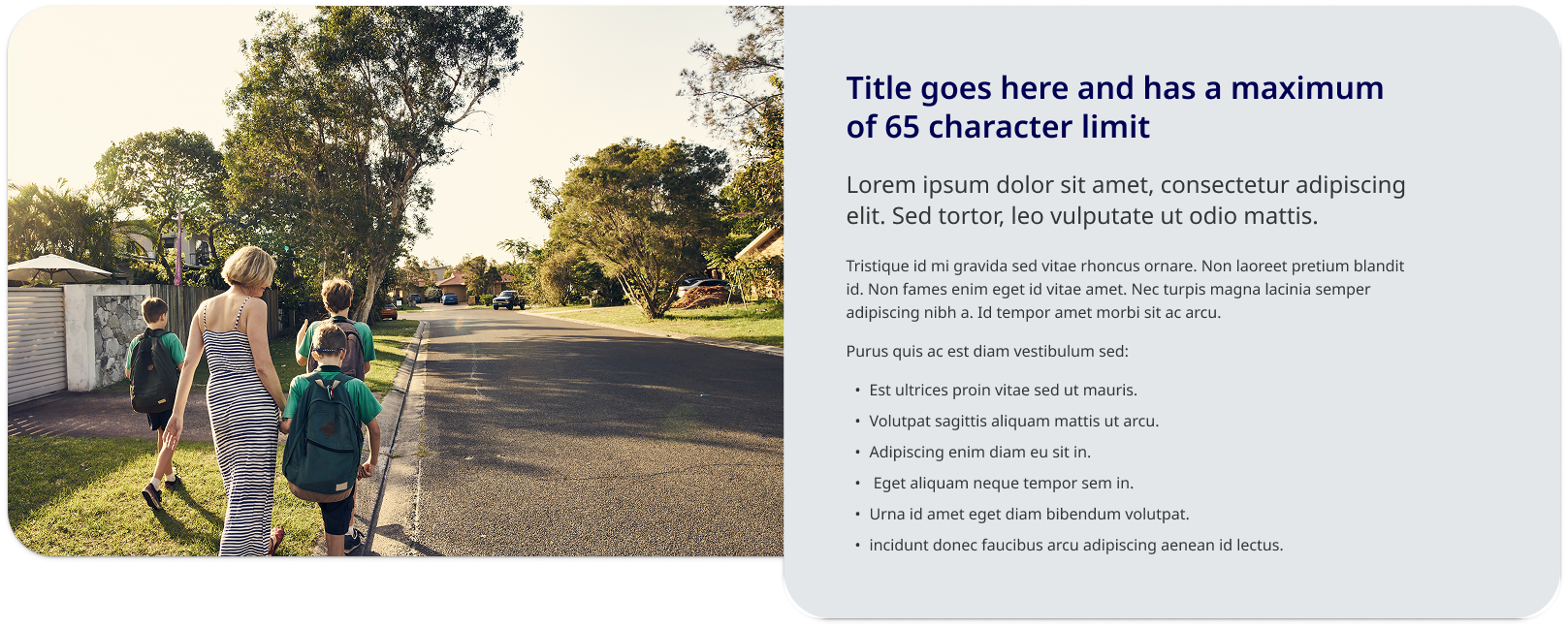
Indented image panel (larger text container)
This type of promotional panel is best used when the text needs to be larger and have greater focus. An example would be when there are many dot-points or paragraphs that require more vertical height. It is the best option when your highlighting content on a page and may not be including a call-to-action.
View indented image example with code
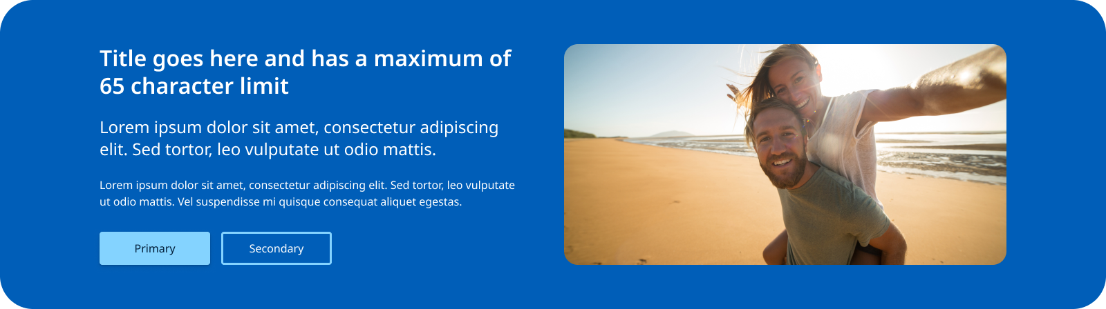
Contained image panel
This style of promo panel has a layout where the image and text are designed to have equal visual weight. It can be a useful option if you are encountering issues with image cropping and tends to work better for smaller amounts of content with one primary call-to-action. This style of promo panel has a more contained appears for that reason will look more distinct from the rest of the page's content. This is useful for content useful for the user but may not be directly related to the content on a page such as signing up for a sites newsletter.
View contained example with code
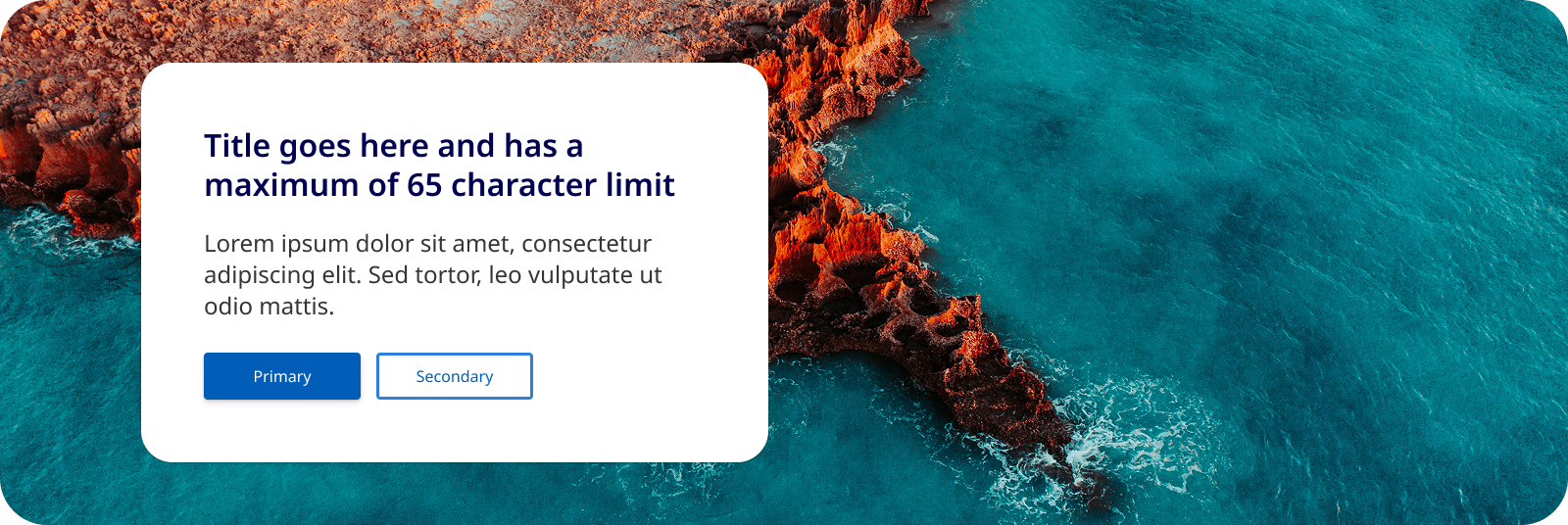
Full image panel
This style of promo panel uses a full width image instead of a solid colour as the background for the container. It is useful for promo panels that feature patterns, graphical branding and landscape imagery. Like the 'contained image panel' this design works best when there is less content.
View full image example with code
Usage guidelines
When to use
Promotional panels should be used in the following scenarios:
- Launching new features or services: When there's a new product, service, or feature, a promotional panel can effectively introduce it to users.
- Highlighting key content on a page: It may sometimes be useful to incorporate a promo panel to showcase key points, facts or a statement that needs to feature prominently on a page.
- Announcing events or campaigns: Use these panels to promote upcoming events, campaigns, or any time-sensitive information.
- Guiding user behaviour: They can be used to direct users toward high-priority actions, such as signing up for a service, downloading a resource, or participating in a survey
When not to use
It's important to avoid using promotional panels in these situations:
- Unrelated content: Do not use promotional panels to highlight content that isn't directly related to the user's current context or journey on the page.
- Non-priority information: Avoid using these panels for information that doesn't require immediate attention or action.
- On content pages: Promo panels should only be used on landing and home pages layouts and not on pages that include side navigation. This is because the response behaviour has been designed for 12 column layouts.
- On sites use vertical navigation patterns: Promo panels will have degraded appearance on vertical navigation as they are yet to be optimised for these layouts.
How to use
Do:
- Use clear and concise messaging: Ensure the message within the panel is direct and easy to understand. Users should grasp the key point within seconds.
- Keep visual consistency: The design of the panel should align with the overall visual language of the website, including colours, fonts, and imagery.
- Place the promo panel strategically: position the panel in areas of the page where users are most likely to see it without disrupting their primary task. It should not be the fist component on a page or the last.
- Use appropriate hero imagery: Above all else, you want your hero shot to be clear, there is also compelling evidence to suggest that featuring a photograph of a real-life person interacting with a product or service will get you a higher conversion rate than a photo or screenshot of a product (Gardner, n.d.).
Do not:
- Use more then one on a single page: Too many promotional panels can overwhelm users and dilute the impact of each individual panel. Try to only use one promo panel per page.
- Include too much copy: This will negatively affect the components visual layout, too much text can clutter the design and reduce the visual impact of the panel, making it less effective at catching the user's eye. Shorter copy allows for better visual balance, ensuring that key elements like images and calls to action stand out. The goal is to provide useful information to users in a way that is simple to consume and retain (Nielsen, 1997).