Design
Research and rationale
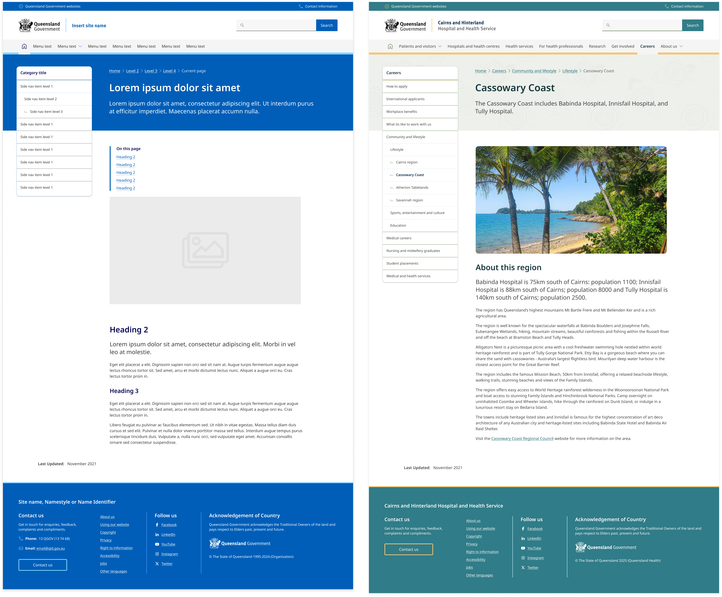
The side navigation was based on research and designs from the Digital Transformation Agency’s (DTA) side navigation component. The DTAs design was found to be consistent with existing best practices and only minor adjustments were made to include design accent colours which was done to allow more brand elements to be incorporated throughout the sites design.
Unique Visual Design for Each Level
People should be able to quickly scan the navigation and understand which links are primary, secondary, and tertiary navigation items. The placement and grouping of the links in our side navigation supports this through typography styles such as indentations and marks which are used to establish hierarchy between the list items (Lin, 2017).
Use Location Indicators
Like with breadcrumbs, location indicators on the navigation help people orient themselves on the site, especially if they're deeper within the website. This clear visual indicator can indicate which section someone is in. In our component, active pages are indicated by having a bold heading colour and interactivity such as hover states are removed.
Three levels
Following the research conducted by the DTA our side navigation supports 3 levels of hierarchy. The reason we only support 3 levels is because beyond 3 levels, visual solutions quickly become too complex or drastically reduce the available line length for links.
The DTA reviewed multiple government and private sector websites and found that the upper extent of complex navigation solutions tended to be around 5 levels.
To accommodate this and avoid overly complex user interfaces the navigation is often split into groups.
The best examples of navigation for a user where:
- One level in a main menu
- Landing page containing a list of second level links
- Three levels in a side navigation, including:
- Active state in main menu
- Title in side navigation for second level
- Breadcrumbs
Styles for the collapsed element
The DTA discovered through usability testing that the collapsed navigation on mobile was often overlooked by users because it was too subtle. A revision was made to make the collapsed navigation similar to the accordion and tertiary button styles in order to be more identifiable as a possible action. We chose to continue with the solution.
Future state
We're currently investigating future state design for this component that incorporates elevation, collapsible sections and more considered integration with banners on content pages.