
Overview
Overview
Use the skip link component to help keyboard and screen reader users bypass sections of repetitive content and quickly get to the main content of the page.
Example
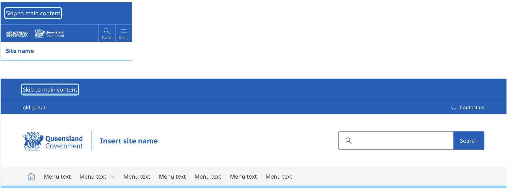
The code libraries below do not yet reflect the latest designs. We're currently updating them and will remove this notice once complete.
Usage guidelines
When to use
- To bypass repetitive blocks on a page.
- On all Queensland Government websites include a skip link that reads “Skip to main content”.
- On pages that have numerous utility links or functions above the main navigation, it may also be useful to provide a “Skip to main navigation” link. Place it after the “Skip to main content” link. Only one skip link appears at a time (when it has focus).
When not to use
- To link to content on other pages.
- To jump to content that is not a substantive region of the page.
How to use
- The skip link is a block-level element. Keep it visually hidden until it receives keyboard focus.
- Match the skip link's colour palette to the pre-header colour palette (choose from default, dark, or dark-alt).
- Place the skip link immediately after the opening
<body>tag. However, if a global alert is present, place the skip link immediately after the global alert to ensure important information is not accidentally bypassed. - Don’t place skip links inside a landmark region like
<nav>or<header>(Leber, 2001 and GOV.UK Design System, n.d.). - The link must properly move users to the targeted area.
- Display only one skip link at a time (when it has focus).