
Overview
Overview
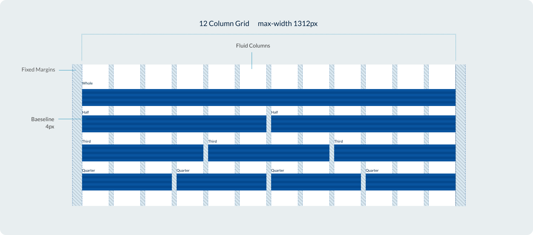
Our grid system uses a flexible 12 column design based on percentages with fixed gutters and margins. Our grid system is similar to bootstrap, giving users the option to change how content within columns behaved across breakpoints via classes.
Breakpoints
The Design System uses a responsive grid which adapts to the user’s viewport across 5 breakpoints.
| Breakpoint | Range | Margin | Gutters |
|---|---|---|---|
Extra-small | 400 | 16 | 16 |
Small | 400 - 699 | 16 | 16 |
Medium | 700 - 991 | 32 | 24 |
Large | 992 - 1312 | 32 | 32 |
Extra-large | Over 1312 | 32 | 32 |
We also have an XXL breakpoint for screen sizes over 1600px however this is specially for the implementation of our contained banner and promotional panel components. It isn't available as a class modifier for our grid system.
Max-width
Our page layouts have a maximum width which is set by a class applied to containers. This maximum width is 86rem which is equal to 1376px including margins or 1312px when you remove the outer margins.
Creating layouts with the grid
The Queensland Design System utilises a grid system consisting of rows and columns. You can control how content spans across columns at different breakpoints by changing the class name or by using the variables in the example below.
To define the columns within a row, specific classes are used in the following format:col-{breakpoint}-{columns}
The classes for columns are determined by the desired breakpoint, which can be one of the following: xs, sm, md, lg, or xl.
The number of columns can range from 1 to 12.
                <div class="container-fluid example-col">
      <div class="row">
        <div class="col-xs-1"><span>1</span></div>
        <div class="col-xs-1"><span>1</span></div>
        <div class="col-xs-1"><span>1</span></div>
        <div class="col-xs-1"><span>1</span></div>
        <div class="col-xs-1"><span>1</span></div>
        <div class="col-xs-1"><span>1</span></div>
        <div class="col-xs-1"><span>1</span></div>
        <div class="col-xs-1"><span>1</span></div>
        <div class="col-xs-1"><span>1</span></div>
        <div class="col-xs-1"><span>1</span></div>
        <div class="col-xs-1"><span>1</span></div>
        <div class="col-xs-1"><span>1</span></div>
      </div>
      <div class="row">
        <div class="col-xs-2"><span>2</span></div>
        <div class="col-xs-2"><span>2</span></div>
        <div class="col-xs-2"><span>2</span></div>
        <div class="col-xs-2"><span>2</span></div>
        <div class="col-xs-2"><span>2</span></div>
        <div class="col-xs-2"><span>2</span></div>
      </div>
      <div class="row">
        <div class="col-xs-3"><span>3</span></div>
        <div class="col-xs-3"><span>3</span></div>
        <div class="col-xs-3"><span>3</span></div>
        <div class="col-xs-3"><span>3</span></div>
      </div>
      <div class="row">
        <div class="col-xs-4"><span>4</span></div>
        <div class="col-xs-4"><span>4</span></div>
        <div class="col-xs-4"><span>4</span></div>
      </div>
      <div class="row">
        <div class="col-xs-6"><span>6</span></div>
        <div class="col-xs-6"><span>6</span></div>
      </div>
      <div class="row">
        <div class="col-xs-12"><span>12</span></div>
      </div>
    </div>
Recommendations:
The following number of columns per breakpoint are recommended to ensure your content meets best accessibility and usability.
- xs (Extra small) - 1 col layout
- sm (Small) - up to 2 columns
- md (Medium) - up to 3 columns although 2 often works best.
- lg and xl (Large) - up to 4 columns although 3 often works best.
Controlling the order with pull and push
You can control the visual order of columns within a row by using the pull and push modifiers in class names.
                <div class="container example-col">
    <div class="row">
      <div class="col-xs-4 col-xs-push-8"><span>First in source, last to display.</span></div>
      <div class="col-xs-4"><span>Second in source, second to display.</span></div>
      <div class="col-xs-4 col-xs-pull-8"><span>Last in source, first to display.</span></div>
    </div>
  </div>
Offset columns
You can offset a row by a specified number of columns by using the offset class name.
                <div class="container example-col">
    <div class="row">
      <div class="col-xs-6">6 cols</div>
      <div class="col-xs-offset-3 col-xs-3">3 cols</div>
    </div>
  </div>
Fluid
Use [.container-fluid] class for a full width container, spanning the entire width of your viewport.
                <div class="container-fluid example-col">
    <div class="row">
      <div class="col-xs-4"><span>4</span></div>
      <div class="col-xs-4"><span>4</span></div>
      <div class="col-xs-4"><span>4</span></div>
    </div>
  </div>